


| Author: | frontutility |
|---|---|
| Views Total: | 92 views |
| Official Page: | Go to website |
| Last Update: | July 16, 2025 |
| License: | MIT |
Preview:
Description:
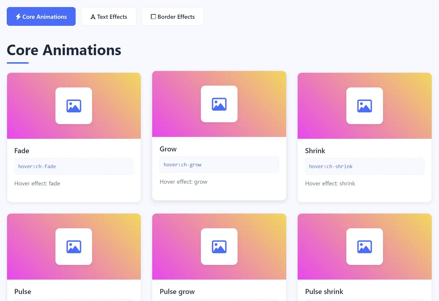
ChangeHover is a CSS animation library that provides over 150 ready-to-use hover effects for buttons, cards, text, and other UI elements.
The library currently covers three animation categories: core animations (94+ effects), text effects (19+ animations), and border effects (9+ animations). Each animation activates through simple HTML attributes.
Features
- Mobile-optimized with touch-friendly hover states.
- Cross-browser compatibility supporting Chrome, Firefox, Safari, Edge.
- Accessibility support with
prefers-reduced-motionrespect. - Modular loading with separate CSS files for different animation types.
- Attribute-based syntax using
hover:ch-*pattern.
How to use it:
1. Download the package and load the stylesheet in the <head> of your HTML file.
<!-- All animations -->
<link rel="stylesheet" href="/dist/changehover.min.css">
<!-- Core Animations -->
<link rel="stylesheet" href="/dist/core.min.css">
<!-- Text Effects -->
<link rel="stylesheet" href="/dist/text.min.css">
<!-- Border Effects -->
<link rel="stylesheet" href="/dist/borders.min.css">
2. Add a hover:ch-* attribute to any HTML element.
<!-- Core Animation -->
<button hover:ch-grow>Grow Effect</button>
<!-- Text Animation -->
<h1 hover:ch-text-glitch>Text Glitch Effect</h2>
<!-- Border Animation -->
<div hover:ch-border-wave>
<span class="ch-animation-helper"></span>
Border Wave Effect
</div>
Core Animations & Attributes:
- Fade:
hover:ch-fade - Grow:
hover:ch-grow - Shrink:
hover:ch-shrink - Pulse:
hover:ch-pulse - Pulse grow:
hover:ch-pulse-grow - Pulse shrink:
hover:ch-pulse-shrink - Push:
hover:ch-push - Pop:
hover:ch-pop - Bounce in:
hover:ch-bounce-in - Bounce out:
hover:ch-bounce-out - Rotate:
hover:ch-rotate - Rotate grow:
hover:ch-rotate-grow - Float:
hover:ch-float - Sink:
hover:ch-sink - Bob:
hover:ch-bob - Hang:
hover:ch-hang - Skew:
hover:ch-skew - Skew forward:
hover:ch-skew-forward - Skew backward:
hover:ch-skew-backward - Wobble horizontal:
hover:ch-wobble-horizontal - Wobble vertical:
hover:ch-wobble-vertical - Buzz:
hover:ch-buzz - Buzz out:
hover:ch-buzz-out - Forward:
hover:ch-forward - Backward:
hover:ch-backward - Fade back:
hover:ch-fade-back - Back pulse:
hover:ch-back-pulse - Bounce:
hover:ch-bounce - Flash:
hover:ch-flash - RubberBand:
hover:ch-rubberBand - ShakeX:
hover:ch-shakeX - ShakeY:
hover:ch-shakeY - HeadShake:
hover:ch-headShake - Swing:
hover:ch-swing - Tada:
hover:ch-tada - Jello:
hover:ch-jello - HeartBeat:
hover:ch-heartBeat - BackInDown:
hover:ch-backInDown - BackInLeft:
hover:ch-backInLeft - BackInRight:
hover:ch-backInRight - BackInUp:
hover:ch-backInUp - BackOutDown:
hover:ch-backOutDown - BackOutLeft:
hover:ch-backOutLeft - BackOutRight:
hover:ch-backOutRight - BackOutUp:
hover:ch-backOutUp - BounceIn:
hover:ch-bounceIn - BounceInDown:
hover:ch-bounceInDown - BounceInLeft:
hover:ch-bounceInLeft - BounceInRight:
hover:ch-bounceInRight - BounceInUp:
hover:ch-bounceInUp - BounceOut:
hover:ch-bounceOut - BounceOutDown:
hover:ch-bounceOutDown - BounceOutLeft:
hover:ch-bounceOutLeft - BounceOutRight:
hover:ch-bounceOutRight - BounceOutUp:
hover:ch-bounceOutUp - FadeIn:
hover:ch-fadeIn - FadeInDown:
hover:ch-fadeInDown - FadeInLeft:
hover:ch-fadeInLeft - FadeInRight:
hover:ch-fadeInRight - FadeInUp:
hover:ch-fadeInUp - FadeOut:
hover:ch-fadeOut - FadeOutDown:
hover:ch-fadeOutDown - FadeOutLeft:
hover:ch-fadeOutLeft - FadeOutRight:
hover:ch-fadeOutRight - FadeOutUp:
hover:ch-fadeOutUp - Flip:
hover:ch-flip - FlipInX:
hover:ch-flipInX - FlipInY:
hover:ch-flipInY - FlipOutX:
hover:ch-flipOutX - FlipOutY:
hover:ch-flipOutY - LightSpeedInRight:
hover:ch-lightSpeedInRight - LightSpeedInLeft:
hover:ch-lightSpeedInLeft - LightSpeedOutRight:
hover:ch-lightSpeedOutRight - LightSpeedOutLeft:
hover:ch-lightSpeedOutLeft - RotateIn:
hover:ch-rotateIn - RotateInDownLeft:
hover:ch-rotateInDownLeft - RotateInDownRight:
hover:ch-rotateInDownRight - RotateInUpLeft:
hover:ch-rotateInUpLeft - RotateInUpRight:
hover:ch-rotateInUpRight - RotateOut:
hover:ch-rotateOut - RotateOutDownLeft:
hover:ch-rotateOutDownLeft - RotateOutDownRight:
hover:ch-rotateOutDownRight - RotateOutUpLeft:
hover:ch-rotateOutUpLeft - RotateOutUpRight:
hover:ch-rotateOutUpRight - Hinge:
hover:ch-hinge - JackInTheBox:
hover:ch-jackInTheBox - RollIn:
hover:ch-rollIn - RollOut:
hover:ch-rollOut - ZoomIn:
hover:ch-zoomIn - ZoomInDown:
hover:ch-zoomInDown - ZoomInLeft:
hover:ch-zoomInLeft - ZoomInRight:
hover:ch-zoomInRight - ZoomInUp:
hover:ch-zoomInUp - ZoomOut:
hover:ch-zoomOut - ZoomOutDown:
hover:ch-zoomOutDown - ZoomOutLeft:
hover:ch-zoomOutLeft - ZoomOutRight:
hover:ch-zoomOutRight - ZoomOutUp:
hover:ch-zoomOutUp - SlideInDown:
hover:ch-slideInDown - SlideInLeft:
hover:ch-slideInLeft - SlideInRight:
hover:ch-slideInRight - SlideInUp:
hover:ch-slideInUp - SlideOutDown:
hover:ch-slideOutDown - SlideOutLeft:
hover:ch-slideOutLeft - SlideOutRight:
hover:ch-slideOutRight - SlideOutUp:
hover:ch-slideOutUp
Text Animations & Attributes:
- Text gradient flow:
hover:ch-text-gradient-flow - Text glitch:
hover:ch-text-glitch - Text neon:
hover:ch-text-neon - Text bounce:
hover:ch-text-bounce - Text wave:
hover:ch-text-wave - Text rotate3d:
hover:ch-text-rotate3d - Text fade in:
hover:ch-text-fade-in - Text slide in:
hover:ch-text-slide-in - Text zoom in:
hover:ch-text-zoom-in - Text shake:
hover:ch-text-shake - Text pulse:
hover:ch-text-pulse - Text wobble:
hover:ch-text-wobble - Text blink:
hover:ch-text-blink - Text swing:
hover:ch-text-swing - Text jelly:
hover:ch-text-jelly - Text skew:
hover:ch-text-skew - Text fly in:
hover:ch-text-fly-in - Text reveal:
hover:ch-text-reveal
Border Animations & Attributes:
- Border Left to Right:
hover:ch-border-ltr - Border Right to Left:
hover:ch-border-rtl - Border Top to Bottom:
hover:ch-border-ttb - Border Bottom to Top:
hover:ch-border-btt - Border Dashed:
hover:ch-border-dashed - Border Radius:
hover:ch-border-radius - Border Wave:
hover:ch-border-wave - Border Shimmer:
hover:ch-border-shimmer - Border Flow:
hover:ch-border-flow
See Also:
 Create Interactive Pixelated Image Transitions with JavaScript
 Interactive 3D Parallax Effect on Hover with Pure CSS/CSS3
 Determine User Intent Using Vanilla JavaScript – sv-hover-intent
 Minimal Ripple Click & Hover Effect – ripple.js
 3D Hover-triggered Wave Effect With Pure CSS/CSS3
 Custom Cursor That Interacts With Buttons – Wobbly Buttons
 3D Multi-layer Parallax Hover Effect In JavaScript – Atropos
 Smooth 3D Parallax Tilt Hover Effect – Card3d.js