


| Author: | dolce |
|---|---|
| Views Total: | 8,028 views |
| Official Page: | Go to website |
| Last Update: | July 23, 2015 |
| License: | MIT |
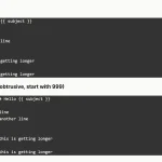
Preview:

Description:
A lightweight JavaScript library to create a responsive, drag’n’drop modal window with support keyboard shortcuts. Inspired by Google Modal and based on Draggabilly PACKAGED library.
How to use it:
Load the draggabilly.pkgd.js and modal.js in the html page.
<script src="js/draggabilly.pkgd.js"></script>
<script src="js/modal.js"></script>
Create a modal window following the markup structure like so:
<div class="modal">
  <header class="modal-header">
    <h1 class="modal-header-title left">Title of Modal</h1>
    <button class="modal-header-btn right modal-close" title="Close Modal">OK</button>
  </header>
  <div class="modal-body">
    <section class="modal-content">
      Modal Content Goes Here
    </section>
  </div>
</div>
Create a button to launch the modal window.
<button class="modal-header-btn modal-trigger btn-fixed">Open Modal</button>
The basic CSS styles for the modal window.
.modal-overlay {
  visibility: hidden;
  opacity: 0;
  position: absolute;
  left: 0;
  top: 0;
  bottom: 0;
  right: 0;
  z-index: 98;
}
.modal {
  visibility: hidden;
  opacity: 0;
  background: #fff;
  box-shadow: 0 4px 16px rgba(0,0,0,.2);
  border: 1px solid rgba(0,0,0,.333);
  width: 800px;
  height: 360px;
  position: absolute;
  left: 50%;
  top: 50%;
  margin-left: -400px;
  margin-top: -180px;
  z-index: 99;
}
.modal-body {
  overflow-y: scroll;
  height: calc( 100% - 75px );
}
.modal-content {
  padding: 20px;
  transition: transform 0.7s cubic-bezier(0.165, 0.840, 0.440, 1.000);
  transform: translateY(-50px);
}
.modal.opening .modal-content { transform: translateY(0px); }
.modal-content p {
  font-size: 15px;
  margin: 0 0 15px;
}
.modal-header {
  transition: border-color 0.2s ease;
  box-sizing: border-box;
  background-color: #eee;
  border-bottom: 1px solid rgba(0,0,0,.2);
  font-size: 16px;
  height: 75px;
  line-height: 30px;
  margin: 0;
  padding: 22px 26px;
  vertical-align: middle;
}
.modal-header-title {
  margin: 0;
  padding: 0;
  font-size: 15px;
  line-height: 28px;
  font-weight: 400;
  letter-spacing: -0.03em;
  cursor: default;
}
.modal-header-btn {
  background-color: #4d90fe;
  background-image: -webkit-linear-gradient(top, #4d90fe, #4787ed);
  background-image: linear-gradient(top, #4d90fe, #4787ed);
  border: 1px solid #3079ed;
  color: #fff;
  border-radius: 2px;
  font-size: 11px;
  font-weight: 600;
  text-align: center;
  white-space: nowrap;
  margin-left: 5px;
  line-height: 26px;
  min-width: 70px;
  outline: 0;
  padding: 0 12px;
  cursor: pointer;
}
.modal-header-btn:hover { opacity: 0.8; }
.modal-header-btn:active {
  box-shadow: inset 0 1px 2px rgba(0,0,0,0.3);
  background: #357ae8;
  border: 1px solid #2f5bb7;
  border-top: 1px solid #2f5bb7;
}
The CSS styles for different modal status and open/close animations.
.modal.is-full {
  left: 0 !important;
  top: 0 !important;
  width: calc(100% - 30px) !important;
  height: calc(100% - 30px) !important;
  margin: 15px !important;
}
.modal.is-left {
  left: 0px !important;
  right: auto !important;
  top: 0px !important;
  margin: 0px !important;
  height: 100% !important;
}
.modal.is-left {
  left: 0px !important;
  right: auto !important;
  top: 0px !important;
  margin: 0px !important;
  height: 100% !important;
}
.modal.is-right {
  left: auto !important;
  right: 0px !important;
  top: 0px !important;
  margin: 0px !important;
  height: 100% !important;
}
.modal.is-dragging {
  border-color: #66afe9;
  outline: 0;
  box-shadow: 0 0 8px rgba(102,175,233,.6), 0 6px 20px rgba(0,0,0,.2);
}
.modal.opening, .modal-overlay.opening {
  -webkit-animation: show 0.5s ease;
  animation: show 0.5s ease;
  -webkit-animation-fill-mode: forwards;
  animation-fill-mode: forwards;
}
.modal.closing, .modal-overlay.closing {
  -webkit-animation: hide 0.5s ease;
  animation: hide 0.5s ease;
  -webkit-animation-fill-mode: forwards;
  animation-fill-mode: forwards;
}
@keyframes
show {  0% {
opacity: 0;
}
 100% {
opacity: 1;
}
}
@-webkit-keyframes
show {  0% {
opacity: 0;
}
 100% {
opacity: 1;
}
}
@keyframes
hide {  0% {
opacity: 1;
}
 100% {
opacity: 0;
}
}
@-webkit-keyframes
hide {  0% {
opacity: 1;
}
 100% {
opacity: 0;
}
}
@media only screen and (max-width : 800px) {
.modal {
  width: 100%;
  left: 0 !important;
  margin-left: 0 !important;
}
}
Initialize the modal.
window.onload = function(e){

  Modal.init();
};
Shortcuts:
- Ctrl + Up Arrow: Fill the entire screen;
- Ctrl + Down Arrow: Exit full screen;
- Ctrl + Left Arrow: Align the left, filling half the screen*;
- Ctrl + Right Arrow: Align the right, filling half the screen*;
See Also:
 Add Numbering to Pre and Textarea – line-numbers Web Component
 Create An Exit Popup When Leaving Website – ouibounce.js
 Lightweight Animated Tooltip Plugin For JavaScript – MarcTooltips.js
 Responsive Image Carousel In Vanilla JavaScript
 Generating Responsive Timetables In Vanilla JavaScript – Timetable.js
 Easy Custom File Input With JavaScript And CSS – Input-file.js
 Handling Click Outside Event In Pure JavaScript – click-outside.js
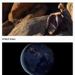 Lightweight Background Video Library – vidim
Hi, and how to open multiple windows? ..in this because most feature( . .)