


Here is a constantly updated list of the 10 best JavaScript and CSS based Responsive Menus we published on CSSScript.com.
All of these responsive menus will auto-switch between regular site navigation and mobile-friendly navigation depending on the viewport size.
I hope you like it and don’t forget to spread the world.
Originally Published Nov 17 2017, updated Jan 18 2026
Table Of Contents:
Pure CSS Responsive Menus:
Responsive Pure CSS Dropdown Navigation Menu
A fully responsive, CSS-only navigation that breaks down into a hamburger dropdown menu when the viewport size is smaller than a breakpoint specified in the CSS3 media queries.

Pure CSS Mobile-compatible Responsive Dropdown Menu
A pure CSS responsive menu created by andornagy that automatically changes to a toggleable dropdown menu at a specified breakpoint based on CSS3 media queries.

Transform Navbar Into Bottom Navigation
A mobile-friendly navigation system that transforms the site menu into a bottom navigation bar on small screens.

Responsive Hamburger Menu In Pure CSS
A CSS only responsive, multi-level menu that expands the hamburger toggle button into a horizontal drop-down nav on the desktop or an off-canvas side menu on mobile.

CSS Only Responsive Hamburger Navigation
Yet another responsive, mobile-friendly hamburger navigation menu for your cross-platform web pages. Implemented with pure HTML and CSS/CSS3.

Pure JavaScript Responsive Menus:
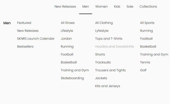
Responsive Mega Menu In JavaScript
A modern, responsive mega menu template for online stores. Written in Pure JavaScript and CSS/CSS3.

Responsive Multi-level Dropdown Menu With JavaScript And CSS – ozmenu.js
A modern, clean, responsive, multi-level dropdown menu written in vanilla JavaScript and CSS.

Responsive Sliding Hamburge Menu System
A responsive navigation system that transforms the regular horizontal navbar into a mobile-friendly hamburger menu when visiting on small screens.

Responsive Multi-level Dropdown Menu For Navbar
A Vanilla JavaScript library that makes it easier to create responsive, mobile-friendly, multi-level dropdown menus for the navbar of your cross-platform web app.

Responsive Dropdown Mega Menu In JavaScript
A fully responsive, mobile-friendly dropdown mega navigation written in JavaScript, CSS, and Material Icons.
It automatically transforms the navbar into a vertical accordion menu with a hamburger button for a better experience on mobile devices.
More Resources:
To download more responsive menus for your modern website & web app, here are a few more resources available online: