JavaScript Video Conference Grid Layout Library with Gallery & Spotlight Modes

JavaScript library for video meeting layouts with dynamic grids, pin mode, pagination, and draggable PiP. Framework-agnostic core with React/Vue wrappers.


JavaScript library for video meeting layouts with dynamic grids, pin mode, pagination, and draggable PiP. Framework-agnostic core with React/Vue wrappers.

A JavaScript text layout library for measuring multiline text height and line breaks before render with cached metrics and browser-like wrapping.

Dynamically resize iframe height based on content with iFrame Adjuster. A tiny vanilla JS plugin that handles multiple iframes and form reloads.

Build responsive hexagon grid layouts with CSS Grid and container queries. No media queries needed. Uses CSS math functions for auto-adaptation.
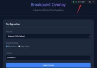
Drop-in developer overlay for visualizing responsive breakpoints. Shows viewport size, active breakpoint, and device pixel ratio in real-time.

Create resizable split-pane layouts with ResizerTwo.js. Zero dependencies, supports horizontal and vertical layouts, customizable handles.
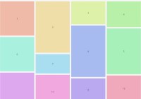
A lightweight masonry grid library with zero dependencies. Supports responsive layouts in vanilla JavaScript and React with automatic gap filling and optional item balancing.

Yet another pure CSS implementation of the responsive, customizable block/wall grid layout system.

A zero-dependency JS library that transforms CSS grids into responsive masonry layouts, respecting your existing grid styles.

A lightweight, responsive, mobile-friendly one page scoll layout with synchronized navigation, perfect for interactive storytelling and portfolio displays.