


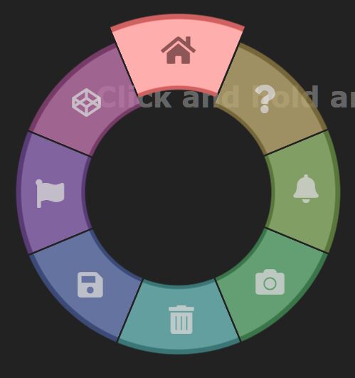
An interactive wheel menu system triggered by click/tap and hold. Written in pure JavaScript and CSS.
How to use it:
<div class="wheel">
  <div class="arc">Menu Item 1</div>
  <div class="arc">Menu Item 2</div>
  <div class="arc">Menu Item 3</div>
  <div class="arc">Menu Item 4</div>
  <div class="arc">Menu Item 5</div>
  <div class="arc">Menu Item 6</div>
  <div class="arc">Menu Item 7</div>
  <div class="arc">Menu Item 8</div>
</div>
The necessary CSS/CSS3 rules for the wheel menu.
.wheel {
  --x: 0px;
  --y: 0px;
  position: absolute;
  top: var(--y);
  left: var(--x);
  width: 500px;
  height: 500px;
  transform: translate(-50%, -50%);
  transform-origin: 0% 0%;
}
.wheel.on .arc {
  opacity: 0.8;
  transform: scale(1) rotate(var(--rotation)) !important;
  transition-timing-function: cubic-bezier(0, 0.5, 0.5, 1.5);
}
.wheel .arc {
  position: absolute;
  top: 0;
  right: 0;
  width: 50%;
  height: 50%;
  transform-origin: 0% 100%;
  background-image: radial-gradient(circle at 0% 100%, transparent, transparent 29.5%, var(--color-border) 30%, var(--color-border) 30.5%, var(--color) 31%, var(--color) 50%, var(--color-border) 50.25%, var(--color-border) 51.5%, transparent 51.75%, transparent);
  transition-property: transform, opacity, filter;
  transition-duration: 0.3s;
  transition-timing-function: cubic-bezier(0.4, -0.4, 0.7, -0.3);
  -webkit-clip-path: polygon(0 0, 0 99%, 99% 0);
  clip-path: polygon(0 0, 0 99%, 99% 0);
  opacity: 0;
}
.wheel[data-chosen='1'] .arc:nth-child(1) {
  opacity: 1;
  transform: scale(1.1) rotate(var(--rotation)) !important;
  filter: brightness(150%);
}
.wheel[data-chosen='1'] .arc:nth-child(1) i {
  color: rgba(0, 0, 0, 0.5);
}
.wheel .arc:nth-child(1) {
  --rotation: -22.5deg;
  --color: hsl(0deg, 36%, 60%);
  --color-border: hsl(0deg, 36%, 40%);
  transform: scale(0) rotate(var(--rotation));
  transition-delay: 0.015s;
}
.wheel .arc:nth-child(1) i {
  transform: rotate(calc(var(--rotation) * -1));
  color: rgba(255, 255, 255, 0.8);
  transition: color 0.3s;
}
.wheel[data-chosen='2'] .arc:nth-child(2) {
  opacity: 1;
  transform: scale(1.1) rotate(var(--rotation)) !important;
  filter: brightness(150%);
}
.wheel[data-chosen='2'] .arc:nth-child(2) i {
  color: rgba(0, 0, 0, 0.5);
}
.wheel .arc:nth-child(2) {
  --rotation: 22.5deg;
  --color: hsl(45deg, 36%, 60%);
  --color-border: hsl(45deg, 36%, 40%);
  transform: scale(0) rotate(var(--rotation));
  transition-delay: 0s;
}
.wheel .arc:nth-child(2) i {
  transform: rotate(calc(var(--rotation) * -1));
  color: rgba(255, 255, 255, 0.8);
  transition: color 0.3s;
}
.wheel[data-chosen='3'] .arc:nth-child(3) {
  opacity: 1;
  transform: scale(1.1) rotate(var(--rotation)) !important;
  filter: brightness(150%);
}
.wheel[data-chosen='3'] .arc:nth-child(3) i {
  color: rgba(0, 0, 0, 0.5);
}
.wheel .arc:nth-child(3) {
  --rotation: 67.5deg;
  --color: hsl(90deg, 36%, 60%);
  --color-border: hsl(90deg, 36%, 40%);
  transform: scale(0) rotate(var(--rotation));
  transition-delay: 0.015s;
}
.wheel .arc:nth-child(3) i {
  transform: rotate(calc(var(--rotation) * -1));
  color: rgba(255, 255, 255, 0.8);
  transition: color 0.3s;
}
.wheel[data-chosen='4'] .arc:nth-child(4) {
  opacity: 1;
  transform: scale(1.1) rotate(var(--rotation)) !important;
  filter: brightness(150%);
}
.wheel[data-chosen='4'] .arc:nth-child(4) i {
  color: rgba(0, 0, 0, 0.5);
}
.wheel .arc:nth-child(4) {
  --rotation: 112.5deg;
  --color: hsl(135deg, 36%, 60%);
  --color-border: hsl(135deg, 36%, 40%);
  transform: scale(0) rotate(var(--rotation));
  transition-delay: 0s;
}
.wheel .arc:nth-child(4) i {
  transform: rotate(calc(var(--rotation) * -1));
  color: rgba(255, 255, 255, 0.8);
  transition: color 0.3s;
}
.wheel[data-chosen='5'] .arc:nth-child(5) {
  opacity: 1;
  transform: scale(1.1) rotate(var(--rotation)) !important;
  filter: brightness(150%);
}
.wheel[data-chosen='5'] .arc:nth-child(5) i {
  color: rgba(0, 0, 0, 0.5);
}
.wheel .arc:nth-child(5) {
  --rotation: 157.5deg;
  --color: hsl(180deg, 36%, 60%);
  --color-border: hsl(180deg, 36%, 40%);
  transform: scale(0) rotate(var(--rotation));
  transition-delay: 0.015s;
}
.wheel .arc:nth-child(5) i {
  transform: rotate(calc(var(--rotation) * -1));
  color: rgba(255, 255, 255, 0.8);
  transition: color 0.3s;
}
.wheel[data-chosen='6'] .arc:nth-child(6) {
  opacity: 1;
  transform: scale(1.1) rotate(var(--rotation)) !important;
  filter: brightness(150%);
}
.wheel[data-chosen='6'] .arc:nth-child(6) i {
  color: rgba(0, 0, 0, 0.5);
}
.wheel .arc:nth-child(6) {
  --rotation: 202.5deg;
  --color: hsl(225deg, 36%, 60%);
  --color-border: hsl(225deg, 36%, 40%);
  transform: scale(0) rotate(var(--rotation));
  transition-delay: 0s;
}
.wheel .arc:nth-child(6) i {
  transform: rotate(calc(var(--rotation) * -1));
  color: rgba(255, 255, 255, 0.8);
  transition: color 0.3s;
}
.wheel[data-chosen='7'] .arc:nth-child(7) {
  opacity: 1;
  transform: scale(1.1) rotate(var(--rotation)) !important;
  filter: brightness(150%);
}
.wheel[data-chosen='7'] .arc:nth-child(7) i {
  color: rgba(0, 0, 0, 0.5);
}
.wheel .arc:nth-child(7) {
  --rotation: 247.5deg;
  --color: hsl(270deg, 36%, 60%);
  --color-border: hsl(270deg, 36%, 40%);
  transform: scale(0) rotate(var(--rotation));
  transition-delay: 0.015s;
}
.wheel .arc:nth-child(7) i {
  transform: rotate(calc(var(--rotation) * -1));
  color: rgba(255, 255, 255, 0.8);
  transition: color 0.3s;
}
.wheel[data-chosen='8'] .arc:nth-child(8) {
  opacity: 1;
  transform: scale(1.1) rotate(var(--rotation)) !important;
  filter: brightness(150%);
}
.wheel[data-chosen='8'] .arc:nth-child(8) i {
  color: rgba(0, 0, 0, 0.5);
}
.wheel .arc:nth-child(8) {
  --rotation: 292.5deg;
  --color: hsl(315deg, 36%, 60%);
  --color-border: hsl(315deg, 36%, 40%);
  transform: scale(0) rotate(var(--rotation));
  transition-delay: 0s;
}
.wheel .arc:nth-child(8) i {
  transform: rotate(calc(var(--rotation) * -1));
  color: rgba(255, 255, 255, 0.8);
  transition: color 0.3s;
}
The core JavaScript to activate the wheel menu.
document.body.addEventListener('contextmenu', e => e.preventDefault() & e.stopPropagation());
document.body.addEventListener('mousedown', onMouseDown);
document.body.addEventListener('touchstart', e => onMouseDown(e.touches[0]));
document.body.addEventListener('mouseup', onMouseUp);
document.body.addEventListener('touchend', e => onMouseUp(e.touches[0]));
document.body.addEventListener('mousemove', onMouseMove);
document.body.addEventListener('touchmove', e => onMouseMove(e.touches[0]));
let showing, anchorX, anchorY, min = 100;
const wheel = document.querySelector('.wheel');
function onMouseDown({ clientX: x, clientY: y }) {
  showing = true;
  anchorX = x;
  anchorY = y;
  wheel.style.setProperty('--x', `${x}px`);
  wheel.style.setProperty('--y', `${y}px`);
  wheel.classList.add('on');
}
function onMouseUp() {
  showing = false;
  wheel.setAttribute('data-chosen', 0);
  wheel.classList.remove('on');
}
function onMouseMove({ clientX: x, clientY: y }) {
  if (!showing) return;
  let dx = x - anchorX;
  let dy = y - anchorY;
  let mag = Math.sqrt(dx * dx + dy * dy);
  let index = 0;
  if (mag >= min) {
    let deg = Math.atan2(dy, dx) + 0.625 * Math.PI;
    while (deg < 0) deg += Math.PI * 2;
    index = Math.floor(deg / Math.PI * 4) + 1;
  }
  wheel.setAttribute('data-chosen', index);
}
Alternatives & Related Resources:
- Build Modern Unique Radial UIs With Orbit CSS Framework
- 10 Best Circle(Radial) Menu Plugins In JavaScript & CSS
See Also:
 Animated SVG Based Wheel Menu – wheelnav.js
 Convert XML To JSON With Pure JavaScript – xmlToJson
 Display A Back To Top Button When Reaching The Bottom Of the Page – pageTopScroller
 Dynamic Reading Position Progress Bar – proBaws.js
 Circular Image Slider With Pure CSS
 Neumorphism Style Analog Clock Icon In JavaScript And CSS
 Interactive Wizard UI Using Bootstrap 5 Tabs Component
 Detect What Device and Browser You’re Using – get-browser
great code. if i enter a textbox, then this menu comes up, please update it so it does not affect any other controls on the page when you click the mouse! thank you!