


ipad-cursor is a custom cursor library that allows developers to integrate iPad-style cursor effects into web projects.
Features:
- Customize cursor color, size, and animation
- Support cursor interactions on inline text and content blocks
- Integrate seamlessly with React, Vue, and more
How to use it:
1. Install and import the ipad-cursor.
# NPM
$ npm i ipad-cursor
// Browser
import cursor from "https://unpkg.com/ipad-cursor@latest"
cursor.initCursor()
// Vue
import { useCursor } from "ipad-cursor/vue";
useCursor()
// React
import { IPadCursorProvider, useIPadCursor } from "ipad-cursor/react";
import type { IpadCursorConfig } from "ipad-cursor";
const config: IpadCursorConfig = {};
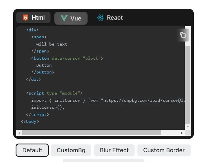
useIPadCursor();2. Apply the iPad cursor effect to elements as follows:
<div data-cursor="text">
  Text Cursor
</div>
<div data-cursor="block">
  Block Cursor
</div>
3. Customize the styles of the cursor.
<button class="btn"
  data-cursor="block"
  data-cursor-style="backdropBlur: 0; durationBackdropFilter: 1000"
>Example Button</button>
4. Available cursor options.
/**
 * Strength of adsorption, the larger the value,
 * The higher the value, the greater the range of the block that can be moved when it is hovered
 * @type {number} between 0 and 30
 * @default 10
 */
adsorptionStrength?: number;
/**
 * The class name of the cursor element
 * @type {string}
 * @default 'cursor'
 */
className?: string;
/**
 * The style of the cursor, when it does not hover on any element
 */
normalStyle?: IpadCursorStyle;
/**
 * The style of the cursor, when it hovers on text
 */
textStyle?: IpadCursorStyle;
/**
 * The style of the cursor, when it hovers on a block
 */
blockStyle?: IpadCursorStyle;
/**
 * The style of the cursor, when mousedown
 */
mouseDownStyle?: IpadCursorStyle;
/**
 * Cursor padding when hover on block
 */
blockPadding?: number | "auto";
/**
 * detect text node and apply text cursor automatically
 **/
enableAutoTextCursor?: boolean;
/**
 * whether to enable lighting effect
 */
enableLighting?: boolean;
/**
 * whether to apply effect for mousedown action
 */
enableMouseDownEffect?: boolean;
5. Available style options.
/**
 * The width of the cursor
 */
width?: MaybeSize;
/**
 * The width of the cursor
 */
height?: MaybeSize;
/**
 * Border radius of cursor
 */
radius?: MaybeSize | "auto";
/**
 * Transition duration of basic properties like width, height, radius, border, background-color
 */
durationBase?: MaybeDuration;
/**
 * Transition duration of position: left, top
 */
durationPosition?: MaybeDuration;
/**
 * Transition duration of backdrop-filter
 */
durationBackdropFilter?: MaybeDuration;
/**
 * The background color of the cursor
 */
background?: MaybeColor;
/**
 * Border of the cursor
 * @example '1px solid rgba(100, 100, 100, 0.1)'
 */
border?: string;
/** z-index of cursor */
zIndex?: number;
/**
 * Scale of cursor
 */
scale?: number;
/**
 * backdrop-filter blur
 */
backdropBlur?: MaybeSize;
/**
 * backdrop-filter saturate
 */
backdropSaturate?: string;
6. API methods.
initCursor(cfg)
updateCursor()
disposeCursor()
updateConfig(cfg)
customCursorStyle(style)
resetCursor()
Changelog:
v0.5.2 (07/30/2023)
- feat: add vue directive support
- feat: ensure cursor is inited when updateCursor is called
v0.5.0 (07/22/2023)
- feat: support for auto detect dom change
- set enableAutoUpdateCursor to true to enable this feature
- fix: prevents the cursor from shifting from the node during rapid enter/leave
- fix: prevents falling back to the default value when using 0 values
See Also:
 90’s Cursor Move Effects In Pure JavaScript
 Aura Cursor: Custom Mouse Effects for Modern Web Apps
 Interactive WebGL Fluid Motion with Smokey Fluid Cursor
 JavaScript Cursor Library with Particle Effects – Cursorly.js
 Interactive Smoke/Fluid Motion Effects with Canvas and WebGL
 Add Custom Spotlight Effects to Mouse Movements – gradient-cursor
 Create Custom Interactive Mouse Cursors with Cursix and GSAP
 Create Smooth Custom Cursor Effects Using Cursor Magic