


A high-performance, Material Design style select box replacement that supports single/multiple select, virtual scrolling (for larger data lists), live search, and dynamic data rendering.
How to use it:
1. Load the Virtual Select’s JavaScript and CSS files in the HTML document.
<link rel="stylesheet" href="dist/virtual-select.min.css" />
<script src="dist/virtual-select.min.js"></script>
2. Create a container to hold the virtual select.
<div id="example-select"></div>
3. Define your own options for the virtual select.
myOptions = [
  { label: 'Options 1', value: '1', alias: 'custom label for search', classNames: 'customClassNames', },
  { label: 'Options 2', value: '2', description: 'custom description for label', customData: '' },
  { label: 'Options 3', value: '3' },
  ...
  { label: 'Options 100000', value: '100000' },
],
4. Initialize the Virtual Select library and done.
VirtualSelect.init({
  ele: '#example-select',
  options: myOptions
});
5. You can also directly initialize the library on the native select element.
<select multiple name="native-select" placeholder="Native Select" data-search="false" data-silent-initial-value-set="true">
  <option value="1" disabled>Option 1</option>
  <option value="2">Option 2</option>
  <option value="3" selected>Option 3</option>
  ...
</select>
VirtualSelect.init({
  ele: 'select'
});
6. Enable the multi select support.
VirtualSelect.init({
  ele: '#example-select',
  options: myOptions,
  multiple: true
});
7. Enable the live search support.
VirtualSelect.init({
  ele: '#example-select',
  options: myOptions,
  search: true,
  searchGroup: false, // Include group title for searching
  searchByStartsWith: false, // Search options by startsWith() method
});
8. Customize the placeholder text.
VirtualSelect.init({
  ele: '#example-select',
  options: myOptions,
  placeholder: 'Select options here'
});
9. Define an array of disabled options.
VirtualSelect.init({
  ele: '#example-select',
  options: myOptions,
  disabledOptions: [1, 1000, 10000]
});
10. Determine whether to hide the clear button.
VirtualSelect.init({
  ele: '#example-select',
  options: myOptions,
  hideClearButton: true
});
11. More configuration options.
VirtualSelect.init({
  // parent element to render dropbox. (self, body, or any css selectror)
  dropboxWrapper: 'self',
  // No.of options to show on viewport
  optionsCount: 5,
  // if has options descriptions
  hasOptionDescription: false,
  // disable select all
  disableSelectAll: false,
  // Height of option
  optionHeight: '40px',
  // top, bottom, auto
  position: 'auto',
  // allow searching by label ignoring diacritics
  searchNormalize: false,
  // disable dropdown
  disabled: false,
  // enable required validation.
  required: false,
  // disable required validation
  disableValidation: false,
  // use Group's value
  useGroupValue: false,
  // autofocus dropdown on load
  autofocus: false,
  // Text to show when no options to show
  noOptionsText: 'No results found',
  // Text to show when no results on search
  noSearchResultsTex: 'No results found',
  // Text to show near select all checkbox when search is disabled
  selectAllText: 'Select all',
  // Text to show as placeholder for search input
  searchPlaceholderText: 'Search...',
  // Text to use when displaying no.of values selected text (i.e. 3 options selected)
  optionsSelectedText: 'options selected',
  // Text to use when displaying no.of values selected text and only one value is selected (i.e. 1 option selected)
  optionSelectedText: 'option selected',
  // Text to use when displaying all values selected text (i.e. All (10))
  allOptionsSelectedText: 'All',

  // By default, when all values selected "All (10)" value text would be shown.
  // Set true to show value text as "10 options selected".
  disableAllOptionsSelectedText: false,
  // By default, no.of options selected text would be shown when there is no enough space to show all selected values.
  // Set true to override this.
  alwaysShowSelectedOptionsCount: false,
  // By default, no.of options selected text would be shown when there is no enough space to show all selected values.
  // Set true to show labels even though there is no enough space.
  alwaysShowSelectedOptionsLabel: false,
  // Show each selected values as tags with remove icon
  showValueAsTags: false,
  // For right-to-left text direction languages
  textDirection: 'ltr',
  // Disable option group title checkbox
  disableOptionGroupCheckbox: false,
  // Set true to replace HTML tags from option's text (value and label) to prevent XSS attack.
  // This feature is not enabled by default to avoid performance issue.
  enableSecureText: false,
  // Set value for hidden input in array format (e.g. '["1", "2"]')
  setValueAsArray: false,
  // Empty value to use for hidden input when no value is selected (e.g. 'null' or '[]' or 'none')
  emptyValue: '',
  // allows you to add new options
  allowNewOption: true,
  // select first option by default on load
  autoSelectFirstOption: false,
  // Single value or array of values to select on init
  selectedValue: '',
  // To avoid "change event" trigger on setting initial value
  silentInitialValueSet: false,
  // Custom width
  dropboxWidth: null,
  // CSS z-index
  zIndex: 1,
  // additional CSS classes
  additionalClasses: '',
  // Additional CSS classes for the dropbox element
  additionalDropboxClasses: '',
  // Additional CSS classes for the dropbox container element
  additionalDropboxContainerClasses: '',
  // Additional CSS classes for the toggle button element, to allow customizing the select input
  additionalToggleButtonClasses: '',
  // Maximum no.of values to show in the tooltip for multi-select
  noOfDisplayValues: 50,
  // Mark matched term in label
  markSearchResults: false,
  // Font size for tooltip
  tooltipFontSize: '14px',
  // CSS Text alignment for tooltip
  tooltipAlignment: 'center',
  // max width of tooltip
  tooltipMaxWidth: '300px',
  // Show selected options at the top of the dropbox
  showSelectedOptionsFirst: false,
  // Scroll selected option to viewport on dropbox open
  focusSelectedOptionOnOpen: false,
  // Tooltip text for clear button
  clearButtonText: 'clear',
  // Text to show when more than noOfDisplayValues options selected (i.e + 10 more...)
  moreText: 'more...',
  // name attribute for hidden input
  name: '',
  // keep dropbox always open with fixed height
  keepAlwaysOpen: false,
  // maximum number of options allowed to select
  maxValues: 0,
  // minimum no.of options should be selected to succeed required validation
  minValues: 0,
  // show dropbox as popup on small screen like mobile
  showDropboxAsPopup: true,
  // maximum screen width that allowed to show dropbox as popup
  popupDropboxBreakpoint: '576px',
  // left, center, or right
  popupPosition: 'center',
  // hide value tooltip if all options selected
  hideValueTooltipOnSelectAll: true,
  // Callback function to integrate server search
  onServerSearch: function(){},
  // Callback function to render label, which could be used to add image, icon, or custom content
  labelRenderer: function(){},
  // Callback function to render label of selected item when select is closed, similar to labelRenderer
  selectedLabelRenderer: function(){},
  // Delay time in milliseconds to trigger onServerSearch callback function
  searchDelay: 300,
  // ID of the label element to use as a11y attribute aria-labelledby
  ariaLabelledby: '',
  // enhance accessibility when focusing on the dropdown wrapper making it more verbose
  ariaLabelText: 'Options list',
  // enhance accessibility when focusing on the clear tag option
  ariaLabelTagClearButtonText: 'Clear',
  // ID of the label element to use as a11y attribute aria-labelledby
  ariaLabelSearchClearButtonText: 'Clear',

  // enhance accessibility when using the search functionality on the dropdowns
  searchFormLabel: 'Search',
  // show options to select only if search value is not empty
  showOptionsOnlyOnSearch: false,
  // Select only visible options on clicking select all checkbox when options filtered by search
  showOptionsOnlyOnSearch: false,
  // Maximum width
  maxWidth: '250px',
  // throttle time for updating dropbox position on scroll event
  updatePositionThrottle: 100,
  // Dropdown opening animation time in milliseconds
  showDuration: 300,
  // Dropdown closing animation time in milliseconds
  hideDuration: 200

});
12. You are also allowed to pass options via HTML data attributes:
- ‘multiple’: ‘multiple’,
- ‘placeholder’: ‘placeholder’
- ‘data-label-key’: ‘labelKey’
- ‘data-value-key’: ‘valueKey’
- ‘data-alias-key’: ‘aliasKey’
- ‘data-search’: ‘search’
- ‘data-hide-clear-button’: ‘hideClearButton’
- ‘data-auto-select-first-option’: ‘autoSelectFirstOption’
- ‘data-has-option-description’: ‘hasOptionDescription’
- ‘data-options-count’: ‘optionsCount’
- ‘data-option-height’: ‘optionHeight’
- ‘data-position’: ‘position’
- ‘data-no-options-text’: ‘noOptionsText’
- ‘data-no-search-results-text’: ‘noSearchResultsText’
- ‘data-silent-initial-value-set’: ‘silentInitialValueSet’
- ‘data-dropbox-width’: ‘dropboxWidth’
- ‘data-z-index’: ‘zIndex’
- ‘data-no-of-display-values’: ‘noOfDisplayValues’
- ‘data-allow-new-option’: ‘allowNewOption’
- ‘data-mark-search-results’: ‘markSearchResults’
- ‘data-tooltip-font-size’: ‘tooltipFontSize’
- ‘data-tooltip-alignment’: ‘tooltipAlignment’
- ‘data-tooltip-max-width’: ‘tooltipMaxWidth’
- ‘data-show-selected-options-first’: ‘showSelectedOptionsFirst’
- ‘data-hidden-input-name’: ‘hiddenInputName’
- ‘data-disable-select-all’: ‘disableSelectAll’
- ‘data-keep-always-open’: ‘keepAlwaysOpen’
- ‘data-max-values’: ‘maxValues’
- ‘data-min-values’: ‘minValues’
- ‘data-additional-classes’: ‘additionalClasses’
- ‘data-show-dropbox-as-popup’: ‘showDropboxAsPopup’
- ‘data-popup-dropbox-breakpoint’: ‘popupDropboxBreakpoint’
- ‘data-hide-value-tooltip-on-select-all’: ‘hideValueTooltipOnSelectAll’,
- ‘data-show-options-only-on-search’: ‘showOptionsOnlyOnSearch’,
- ‘data-select-all-only-visible’: ‘selectAllOnlyVisible’,
<div id="sample-select"
     multiple
     placeholder="Select country"
     data-value-key="id"
     data-search="true"
></div>
13. API methods.
// get selected value
$('#example-select').val();
// or
document.querySelector('#example-select').value;
// set value
document.querySelector('#example-select').setValue(value);
// reset the virtual select
document.querySelector('#example-select').reset(formReset, disableChangeEven);
// open
document.querySelector('#exmple-select').open();
// close
document.querySelector('#example-select').close();
// focus
document.querySelector('#example-select').focus();
// enable
document.querySelector('#example-select').enable();
// disable
document.querySelector('#example-select').disable(options);
// set enabled options
document.querySelector('#example-select').setDisabledOptions(disabledOptions, keepValue);
// set disabled options
document.querySelector('#sample-select').setEnabledOptions(enabledOptions);
// enable all option
document.querySelector('#sample-select').setEnabledOptions(true);
// select / deselect all options
document.querySelector('#example-select').toggleSelectAll(true/false);
// check if all options are selected
document.querySelector('#example-select').isAllSelected();
// add options
document.querySelector('#example-select').addOption({
  // options here
});
// validate required field
document.querySelector('#sample-select').validate();
// or
VirtualSelect.validate(document.querySelector('#myForm'));
// update required value
document.querySelector('#sample-select').toggleRequired(true);
// get selected value
document.querySelector('#example-select').getNewValue();
// get selected option's display value
document.querySelector('#example-select').getDisplayValue();
// get selected option's details
document.querySelector('#example-select').getSelectedOptions();
// Get disabled option's details
document.querySelector('#example-select').getDisabledOptions();
// destroy the instance
// get selected option's details
document.querySelector('#example-select').destroy();
14. Trigger a function every time you change the option.
document.querySelector('#example-select').addEventListener('change', function() {
  console.log(this.value);
});
15. Trigger functions before/after open/close/reset.
document.querySelector('#example-select').addEventListener('beforeOpen', function() {
  // do something
});
document.querySelector('#example-select').addEventListener('beforeClose', function() {
  // do something
});
document.querySelector('#example-select').addEventListener('afterOpen', function() {
  // do something
});
document.querySelector('#example-select').addEventListener('afterClose', function() {
  // do something
});
document.querySelector('#example-select').addEventListener('reset', function() {
  // do something
});
Changelog:
v1.3.0 (06/11/2026)
- Update
v1.1.4 (05/13/2026)
- Update
v1.1.3 (11/26/2025)
- Fixed an accessibility issue that caused screen readers to announce the wrong total number of available options in the Dropdowns.
v1.1.2 (10/03/2025)
- Improved memory leak prevention by enhancing event listener cleanup and timeout management in the VirtualSelect component
- Updated the code base dependencies to modernize build and styles, fix linting/formatting, and ensure a clean, reproducible build and test run
- Fixed bugs
v1.1.1 (10/03/2025)
- Update
v1.1.0 (08/07/2025)
- Modernize build and styles, fix linting/formatting
- Fix a11y regression issues
v1.1.0 (08/07/2025)
- Modernize build and styles, fix linting/formatting
v1.0.49 (04/08/2025)
- Bugfixes
v1.0.48 (03/30/2025)
- Added more configuration options
- Fixed bugs
v1.0.47 (03/30/2025)
- Improve A11Y and fix some issues
v1.0.46 (01/06/2025)
- Bugfixes
v1.0.45 (08/26/2024)
- Added more options
- Added more callback
v1.0.44 (04/24/2024)
- Bugfixes
v1.0.43 (03/12/2024)
- A new option disableChangeEvent
- Fixed bugs
v1.0.42 (03/12/2024)
- Accessibility improvements to the clear button present on the dropdowns.
- New property ariaLabelClearButtonText: ‘Clear button’ that will help enhance accessibility when focusing on the dropdown clear button making it more verbose.
- Fixed bugs.
v1.0.41 (01/02/2024)
- Added support for dropdowns showing selected options with tags to have tooltips whenever the text on the tag overflows its parent.
- Added several accessibility improvements.
- Bugfixes.
v1.0.40 (08/23/2023)
- Bugfix
v1.0.39 (06/18/2023)
- Update
- Bugfix
v1.0.38 (05/29/2023)
- Added New property searchNormalize: false that will allow searching by label ignoring diacritics in order to allow things like searching for ‘Goncalo’ and finding ‘Gonçalo’ or searching for ‘Pole’ and finding ‘Pôle’.
- Added New property searchFormLabel: ‘Search’ that will the used to enhance accessibility when using the search functionality on the dropdowns
- Added New property ariaLabelText: ‘Options list’ that will the used to enhance accessibility when focusing on the dropdown wrapper making it more verbose
- Bugfixed
v1.0.37 (01/01/2023)
- Added New property focusSelectedOptionOnOpen
- Bugfix
v1.0.36 (12/04/2022)
- Added – New property alwaysShowSelectedOptionsLabel
- Added – New method getDisabledOptions()
- Changed – Improved selectAllOnlyVisible feature
v1.0.35 (11/21/2022)
- Bugfix
- New property searchDelay to debounceonServerSearch callback
v1.0.34 (10/31/2022)
- Bugfix
v1.0.33 (09/25/2022)
- Added: Clearing search value on selecting option in single select only
v1.0.32 (09/25/2022)
- Added minValues – Minimum no.of options should be selected to succeed required validation
- Added setEnabledOptions()
- Added options[].classNames – Additional class names to customize specific option
- Bugfixes
v1.0.31 (07/18/2022)
- New property updatePositionThrottle
- Bugfix
v1.0.30 (06/19/2022)
- New property searchByStartsWith
v1.0.29 (04/24/2022)
- Bugfixes
v1.0.28 (04/17/2022)
- Bugfixes
- Added new properties
v1.0.27 (03/24/2022)
- Bugfixes
v1.0.26 (02/21/2022)
- Bugfixes
- Added new properties
v1.0.25 (02/13/2022)
- Implemented accessibility feature
- Added new properties
v1.0.24 (01/09/2022)
- Bug fixes
- Added New properties
- Added New methods
v1.0.23 (01/02/2022)
- Bug fixes
v1.0.22 (12/26/2021)
- Bug fixes
- New properties
- Allows to initialize plugin from the native select element
v1.0.21 (12/19/2021)
- Bug fixes
- New methods
v1.0.20 (12/05/2021)
- Bug fixes
v1.0.19 (11/14/2021)
- Bug fixes
- New properties
- New method: focus()
v1.0.18 (10/16/2021)
- Bug fixes
- We can use Shift + Click to select the options between the current option and the previously selected option
v1.0.17 (10/12/2021)
- New properties
- New argument keepValue in setDisabledOptions(disabledOptions, keepValue)
- Bugfixes
v1.0.16 (08/20/2021)
- Bug fixes
v1.0.15 (08/16/2021)
- Bug fixes
- Added css for .vscomp-ele[disabled]
- Added more properties
- Added destroy() metho
v1.0.14 (08/07/2021)
- Bug fixes
- Added new properties
v1.0.12 (07/12/2021)
- New property: optionsSelectedText
- New event: reset
v1.0.11 (06/07/2021)
- Added labelRenderer callback
v1.0.10 (05/01/2021)
- New property: selectAllOnlyVisible
- New events
v1.0.9 (04/17/2021)
- Bug fixes
- New property clearButtonText
- New property getSelectedOptions
v1.0.8 (03/13/2021)
- Bug fixes
- New property: showOptionsOnlyOnSearch
v1.0.7 (03/06/2021)
- Bug fixes
- New properties
v1.0.6 (02/27/2021)
- Bug fixes
- Changed arrow icon
- New properties / features
v1.0.5 (02/20/2021)
- Renamed the property “hiddenInputName” to “name”
- Enabled showSelectedOptionsFirst feature for optGroup
- Option description as second line text for label
- New methods
v1.0.4 (02/15/2021)
- Bug fixes
- New properties, features, and methods
v1.0.3 (02/06/2021)
- Bug fixes
- Added New properties
- Added New methods
- Added Option group support
- Show selected options first
- Use alias for searching
v1.0.2 (02/01/2021)
- Bug fixes
- Property to define no.of values to show in tooltip
- Allow to add new option
- Getting properties from element attribute
01/23/2021
- Bugfix
See Also:
 Tagging & Searchable Dropdown with Multi-Select – Searchdown.js
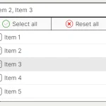 Feature-rich Custom Select JavaScript Library – SimpSelect
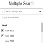 Powerful Single & Multiple Select Library – tail.select
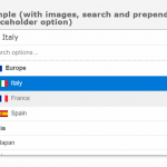 Enhanced Dropdown Select In Pure JavaScript – LC-select
 Enhanced Select Box In Vanilla JavaScript – Select.js
 Enhance HTML Selects with Advanced Features – SnapSelect
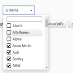 Custom Single/Multi Select In Pure JavaScript – vanillaSelectBox
 Advanced Custom Dropdown Select With Vanilla JavaScript
How to use it in a form like contact form 7, can we use it as select field ? how the field in the form will get the value we choose with this field ?
Thanks
can we use this on a react native project??
I have called the API and poured date data into the selectbox, how can the default filter tick on current date when the page loads?