


Puppertino is a lightweight, modular, iOS- & macOS-style UI framework following Apple’s Human Interface Guidelines.
Components Included:
- Buttons
- Form Controls
- Modals
- Icons
- Layout
- Colors
How to use it:
1. Install & Download.
# NPM
$ npm i puppertino --save
2. Load the Puppertino’s stylesheet in the document.
<!-- All In One -->
<link rel="stylesheet" href="dist/full.css" />
<!-- Buttons Componet -->
<link rel="stylesheet" href="dist/css/buttons.css" />
<!-- Cards Componet -->
<link rel="stylesheet" href="dist/css/cards.css" />
<!-- Colors Componet -->
<link rel="stylesheet" href="dist/css/color_palette.css" />
<!-- Forms Componet -->
<link rel="stylesheet" href="dist/css/forms.css" />
<!-- Layout Componet -->
<link rel="stylesheet" href="dist/css/layout.css" />
<!-- Modals Componet -->
<link rel="stylesheet" href="dist/css/modals.css" />
3. Load the modals.js for the modal component.
<script src="./src/js/modals.js"></script>
Previews:

macOS Style UI Framework – Puppertino Buttons

macOS Style UI Framework – Puppertino Dropdown

macOS Style UI Framework – Puppertino Checkbox

macOS Style UI Framework – Puppertino Radio Button

macOS Style UI Framework – Puppertino Switch

macOS Style UI Framework – Puppertino Typography

macOS Style UI Framework – Puppertino Modal Dialog
See Also:
 Create Smooth Momentum Scrolling Effects – Butter.js
 Material Style Text Avatar Generator – Material Avatar
 3D Carousel With Mouse & Touch Interactions
 Animated Typing Effect In Pure JavaScript – Typical
 Form Wizard UI With Step Navigation – Wizard-JS
 Minimalist Fullscreen Image Viewer/Lightbox In JavaScript – IMG-BOX
 Preload Pages Based On User’s Intention – instant.page
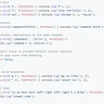 Tiny & Robust Keyboard Shortcut Solution For JavaScript – Mousetrap