


A Pure CSS/CSS3 vertical navigation menu that supports infinite sub menus using nested Html unordered lists.
How to use it:
Create a multi-level navigation menu using nested Html lists. Add the class ‘has-sub’ to your lists which have one or more sub menus.
<div class="navigation">
  <ul>
    <li class="has-sub"> <a href="#">Menu 1</a>
      <ul>
        <li class="has-sub"> <a href="#">Submenu 1.1</a>
          <ul>
            <li><a href="#">Submenu 1.1.1</a></li>
            <li class="has-sub"><a href="#">Submenu 1.1.2</a>
              <ul>
                <li><a href="#">Submenu 1.1.2.1</a></li>
                <li><a href="#">Submenu 1.1.2.2</a></li>
              </ul>
            </li>
          </ul>
        </li>
        <li><a href="#">Submenu 1.2</a></li>
      </ul>
    </li>
    <li class="has-sub"> <a href="#">Menu 2</a>
      <ul>
        <li><a href="#">Submenu 2.1</a></li>
        <li><a href="#">Submenu 2.2</a></li>
      </ul>
    </li>
    <li class="has-sub"> <a href="#">Menu 3</a>
      <ul>
        <li><a href="#">Submenu 3.1</a></li>
        <li><a href="#">Submenu 3.2</a></li>
      </ul>
    </li>
  </ul>
</div>
The required CSS styles for the navigation menu.
.navigation {
  padding: 0;
  margin: 0;
  border: 0;
  line-height: 1;
}
.navigation ul,
.navigation ul li,
.navigation ul ul {
  list-style: none;
  margin: 0;
  padding: 0;
}
.navigation ul {
  position: relative;
  z-index: 500;
  float: left;
}
.navigation ul li {
  float: left;
  min-height: 0.05em;
  line-height: 1em;
  vertical-align: middle;
  position: relative;
}
.navigation ul li.hover,
.navigation ul li:hover {
  position: relative;
  z-index: 510;
  cursor: default;
}
.navigation ul ul {
  visibility: hidden;
  position: absolute;
  top: 100%;
  left: 0px;
  z-index: 520;
  width: 100%;
}
.navigation ul ul li { float: none; }
.navigation ul ul ul {
  top: 0;
  right: 0;
}
.navigation ul li:hover > ul { visibility: visible; }
.navigation ul ul {
  top: 0;
  left: 99%;
}
.navigation ul li { float: none; }
.navigation ul ul { margin-top: 0.05em; }
.navigation {
  width: 13em;
  background: #333333;
  font-family: 'roboto', Tahoma, Arial, sans-serif;
  zoom: 1;
}
.navigation:before {
  content: '';
  display: block;
}
.navigation:after {
  content: '';
  display: table;
  clear: both;
}
.navigation a {
  display: block;
  padding: 1em 1.3em;
  color: #ffffff;
  text-decoration: none;
  text-transform: uppercase;
}
.navigation > ul { width: 13em; }
.navigation ul ul { width: 13em; }
.navigation > ul > li > a {
  border-right: 0.3em solid #34A65F;
  color: #ffffff;
}
.navigation > ul > li > a:hover { color: #ffffff; }
.navigation > ul > li a:hover,
.navigation > ul > li:hover a { background: #34A65F; }
.navigation li { position: relative; }
.navigation ul li.has-sub > a:after {
  content: '»';
  position: absolute;
  right: 1em;
}
.navigation ul ul li.first {
  -webkit-border-radius: 0 3px 0 0;
  -moz-border-radius: 0 3px 0 0;
  border-radius: 0 3px 0 0;
}
.navigation ul ul li.last {
  -webkit-border-radius: 0 0 3px 0;
  -moz-border-radius: 0 0 3px 0;
  border-radius: 0 0 3px 0;
  border-bottom: 0;
}
.navigation ul ul {
  -webkit-border-radius: 0 3px 3px 0;
  -moz-border-radius: 0 3px 3px 0;
  border-radius: 0 3px 3px 0;
}
.navigation ul ul { border: 1px solid #34A65F; }
.navigation ul ul a { color: #ffffff; }
.navigation ul ul a:hover { color: #ffffff; }
.navigation ul ul li { border-bottom: 1px solid #0F8A5F; }
.navigation ul ul li:hover > a {
  background: #4eb1ff;
  color: #ffffff;
}
.navigation.align-right > ul > li > a {
  border-left: 0.3em solid #34A65F;
  border-right: none;
}
.navigation.align-right { float: right; }
.navigation.align-right li { text-align: right; }
.navigation.align-right ul li.has-sub > a:before {
  content: '+';
  position: absolute;
  top: 50%;
  left: 15px;
  margin-top: -6px;
}
.navigation.align-right ul li.has-sub > a:after { content: none; }
.navigation.align-right ul ul {
  visibility: hidden;
  position: absolute;
  top: 0;
  left: -100%;
  z-index: 598;
  width: 100%;
}
.navigation.align-right ul ul li.first {
  -webkit-border-radius: 3px 0 0 0;
  -moz-border-radius: 3px 0 0 0;
  border-radius: 3px 0 0 0;
}
.navigation.align-right ul ul li.last {
  -webkit-border-radius: 0 0 0 3px;
  -moz-border-radius: 0 0 0 3px;
  border-radius: 0 0 0 3px;
}
.navigation.align-right ul ul {
  -webkit-border-radius: 3px 0 0 3px;
  -moz-border-radius: 3px 0 0 3px;
  border-radius: 3px 0 0 3px;
}
See Also:
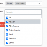 Filterable & Checkable Multi-Select Dropdown In JavaScript
 Marquee-like Infinite Scrolling Text in Vanilla JavaScript – text-roller
 A JavaScript Plugin To Rate Your Password Strength – passwordMeter.js
 Modern Canvas JavaScript Charting Library – MyChart.js
 JavaScript Library For Panning & Zooming Elements – Panzoom
 Digital Clock With Countdown Circle – rounded-clock
 Fancy Folding Modal Popup With JavaScript And CSS
 Photoshop-like Ruler Using JavaScript And SVG – Rulez.js
Let’s assume that the list of items has height to accommodate 10 list items. Hence there is no need for scrollbar on the list and the above solution works. What if there are 20 list items for the same height that shows 10 list items at a time and hence the list would require a scrollbar (overflow: hidden), then the solution would not work. Is there any workaround for this?
I have one element that has a sub menu of four pages, but the main element is not a separate page, so I don’t want it in an tag. As soon as i remove the tag the text moves left . How can I get https://uploads.disquscdn.com/images/44d854c132363444800c22c22ede6d0a6730d1bfb3ce0acbefa2af8ef6320cc7.jpg the text in the same position after removing the tag?
I’m looking for this type of menu. But, is it possible to make it responsive? Is there any vertical menu comes with multi submenu that has responsive?
hello. It’s a beautiful menu. Why don’t works on IPAD?