


A pure CSS solution to render a fully responsive hexagon grid layout with fancy mouse hover effects on your HTML page.
See also:
How to use it:
Just include the core style sheet hexagons.css in the header of your HTML document and you’re ready to go.
<link rel="stylesheet" href="hexagons.css">
Create a hexagon grid with custom images, titles, and descriptions as follows:
<ul id="hexGrid">
  <li class="hex">
    <a class="hexIn" href="#">
        <img src="1.jpg" alt="">
        <h1>This is a title 1</h1>
        <p>This is description 1</p>
    </a>
  </li>
  <li class="hex">
    <a class="hexIn" href="#">
        <img src="2.jpg" alt="">
        <h1>This is title 2</h1>
        <p>This is description 2</p>
    </a>
  </li>
  <li class="hex">
    <a class="hexIn" href="#">
        <img src="3.jpg" alt="">
        <h1>This is title 3</h1>
        <p>This is description 3</p>
    </a>
  </li>
</ul>
That’s it. Override and modify the CSS rules in the hexagons.css to create your own styles.
See Also:
 Responsive Hexagon Grid Layout Using CSS Grid and Container Queries
 Create Flexible Hexagonal Grids with HoneyCombLayoutJs
 Responsive Fluid Hexagon Grid Layout In CSS/SASS – Hextile
 Responsive Hexagon Layout In Pure CSS – Hexi-Flexi Grid
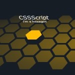 Create A 3D Hexagon Grid Layout with CSS3
 JavaScript Video Conference Grid Layout Library with Gallery & Spotlight Modes
 Neat Block Grid In Pure CSS – wall.css
 Responsive Masonry Layouts with CSS Grid and Mason-it.js
only half of them display correctly on IE9