Minimal Mobile-friendly Off-canvas Navigation
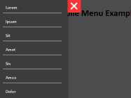
A minimal mobile-friendly navigation that allows to reveal an off-canvas sidebar menu with a fullpage overlay when the user click on the hamburger toggle button.


A minimal mobile-friendly navigation that allows to reveal an off-canvas sidebar menu with a fullpage overlay when the user click on the hamburger toggle button.

Sidekick is a pure HTML / CSS based off-screen sidebar menu for your mobile site navigation.

A pure Html / CSS solution used to create an App style off-canvas push menu for site navigation using CSS3 :target selector.

A HTML / CSS only navigation system that uses :checked selector to toggle an off-screen menu with a hamburger button.

A modern, mobile-friendly navigation solution to create an off-canvas slide or push menu using pure CSS / CSS3 and plain html.

Yet another pure CSS off-canvas menu concept that reveals an 0ff-screen navigation menu while shrinking the main content.

A JavaScript based drawer navigation that slides out from the left side of the webpage with a CSS3 based animation when toggled, similar to the famous app off-canvas menu. How to use it: Load the required stylesheet files in the head section of your web page. <link rel=”stylesheet” href=”dd-menu.css”> <link rel=”stylesheet” href=”dd-menu-items.css”> <link rel=”stylesheet” href=”theme-standard.css”>… Read More »

A JavaScript & CSS based sidebar interaction concept for easily creating an off-canvas sidebar navigation that you can hide/show based on user actions.

A mobile-friendly responsive navigation which turns a horizontal menu into an off-canvas side menu using pure CSS and html checkbox & label tricks.

Just another pure CSS site navigation that slides out an 0ff-screen sidebar menu when you hover over the menu trigger button.