


This is a frosted glass image loading/revealing effect inspired by ChatGPT-4o Image Generation.
The effect provides an interesting way to handle image loading states, especially when you want something more dynamic than a simple fade-in.
It solves the “blank space” problem during load, replacing it with a stylized placeholder that smoothly transitions to the final image.
See It In Action:
Features:
- Pure CSS Animation: The reveal animation relies entirely on CSS transitions.
- Frosted Glass Effect: Uses
backdrop-filter: blur()for the core visual. - Smooth Reveal: Employs
mask-imagewith a linear gradient for a soft edge during the transition. - Customizable Timing: Easily adjust animation speed and easing via the
transitionproperty. - Simple Structure: Requires minimal HTML markup (a container, image, and overlay div).
- Responsive: Adapts well using standard CSS techniques like
max-widthandaspect-ratio.
How to use it:
1. Place your image and blur overlay in a container div:
<div class="image-container">
  <!-- Your target image -->
  <img src="https://www.jqueryscript.net/dummy/1.jpg" alt="Image Alt">
  <!-- The frosted glass overlay -->
  <div class="blur-overlay"></div>
</div>
2. The core CSS styles for the frosted glass overlay. I’ve included comments explaining the key parts.
aspect-ratio: Usingaspect-ratioon the container is good practice. It prevents layout shifts as the image loads. Adjust the ratio (e.g.,1/1for square,4/3) based on your images.object-fit: cover;: This makes the image fill the container nicely, but be aware it might crop parts of the image if the aspect ratios don’t match exactly. Useobject-fit: contain;if you need to see the whole image, but you might get letterboxing.backdrop-filterPerformance: This property can be computationally intensive, especially with large blur radii or on complex pages. Test performance on target devices. On lower-end hardware, it might cause jank. Keep the blur radius reasonable (e.g., 10px-30px).mask-imageGradient: The25%value in thelinear-gradientcontrols how soft the transition edge is. A smaller percentage means a sharper edge; a larger percentage means a softer, more feathered edge. Experiment to find what looks best.
.image-container {
  position: relative; /* Needed for absolute positioning of the overlay */
  width: 500px;      /* Or your desired width */
  max-width: 90%;    /* Make it responsive */
  aspect-ratio: 16 / 9; /* Maintain aspect ratio - adjust as needed */
  overflow: hidden;  /* Crucial: hides the overlay as it moves out */
  border-radius: 8px; /* Optional: styling */
  box-shadow: 0 4px 15px rgba(0,0,0,0.1); /* Optional: styling */
}
.image-container img {
  display: block;    /* Avoids mystery space below image */
  width: 100%;
  height: 100%;
  object-fit: cover; /* Ensures image covers container, may crop */
  border-radius: 8px; /* Match container rounding if any */
}
.blur-overlay {
  position: absolute;
  top: 0;
  left: 0;
  width: 100%;
  height: 100%;
  background-color: rgba(255, 255, 255, 0.2); /* Light overlay, adjust opacity */
  /* The core blur effect */
  /* Note: Check browser compatibility for backdrop-filter */
  backdrop-filter: blur(20px);
  /* You might still need the -webkit- prefix for older Safari */
  /* -webkit-backdrop-filter: blur(20px); */
  /* The soft edge reveal using a mask */
  mask-image: linear-gradient(
      to bottom,
      transparent 0%, /* Top is fully masked (invisible) */
      black 25%       /* Becomes fully opaque (visible) below 25% */
  );
  /* Prefix for compatibility */
  -webkit-mask-image: linear-gradient(
      to bottom,
      transparent 0%,
      black 25%
  );
  /* Animation settings */
  /* Adjust duration and easing function here */
  transition: transform 8s cubic-bezier(0.25, 0.1, 0.25, 1.0);
  /* Initial position: overlay covers the image */
  transform: translateY(0%);
}
/* The state when the image is 'loaded' */
.image-container.loaded .blur-overlay {
  /* Move the overlay down out of view */
  transform: translateY(100%);
}
3. The CSS handles the look and the animation, but something needs to trigger the end state. This is done by adding the .loaded class to the .image-container. You’ll typically do this with JavaScript once the image is actually loaded, or after a simulated delay.
document.addEventListener('DOMContentLoaded', () => {
  const imageContainers = document.querySelectorAll('.image-container'); // Select all containers if multiple
  imageContainers.forEach(container => {
    const img = container.querySelector('img');
    // Option 1: Trigger after real image load
    if (img.complete) { // Handle cached images
        container.classList.add('loaded');
    } else {
        img.addEventListener('load', () => {
            container.classList.add('loaded');
        });
        // Optional: Add error handling here too
        img.addEventListener('error', () => {
            console.error('Image failed to load:', img.src);
            // Maybe add an error class instead?
            // container.classList.add('error');
        });
    }
    // Option 2: Simulate delay (like the example) - Useful for demos
    // setTimeout(() => {
    //     container.classList.add('loaded');
    // }, 1500); // Adjust delay as needed
  });
});
See Also:
 Progressive Enhancement Resource Lazy Load Library – DemandJS
 Progressive Image Loading Inspired By Medium.com – Pure Media
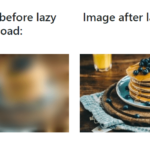 Progressively Load Images & Iframes Using Plain JavaScript – ProgressiveMedia
 Progressive Image lazy Loading With Blur Effect
 Progressive Image Loading Effect In Pure CSS
 JavaScript Library For Progressive Image Loading Effect – Interlace.js
 Progressive Image Loading Library – Antimoderate.js
 SVG Based Odometer Motion Blur Effect – bounty.js