


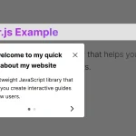
TourGuide.js is a customizable, framework-agnostic, and feature-rich guided tour/onboarding library written in JavaScript (TypeScript).
This step-by-step tour library is designed to make your users feel safe and at ease by breaking down new technology/features into digestible pieces.
More Features:
- Animated smart popup based on Floating UI.
- Auto-store the Finish state in the local storage.
- Easy to implement without having to write JS.
- Auto-scroll to the element when switching between steps.
- Rich API and more…
How to use it:
1. Install & import the TourGuide.js.
# NPM
$ npm i @sjmc11/tourguidejs
// ES
import "@sjmc11/tourguidejs/src/scss/tour.scss"
import {TourGuideClient} from "@sjmc11/tourguidejs/src/Tour"
// Browser
<link rel="stylesheet" href="dist/css/tour.min.css" />
<script src="dist/tour.js"></script>
2. Creata a new instance of the TourGuide.js.
const tg = new tourguide.TourGuideClient()
3. Create tour steps using HTML data attributes:
- data-tg-title: Step title
- data-tg-group: Used to group several tours on the same page
- data-tg-order: The order of the step
- data-tg-fixed: Stick the element
- data-tg-margin: Auto-scroll margin from screen edge
<h1 data-tg-tour='This is the first step' data-tg-order="0">
  TourGuide.js Library Example
</h1>
<p data-tg-tour='This is the second step' data-tg-order="1">
  A customizable, framework-agnostic, and feature-rich guided tour/onboarding library written in JavaScript (TypeScript).
</p>
<button data-tg-tour='This is a button' data-tg-order="1">
  Button Example
</button>
<p data-tg-tour='This is the last step' data-tg-order="99">Last Step</p>
4. Or using JavaScript:
new tourguide.TourGuideClient({
    steps: [{
      content: "Step Content"
      title: "Step Title",
      target: "", // target element
      order: "",
      group: "",
    }],
    // more options here (see below)
})
5. Start the tour.
tg.start()
6. All possible options.
{
  autoScroll?: boolean // auto scroll to elements
  autoScrollSmooth?: boolean // auto scroll smooth
  autoScrollOffset?: number // Offset from edge for smooth scroll
  backdropClass?: string // css transition classes
  backdropAnimate?: boolean // animate backdrop position & size
  backdropColor?: string // RGBA support only
  targetPadding?: number // space around highlighted target in px
  dialogClass?: string // css class for tour dialog
  dialogZ?: number // z-index of dialog
  dialogWidth?: number // width style property for dialog - recommended if loading images into content
  dialogMaxWidth?: number // max-width style property for dialog
  dialogAnimate?: boolean // Animate dialog position & size
  dialogPlacement?: Side | AlignedPlacement // TODO - test this param
  nextLabel?: string // text for next button
  prevLabel?: string // text for prev button
  finishLabel?: string // text for finish button
  hideNext?: boolean // hide next button
  hidePrev?: boolean // hide prev button
  completeOnFinish?: boolean // Set tour as finished in localStorage on finish
  keyboardControls?: boolean // enable next & prev arrow + esc key
  exitOnEscape?: boolean // Close the tour on escape key
  exitOnClickOutside?: boolean // Close the tour on backdrop click
  showStepDots?: boolean // show the dots tour progress
  stepDotsPlacement?: "footer" | "body" // show dots in dialog body/footer
  showButtons?: boolean // show next/prev buttons
  showStepProgress?: boolean // show `1/5` human-readable step progress
  closeButton?: boolean, // show close button
  rememberStep?: boolean // open tour on last active step
  debug?: boolean // show console logging
  steps?: TourGuideStep[] // pre-define the tour steps
}
7. More API methods.
// set options
tg.setOptions({
  // options here
});
// go to a specific step
tg.visitStep("next" | "prev" | number);
// go to the next step
tg.nextStep();
// go to the previous step
tg.prevStep();
// exit the tour
tg.exit().then(() => {
  // do something
});
// finish the tour
tg.finish().then(() => {
  // do something
});
// check if the tour is finished
tg.isFinished('my-tour')
// remove the tour state from the local storage
tg.deleteFinishedTour('my-tour');
// refresh the tour
tg.deleteFinishedTour('my-tour');
// refresh the dialog
tg.refreshDialog();
// update positions
tg.updatePositions()''
8. Events.
tg.onFinish(()=>{
  // do something
});
tg.onBeforeExit(()=>{
  // do something
});
tg.onAfterExit(()=>{
  // do something
});
tg.onBeforeStepChange(()=>{
  // do something
});
tg.onAfterStepChange(()=>{
  // do something
});
Changelog:
v0.0.22 (03/28/2025)
- Prevent user from clicking elements covered by the backdrop when exitOnClickOutside = true.
- Additional option for activeStepInteraction allowing user to click on elements inside the active tour step element without the need for applying their own pointer-events: none css to the .tg-backdrop element.
- Bugfixes.
v0.0.20 (03/03/2025)
- Bugfixes
v0.0.18 (11/02/2024)
- Support the propagateEvents configuration option to allow clicking elements in the highlighted area.
v0.0.17 (08/31/2024)
- Minor fixes & improvements
v0.0.16 (03/14/2024)
- Support allowDialogOverlap option when using large targets
v0.0.14 (03/09/2024)
- Bugfixes
v0.0.11 (12/11/2023)
- Bugfixes
v0.0.9 (06/20/2023)
- FIX: added check stepIndex = 0 to updateDialog for disabled state on previous button
- Remove trailing ; in options
v0.0.8 (03/19/2023)
- Apply disabled attribute & class to prevBtn if activeStep equal to 0
See Also:
 Create Interactive Web App Tours in Under 10KB – GTourJS
 Creating Interactive Step-by-step User Guides with Guidy.js
 Create Guided Tours And Highlight Elements – Tooltip Sequence
 Create Guided Tours For Tutorials & New Features – Walkthrough.js
 Interactive Guide For Web App – Driver.js
 Lightweight Vanilla JS Library for Interactive Guided Tours – Boarding.js
 Lightweight User Tour/Onboarding Library for Web Apps – CodingIntroJS
 Build Interactive Product tours & User Onboarding with Cue.js