


A flexible, accessible, touch-enabled, progressive enhancement autocomplete library written in Vanilla JavaScript.
When a user types something in your input field, the library displays an autocomplete list containing suggestions you defined in a native select element or JS array.
Supports touch gestures on mobile and keyboard interactions on desktop.
Also works with the Preact and React frameworks. See the Readme in the zip for implementation details.
How to use it:
1. Install and import the accessible-autocomplete as a module.
# NPM
$ npm i accessible-autocomplete
@import "accessible-autocomplete";
import accessibleAutocomplete from 'accessible-autocomplete'
2. Or load the needed JavaScript and CSS files on the page.
<link rel="stylesheet" href="dist/accessible-autocomplete.min.css" />
<script src="dist/accessible-autocomplete.min.js"></script>
3. Define your suggestions in a JS array.
const list = [
      'Item 1',
      'Item 2',
      'Item 3',
      ...
]
4. Or insert them as options in a select box:
<select id="list">
  <option value="">Select an item</option>
  <option value="1">Item 1</option>
  <option value="2">Item 2</option>
  <option value="3">Item 3</option>
</select>
5. Initialize the library and done.
<label for="autocomplete-example">Select An Item</label>
<div id="autocomplete-example-container"></div>
// use JS array
accessibleAutocomplete({
  // container element
  element: document.querySelector('#autocomplete-example-container'),
  // input id
  id: 'autocomplete-example',
  // data source
  source: list
})
// use select box
accessibleAutocomplete.enhanceSelectElement({
  selectElement: document.querySelector('#list')
})
6. Available options to customize the autocomplete library.
accessibleAutocomplete({
  // auto select
  autoselect: false,
  // namespace
  cssNamespace: 'autocomplete',
  // default value
  defaultValue: '',
  // 'inline' | 'overlay'
  displayMenu: 'inline',
  // min length to trigger the autocomplete
  minLength: 0,
  // default name
  name: 'input-autocomplete',
  // placeholder
  placeholder: '',
  onConfirm: () => {},
  // cofirm on input blur
  confirmOnBlur: true,
  // show the autocomplete list if no results
  showNoOptionsFound: true,
  // show all values
  showAllValues: false,
  // if the input field is REQUIRED
  required: false,
  // custom message
  tNoResults: () => 'No results found',
  tAssistiveHint: () => 'When autocomplete results are available use up and down arrows to review and enter to select.  Touch device users, explore by touch or with swipe gestures.',
  // dropdown arrow
  dropdownArrow: DropdownArrowDown
})
See Also:
 Powerful Autocomplete With Asynchronous Data Fetch – autocomplete.js
 Lightweight JavaScript Autocomplete for Input Fields – Suggestify.js
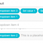 Customizable Select Box & Input Field Enhancement Library – Choices.js
 Fast Autocomplete & Typeahead Library – autoComplete.js
 Lightweight JS Autocomplete & Autosuggest: Ajax & Local Data – Ajax Autocomplete Vanilla
 Bootstrap 5 Autocomplete Component In Vanilla JS – AvalynxAutocomplete
 Lightweight & Fast JavaScript Autocomplete Library – Luggest
 Tiny And Fast Autocomplete JavaScript Library – Autocomp.js