


Say goodbye to rigid, static HTML tables.
The Active Table web component delivers a customizable, interactive, dynamic table experience in your browser.
It allows users to add, remove, move, or edit rows and columns seamlessly. With built-in text validation, sorting, pagination, and filtering, managing vast amounts of data has never been easier.
Plus, the unique column types like Currency, Select, Date, Checkbox, and more ensure that every data type is catered to.
The import/export functionality supports various file formats (csv, xls, xlsx, ods, txt, etc), making data transfer a breeze.
Its responsive design ensures that your table looks perfect on any device. Overflow handling means no more data spillage.
The reactive dimensions automatically adjust to content, and programmatic cell updates allow for dynamic changes on the fly.
Full Features:
- Drag-and-drop rows and columns
- Sort, filter, paginate data
- Editable cells just like spreadsheet
- Text validation and input formatting
- Customizable columns like Select, Date, Checkbox
- Reactive resizing and overflow handling
- Import/export data from Excel, CSV, etc.
- Framework agnostic and customizable
- Feature rich API for advanced use cases
- Better performance than HTML tables
- No need for bloated data grid libraries
How to use it:
1. Install & download.
# NPM
$ npm i active-table
2. Import the Active Table from a CDN.
<script src="https://unpkg.com/[email protected]/dist/activeTable.bundle.js" type="module"></script>
3. Add the active-table component to your project and pass in your tabular data to the data prop.
<active-table
  data='Your Data Array Here'
></active-table>
4. Available component props to customize the table.
- tableStyle: Additional table styles
- overflow: Max height/width
- frameComponentsStyles: Custom styles of frame components
- auxiliaryStyle: Configure Webkit CSS
- data: Tabular data
- enterKeyMoveDown: When the user presses the ENTER key, the cursor focus is moved to the cell below.
- defaultText: Text to display when a cell is empty or its type validation has failed
- isDefaultTextRemovable: Remove default text when a cell is focused
- cellStyle: Additional cell styles
- rootCell: Configuration for the default cell when there is no content inside the table
- isCellTextEditable: Determine if the cells are editable
- spellCheck: Enable/Disable spell check
- headerStyles: Additional header styles
- isHeaderTextEditable: Determine if the header cells are editable
- allowDuplicateHeaders: Determine whether to allow duplicate headers
- displayHeaderIcons: Display an icon beside header text that represents the column type
- headerIconStyle: Custom styles of header icons
- stickyHeader: Stick the header to the top while scrolling
- dataStartsAtHeader: Start the index column count at header row and if pagination is used the header row will not be displayed in pages after the first
- rowHoverStyles: Custom styles when hovering over rows
- stripedRows: Enable striped rows
- rowDropdown: Row dropdown settings
- maxRows: Max number of rows
- dragRows: Allow to drag tows
- displayAddNewRow: Display an Add New Row link
- customColumnsSettings: Array of custom properties for columns with header text that matches the headerName
- isColumnResizable: Determine if the columns are resizable
- columnResizerColors: Resizer colors
- columnDropdown: Column dropdown settings
- maxColumns: Max number of columns
- dragColumns: Allow to drag columns
- preserveNarrowColumns: When preserveNarrowColumns is false and column widths are too narow*, no new columns will be allowed to be inserted. set to true by default
- displayAddNewColumn: Display an Add New Column link
- displayIndexColumn: Display the index column
- defaultColumnTypeName: Name of the default column type
- availableDefaultColumnTypes: Override the default column types: [“Text”, “Number”, “Currency”, “Date d-m-y”, “Date m-d-y”, “Checkbox”, “Select”, “Label”]
- customColumnTypes: Custom column types
- pagination: Enable/disable table pagination
- filter: Enable/disable table filtering
<active-table
  tableStyle='{CSS Styles here}
  overflow='{"maxHeight": "200px", "maxWidth": "100%"}'
  frameComponentsStyles='{
    "styles": {
      CSS Styles here
    },
    "inheritHeaderColors": false
  }'
  auxiliaryStyle="
  ::-webkit-scrollbar {
    width: 10px;
    height: 10px;
  }
  ::-webkit-scrollbar-thumb {
    background-color: #54a7ff;
    border-radius: 5px;
  }"
  data='Your Data Array Here'
  defaultText="-"
  isDefaultTextRemovable="true"
  cellStyle='{"borderBottom": "1px solid black", "borderRight": "1px solid black", "backgroundColor": "#fafafa"}'
  isCellTextEditable="false"
  rootCell='{"text": "Create", "styles": {"default": {"width": "50px"}, "hover": {"backgroundColor": "#e0f1ff"}}}'
  spellCheck="true"
  headerStyles='{
    "default": {
      "backgroundColor": "#efefef",
      "borderBottom": "unset",
      "fontWeight": "700",
      "fontSize": "15px"
    },
    "hoverColors": {
      "backgroundColor": "#d2d2d2"
    }
  }'
  isHeaderTextEditable="false"
  allowDuplicateHeaders="false"
  displayHeaderIcons="false"
  headerIconStyle='{
    "filterColor": "brightness(0) saturate(100%) invert(16%) sepia(85%) saturate(1892%) hue-rotate(210deg) brightness(88%) contrast(103%)",
    "scale": {"x": 1.5, "y": 1.5}
  }'
  stickyHeader="true"
  dataStartsAtHeader="true"
  rowHoverStyles='{"style":{"backgroundColor": "#d6d6d630"}}'
  stripedRows='{"odd": {"backgroundColor": ""}, "even": {"backgroundColor": "#ebebeb7a"}}'
  rowDropdown='{"displaySettings":{"isAvailable": true, "openMethod": {"overlayClick": true}}, "canEditHeaderRow": false}'
  maxRows="5"
  dragRows="true"
  displayAddNewRow="true"
  customColumnsSettings='[
    { "headerName": "Planet", "defaultText": "Insert Planet", "cellStyle": {"width": "150px"}, "isHeaderTextEditable": false },
    { "headerName": "Number", "cellStyle": {"backgroundColor": "#fdfdfd"}, "defaultColumnTypeName": "number", "isHeaderTextEditable": false },
    { "headerName": "Shape", "cellStyle": {"backgroundColor": "#f8f8f8"}, "defaultColumnTypeName": "Select", "isHeaderTextEditable": false },
    { "headerName": "Date Created", "cellStyle": {"backgroundColor": "#f1f1f1"}, "defaultColumnTypeName": "Date d-m-y", "isHeaderTextEditable": false }
  ]'
  isColumnResizable="true"
  columnResizerColors='{ "hover": "#87ddff", "click": "#369cfd" }'
  columnDropdown='{
    "displaySettings": {
      "openMethod": {"overlayClick": true}},
    "isSortAvailable": false,
    "isMoveAvailable": false
  }'
  maxColumns="10"
  dragColumns="true"
  preserveNarrowColumns="true"
  displayAddNewColumn="true"
  displayIndexColumn="true"
  defaultColumnTypeName="Label"
  availableDefaultColumnTypes='["Number"]'
  customColumnTypes='[{
  "name": "Custom type",
  "select": {
    "options": ["Pass", "Fail"],
    "canAddMoreOptions": false
  },
  "iconSettings": {
    "reusableIconName": "select"
  }}]'
  pagination="true"
  filter="true"
  files='{"buttons": [{"import": true}, {"export": true}], "dragAndDrop": true}'
></active-table>
5. API methods.
// get data
tableElementRef.getdata();
// get details of columns
tableElementRef.getColumnsDetails();
// update cells
tableElementRef.updateCell({newText: "sample text", rowIndex: 1, columnIndex: 1});
// update table structure
tableElementRef.updateStructure({
  structure: 'row',
  isInsert: true,
  index: -1,
  data: ['New Planet', '12345', '500', '10', '357'],
});
// update tabular data
tableElementRef.updateData([
  ['Planet', 'Diameter', 'Mass', 'Moons', 'Density'],
  ['Mercury', 4879, 0.33, 0, 5429],
  ['Venus', 12104, 4.87, 0, 5243],
  ['Uranus', 51118, 86.8, 27, 1270],
  ['Pluto', 2376, 0.013, 5, 1850],
  ['Moon', 3475, 0.073, 0, 3340],
]);
// import file
tableElementRef.importFile();
// export file
tableElementRef.exportFile();
6. Events.
tableElementRef.onCellUpdate = (cellUpdate) => { console.log(cellUpdate); });
tableElementRef.ondataUpdate = (dataUpdate) => { console.log(dataUpdate); };
tableElementRef.onColumnsUpdate = (columnsUpdate) => { console.log(columnsUpdate); };
tableElementRef.onRender = () => { console.log('Finished rendering'); };
Changelog:
v1.1.8 (02/26/2025)
- bugfixes
v1.1.7 (05/13/2025)
- paste issue fix for Windows
v1.1.6 (01/15/2025)
- Page resize fixes
v1.1.5 (03/01/2023)
- React compatibility fixes
v1.1.4 (02/02/2023)
- Bugfix
v1.1.3 (02/01/2023)
- The table is now better at parsing CSV content that is separated by double quotes
v1.1.2 (01/08/2023)
- Added ability to change ENTER key behaviour to move down
v1.1.1 (01/02/2023)
- Added ability to drag columns and rows
v1.1.0 (12/21/2023)
- The content property has been renamed to data.
v1.0.16 (11/15/2023)
- Active Table has been migrated to use the new Lit Element version 3. This update also includes other package updates for maintainability and security purposes.
v1.0.15 (11/13/2023)
- optimizing TypeScript API to not have to use enums for properties
v1.0.14 (11/05/2023)
- Optimizing column type change functionality
v1.0.12 (11/03/2023)
- Fixing a bug where the top left header row cell that is part of the index would not get its headerStyles reapplied after new header row is inserted or moved. This is now fixed.
v1.0.10 (10/29/2023)
- Fixed a bug where striped rows did not have their style set.
v1.0.8 (10/28/2023)
- Bugfix
v1.0.3 (10/04/2023)
- Fixed a bug in Firefox where the upon opening the color picker for a label cell, the label dropdown can be closed without closing the color picker, hence the cell colors could be edited out of sync.
v1.0.2 (10/03/2023)
- Fixing a bug where previously if the user clicked on either the new color or remove option buttons inside the dropdown of a label cell and then clicked on the whitespace area of a date cell, the dropdown would not close and any further actions would throw errors.
v1.0.1 (10/01/2023)
- Adding a new configuration property called rootCell which allows devs to style the initial cell (when there is no text) to their preference.
v1.0.0 (09/30/2023)
- Update
v0.3.19 (09/28/2023)
- adding ability to create a dropdown for the export file butt on to choose between different formats, and other bug fixes
See Also:
 High Performance Table Data Presentation Library – regular-table
 Full-feature Online Spreadsheet In Vanilla JavaScript – Luckysheet
 Lightweight Vanilla JS Data Grid for Modern Web Apps – BWDataTable
 Advanced Data Grid/Table Library in Vanilla JavaScript – VanillaGrid
 Lightweight JavaScript Data Grid with Search, Sort, and CSV Export – peggrid.js
 Build Editable, Spreadsheet-like Data Grids with Nano Sheets
 High-Performance Data Grids with Nano Sheets
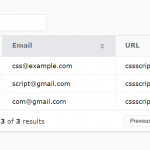 Full-featured Data Table JavaScript Library – Grid.js