


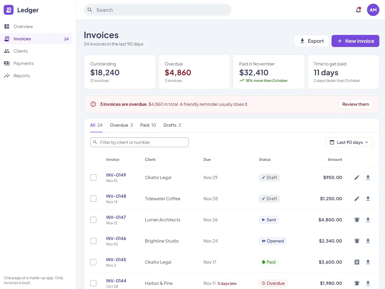
Alloy CSS is a CSS framework for server-rendered websites that includes responsive utility classes, form styles, and interactive UI components.
Features
- Scroll-snap carousels and hover/focus tooltips.
- Radio-based tabs,
<details>accordions, and checkbox toggles. - Styled form fields, buttons, mobile tables, and loading skeletons.
- Utilities for flex layouts, spacing, sizing, typography, and colors.
- Dark and Midnight themes with customizable colors and fonts.
- A CLI checker that reports undefined classes in templates.
How To Use It
Installation
Add the stylesheet to your page’s <head>:
<link rel="stylesheet" href="https://cdn.jsdelivr.net/npm/@alloyhtml/css@1/dist/alloy.min.css">
For an npm project, install @alloyhtml/css:
npm install @alloyhtml/css
Alloy applies a global reset and styles the
body, headings, and links. Check for conflicts with existing.button,.field,.dialog,.flex,.tab, and.tooltipstyles before adding it to an established site.
Basic Usage: Open a Modal Dialog
<main class="container-960 padding-y-40">
  <div class="bg-raised border border-subtle rounded-8 padding-24">
    <h2 class="h4 text-primary margin-bottom-12">Your account</h2>
    <p class="text-body-2 text-secondary margin-bottom-20">Check your current notification preferences.</p>
    <button type="button" commandfor="settings-dialog" command="show-modal"
      class="button bg-primary-1 border-primary-1 text-white hover-bg-primary-2 padding-x-16">
      View account details
    </button>
  </div>
</main>
<dialog id="settings-dialog" closedby="any"
  class="dialog bg-raised rounded-8 padding-24 width-50 width-100-sm">
  <h2 class="h5 text-primary margin-bottom-12">Account details</h2>
  <p class="text-body-2 text-secondary margin-bottom-20">Email updates are enabled for this account.</p>
  <button type="button" commandfor="settings-dialog" command="close"
    class="button bg-surface border-subtle text-primary padding-x-16">Close</button>
</dialog>
Create a Dropdown Menu
<button type="button" popovertarget="account-menu"
  class="button bg-raised border-subtle text-primary padding-x-16">
  Account
</button>
<nav id="account-menu" popover
  class="menu bg-raised border border-subtle rounded-8 shadow-3 padding-8"
  aria-label="Account menu">
  <a class="a a-color-reset block padding-x-12 padding-y-8 text-primary hover-bg-surface" href="/profile">Profile</a>
  <a class="a a-color-reset block padding-x-12 padding-y-8 text-primary hover-bg-surface" href="/settings">Settings</a>
</nav>
Create Tabs With Radio Inputs
Place radio inputs inside .tab labels, followed by a matching .panel for each tab.
<div class="tabs">
  <div class="flex flex-gap-24 border-bottom border-subtle">
    <label class="tab padding-y-8 text-body-2 font-weight-600">
      <input type="radio" name="product-info" checked>Details
    </label>
    <label class="tab padding-y-8 text-body-2 font-weight-600">
      <input type="radio" name="product-info">Shipping
    </label>
  </div>
  <div class="panel padding-y-16 text-body-2 text-secondary">
    Handcrafted ceramic mug with a matte glaze.
  </div>
  <div class="panel padding-y-16 text-body-2 text-secondary">
    Dispatches within two business days.
  </div>
</div>
Show a Toast After an Application Event
For an application event such as a successful save, call showPopover() from your event handler.
<button type="button" popovertarget="save-toast"
  class="button bg-primary-1 border-primary-1 text-white padding-x-16">
  Show notification
</button>
<div id="save-toast" popover="manual" role="status"
  class="toast flex flex-items-center flex-gap-12 bg-inverse text-inverse rounded-8 shadow-3 padding-16">
  <span class="text-body-2 grow-1">Settings saved.</span>
  <button type="button" popovertarget="save-toast" popovertargetaction="hide"
    class="button bg-transparent border-transparent text-inverse padding-4">Dismiss</button>
</div>
// Run after the save succeeds.
document.getElementById('save-toast').showPopover();
Customize the Brand and Dark Theme
Load a brand stylesheet after Alloy’s CSS to set the primary colors, fonts, and control radius.
<link rel="stylesheet" href="https://cdn.jsdelivr.net/npm/@alloyhtml/css@1/dist/alloy.min.css">
<link rel="stylesheet" href="/my-brand.css">
/* my-brand.css */
-root {
  --brand-primary-1: hsl(158, 80%, 29%);
  --brand-primary-2: hsl(158, 82%, 25%);
  --brand-primary-3: hsl(158, 85%, 21%);
  --font-family-base: system-ui, sans-serif;
  --font-family-heading: system-ui, sans-serif;
  --control-radius: 8px;
}
For dark mode based on the visitor’s system preference, add the Dark theme after the base stylesheet:
<link rel="stylesheet" href="https://cdn.jsdelivr.net/npm/@alloyhtml/css@1/dist/themes/dark.min.css"
  media="(prefers-color-scheme: dark)">
To use Midnight at all times, use this link instead:
<link rel="stylesheet" href="https://cdn.jsdelivr.net/npm/@alloyhtml/css@1/dist/themes/midnight.min.css">
Check Classes in Your Templates
The package’s CLI finds undefined class names in HTML and server-rendered templates. It reports the filename and line number, and exits with an error when it finds a match.
npx @alloyhtml/css check templates/
Pass
--css styles/site.cssfor your own classes, or--allow icon-namefor a class supplied by another library.
For AI-assisted page generation, Alloy also provides an agent skill containing its markup rules and class reference:
npx @alloyhtml/css skill
Component and HTML Reference
| Component | Classes and HTML contract |
|---|---|
| Modal dialog | <dialog> with .dialog; commandfor="id" and command="show-modal" or command="close" on buttons; closedby="any" for outside-click dismissal where supported. |
| Responsive drawer | popover, popovertarget, .drawer, and optional .drawer-end; .hidden-md-greater for the mobile-only trigger. Customize width with --drawer-width. |
| Dropdown menu | popover, popovertarget, .menu, and optional .menu-end for right-aligned menus. |
| Header dropdown | <details> and <summary> with .show-when-closed and .show-when-open for state-specific icons. |
| Accordion | <details> and <summary>; shared name groups exclusive rows, open selects an initial row, .rotate-when-open rotates an indicator. |
| Carousel | .flex, .flex-nowrap, .overflow-x-auto, and .scroll-snap-x on the container; .shrink-0 and .snap-start on slides. |
| Tabs | .tabs wrapper, .tab labels containing same-name radio inputs, and ordered .panel elements; maximum 12 tabs per set. |
| Toggle | .toggle with a checkbox; .show-when-off and .show-when-on for alternate content. Toggles cannot be nested. |
| Choice buttons | .choice labels containing radio inputs sharing a name; --choice-picked adjusts the selected border. |
| Toast | popover="manual", .toast, and role="status"; popovertargetaction="hide" closes it. The browser’s showPopover() / hidePopover() methods support application-driven messages. |
| Tooltip | .tooltip on an accessible control and .tip on its text; .tooltip-up and .tooltip-end adjust placement. |
| Copy control | data-copy="#id", data-copy-idle, and data-copy-done provide the markup pattern. You must add a Clipboard API handler to perform the actual copy. |
Layout, Sizing, and Spacing Classes
Responsive suffixes apply at a maximum viewport width: -lg (1200px), -md (992px), -sm (768px), and -xs (576px). Write the desktop class first, followed by the overrides for smaller screens.
Responsive variants apply to the supported layout, sizing, spacing, display, flex, and typography families. Colors, borders, shadows, and animations keep the same values at every width.
| Class or family | Purpose and available values |
|---|---|
.container-1320, .container-960 | Centered fluid containers with 1320px or 960px maximum widths and 24px horizontal padding. |
.flex, .inline-flex, .flex-row, .flex-column | Flex containers and directions; also -reverse directions and .flex-wrap / .flex-nowrap. |
.flex-justify-*, .flex-items-*, .flex-content-* | Justification: start, end, center, between, around; item alignment: start, end, center, baseline, stretch; wrapped-content alignment adds stretch. |
.flex-gap-{n}, .flex-gap-x-{n}, .flex-gap-y-{n} | Flex gaps using 0, 4, 8, 12, 16, 20, 24, 32, or 40px. |
.flex-gutter-{n}, .flex-gutter-x-{n}, .flex-gutter-y-{n} | Column gutters in the same values as gaps. |
.grow-0, .grow-1, .shrink-0, .shrink-1, .fill, .equal | Flex growth, shrinking, fill, and equal-width items. |
.align-*, .order-* | Self-alignment: auto, start, center, end, baseline, stretch; order from .order-min-1 to .order-5. |
.block, .inline, .inline-block | Display utilities. |
.static, .relative, .absolute, .fixed, .sticky | Positioning modes. |
.top-*, .right-*, .bottom-*, .left-* | Edge offsets of 0, 100, or auto; .center-x, .center-y, .center for centering positioned children. |
.z-n2, .z-n1, .z-0 through .z-5, .z-max, .z-unset | Stacking order. |
.hidden, .hidden-{breakpoint}, .hidden-{breakpoint}-greater | Hide globally, below a breakpoint, or above a breakpoint; also .hidden-print, .hidden-screen, .visually-hidden. |
.overflow-*, .overflow-x-*, .overflow-y-* | auto, visible, or hidden; also .overflow-scroll-hidden, .overflow-overlay, and .scrollbar-thin. Overlay scrollbar support is partial. |
.size-{n}px | Square dimensions: 8, 12, 16, 20, 24, 28, 32, 36, 40, 48, 56, 64, or 80px. .height-24px is also available. |
.width-{n}, .height-100 | Percentage widths: 0, 10, 20, 25, 30, 40, 50, 60, 70, 75, 80, 90, 100; full parent height. |
.width-1-3, .width-2-3, .width-1-6, .width-1-12 | Fractional widths; also .width-100v, .height-100v, .width-auto, .height-auto. |
.min-width-0, .max-width-100, .min-height-0, .max-height-100 | Min/max-size helpers. |
.margin-{n}, .padding-{n}, .margin-{side}-{n}, .padding-{side}-{n} | Spacing values: 0, 2, 4, 8, 12, 16, 20, 24, 32, 40, 48, 60, 80, 100, 120, 140px. Sides include x, y, top, right, bottom, left. |
.margin-auto, .margin-x-auto, .margin-y-auto, .margin-{side}-auto | Automatic margins; negative helpers include .margin-right-n8, .margin-top-n20, and .margin-x-n24 / .margin-x-n24-sm. |
.rounded-{n}, .circle | Radius 0, 4, 8, 12, 16, 20px; top/bottom/left/right and individual-corner variants. Only .rounded-0 has responsive variants. |
Color, Typography, and State Classes
Color utilities use .bg-*, .text-*, and .border-*. For semantic styling, use bg-base, bg-surface, bg-raised, bg-sunken, bg-inverse; text-primary, text-secondary, text-muted, text-inverse; and border-subtle, border-strong. The primary-* palette follows your brand tokens.
Fixed palettes include violet, amber, red, magenta, blue, cyan, green, and orange, plus neutral light, gray, dark, white, black, and transparent.
Palette color steps are 1 to 3, with -light-1 to -light-3 and -dark-1 to -dark-3 for supported hues.
| Class or family | Purpose and available values |
|---|---|
.hover-bg-*, .active-bg-*, .hover-text-*, .active-text-*, .hover-border-*, .active-border-* | Interaction states for supported semantic, brand, and neutral colors. |
.border, .border-none, .border-x, .border-y, .border-{side} | Border application; .border-width-2, -3, -4, .border-current. |
.shadow-none, .shadow-1 to .shadow-4 | Elevation; .hover-shadow-1 to -4 and .active-shadow-1 to -4. |
.has-bg-img, .bg-img, .bg-img-repeat, .bg-img-fixed | Background-image wrappers and scrolling behavior. |
.h1 through .h6 | Heading sizes: 40/48, 32/42, 28/36, 24/34, 20/28, 18/28px (font size/line height). Headings also receive these styles as native HTML elements. |
.text-body-1, .text-body-2, .text-body-3, .text-body-4 | Body sizes: 16/24, 14/20, 12/16, and 10/16px (font size/line height). |
.text-left, .text-center, .text-right, .text-justify | Text alignment. |
.text-uppercase, .text-lowercase, .text-capitalize | Text case. |
.text-line-none, .text-strike, .text-underline, .text-underline-primary | Text decoration. |
.text-wrap, .text-nowrap, .text-ellipsis, .text-ellipsis-2, .text-ellipsis-3 | Wrapping and truncation. |
.font-weight-100 through .font-weight-800, .font-weight-normal, .font-weight-bold | Font weight. |
.font-style-italic, .font-style-normal, .font-family-serif | Font style and serif face. |
.line-height-1, .letter-spacing-1, .letter-spacing-2 | Line height and letter spacing. |
.cursor-pointer, .cursor-default, .cursor-progress, .cursor-not-allowed | Cursor variants. |
.a, .a-color-reset, .ul-square, .ul-unstyled | Link styling and list markers. |
.icon-{n}, .material-icons | Icon sizes 12, 16, 20, 24, 32, 48px; supply an icon font separately. |
.show-on-parent-hover, .show-on-parent-focus | Reveal children based on parent hover or focus. |
.fullscreen-on-focus-sm, .close-fullscreen | Expand focused search controls on small screens; spacing uses --fullscreen-padding. |
.opacity-0, .opacity-005, .opacity-02, .opacity-04, .opacity-06, .opacity-08, .opacity-1 | Opacity values 0, .05, .2, .4, .6, .8, and 1. |
.animate-fade-in, .animate-fade-in-up, .animate-fade-in-down, .animate-fade-in-left, .animate-fade-in-right | Fade and directional fade entrances. |
.animate-slide-in-up, .animate-slide-in-down, .animate-slide-in-left, .animate-slide-in-right, .animate-zoom-in | Sliding and zoom entrances. |
.animate-repeat-1 to -3, .animate-delay-1s to -3s, .animate-speed-* | Repetition, start delays, and animation duration (0.2s to 3s). |
.skeleton, .skeleton-whole, .no-skeleton | Loading placeholders, whole-block skeletons, and exclusions. |
Forms, Buttons, and Tables
| Class or attribute | Behavior |
|---|---|
.field, .field-sm, .field-lg | Styled inputs, selects, and textareas. Heights are 40/32/48px with a mouse and 48/40/56px with touch, respectively. |
.field-bare, .float-label | Bare field styling within a custom wrapper, and floating labels. Floating fields need placeholder=" " and an adjacent label. |
aria-invalid="true", .error-message | Invalid field appearance and associated error message; use aria-describedby to connect them. |
.check-stroke, .check-fill, .radio-stroke, .radio-fill | Styled native checkbox and radio labels, each containing an input and an <i> indicator. |
.switch | Native checkbox rendered as a switch. |
.button, .button-sm, .button-lg | Matching default, small, and large button heights. Pair with color utilities for filled or outlined variants. |
.table, .table-compact, .table-border-none, .table-bordered, .table-striped, .table-hovered | Table layout, density, borders, striping, and hover state. |
.th-shrink | Keep a header column near its content width. |
.table-stack-sm, .expand-row, data-label | Mobile stacked-table cards and expandable rows. |
Theme and Component CSS Variables
| Token | Purpose |
|---|---|
--brand-primary-1, --brand-primary-2, --brand-primary-3 | Base, hover, and pressed brand shades. |
--brand-primary-light-1 through -3 | Brand tints for light backgrounds. |
--brand-primary-dark-1 through -3 | Brand text colors on light tints. |
--brand-dark-primary-1 through -3, --brand-dark-on-primary | Brand colors and contrast text for dark themes. |
--color-bg-base, --color-bg-surface, --color-bg-raised, --color-bg-sunken, --color-bg-inverse | Theme background surfaces. |
--color-text-primary, --color-text-secondary, --color-text-muted, --color-text-inverse | Theme text colors. |
--color-border-subtle, --color-border-strong | Theme border colors. |
--color-link, --color-link-hover, --color-focus-ring, --color-on-primary | Link, focus, and text-on-brand colors. |
--font-family-base, --font-family-heading, --font-family-serif | Base, heading, and serif typefaces. |
--control-radius | Form-control and button corner radius. |
--drawer-width, --choice-picked | Drawer width and selected choice outline. |
--fullscreen-padding, --shell-top | Focused mobile search padding and sticky-header offset in app layouts. |
--skeleton-color | Placeholder color. |
Alternatives and Related Resources
- CSS-Only Tailwind CSS v4 UI Components – Frutjam
- Accessible Themeable Pure CSS Framework – µCSS
- Lightweight & Semantic UI Component Library – Oat UI
- Lightweight Material Design 3 CSS Framework – GMX.css
See Also:
 Dark-first UI Component Framework With RTL Support – NYX
 Accessible UI Component Library for Vanilla JS & React – Monochrome
 Apple Aqua-Inspired Glassmorphism UI Component Library – Aqua2
 Modern UI Components with CSS and Vanilla JavaScript – SimpUI
 15+ Product-ready UI Components in Pure JavaScript/CSS – SimpUI
 Time Picker Input With An Animated Clock
 Custom Smooth Scroll Library – jetpack.js
 Play/Rewind Video On Scroll – ScrollyVideo.js