


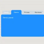
Just another pure CSS tabs component which uses CSS3 transitions for smooth animations, and radio inputs for switching between tabbed panels.
How to use it:
The html structure for the tabs component assicated with 2 tabbed panels.
<div class="tabs">
  <div class="tab-2">
    <label for="tab2-1">Tab One</label>
    <input id="tab2-1" name="tabs-two" type="radio" checked="checked">
    <div>
      <h4>Tab One</h4>
      <p>Content One</p>
    </div>
  </div>
  <div class="tab-2">
    <label for="tab2-2">Tab Two</label>
    <input id="tab2-2" name="tabs-two" type="radio">
    <div>
      <h4>Tab Two</h4>
      <p>Content Two</p>
    </div>
  </div>
</div>
The required CSS/CSS3 styles and radio button hack for the tabs component.
.tabs {
  display: block;
  display: -webkit-flex;
  display: -moz-flex;
  display: flex;
  -webkit-flex-wrap: wrap;
  -moz-flex-wrap: wrap;
  flex-wrap: wrap;
  margin: 0;
  overflow: hidden;
}
.tabs [class^="tab"] label, .tabs [class*=" tab"] label {
  color: #efedef;
  cursor: pointer;
  display: block;
  font-size: 1.1em;
  font-weight: 300;
  line-height: 1em;
  padding: 2rem 0;
  text-align: center;
}
.tabs [class^="tab"] [type="radio"], .tabs [class*=" tab"] [type="radio"] {
  border-bottom: 1px solid rgba(239, 237, 239, 0.5);
  cursor: pointer;
  -webkit-appearance: none;
  -moz-appearance: none;
  appearance: none;
  display: block;
  width: 100%;
  -webkit-transition: all 0.3s ease-in-out;
  -moz-transition: all 0.3s ease-in-out;
  -o-transition: all 0.3s ease-in-out;
  transition: all 0.3s ease-in-out;
}
.tabs [class^="tab"] [type="radio"]:hover, .tabs [class^="tab"] [type="radio"]:focus, .tabs [class*=" tab"] [type="radio"]:hover, .tabs [class*=" tab"] [type="radio"]:focus { border-bottom: 1px solid #fd264f; }
.tabs [class^="tab"] [type="radio"]:checked, .tabs [class*=" tab"] [type="radio"]:checked { border-bottom: 2px solid #fd264f; }
.tabs [class^="tab"] [type="radio"]:checked + div, .tabs [class*=" tab"] [type="radio"]:checked + div { opacity: 1; }
.tabs [class^="tab"] [type="radio"] + div, .tabs [class*=" tab"] [type="radio"] + div {
  display: block;
  opacity: 0;
  padding: 2rem 0;
  width: 90%;
  -webkit-transition: all 0.3s ease-in-out;
  -moz-transition: all 0.3s ease-in-out;
  -o-transition: all 0.3s ease-in-out;
  transition: all 0.3s ease-in-out;
}
.tabs .tab-2 { width: 50%; }
.tabs .tab-2 [type="radio"] + div {
  width: 200%;
  margin-left: 200%;
}
.tabs .tab-2 [type="radio"]:checked + div { margin-left: 0; }
.tabs .tab-2:last-child [type="radio"] + div { margin-left: 100%; }
.tabs .tab-2:last-child [type="radio"]:checked + div { margin-left: -100%; }
That’s it. You can adjust or override the CSS styles as shown above to create your own styles.
See Also:
 CSS-Only Inverted Corner Tabs With Anchor Positioning
 Animated Tabs Component In Pure CSS – Tabsy CSS
 Convert Sectioned Contents Into Tabs – tinytabs
 Lightweight Pure JavaScript Tabs With URL Persistence – Tabzy.js
 Dynamic External Content Tabs with Quicktabs.js
 Create Accessible Tabs with Pure CSS and Semantic HTML
 Accessible Tabs Component – tab-container
 Simple Fast Vanilla JavaScript Tabs