


A simple, animated, responsive tabs component built using CSS/CSS3 and radio+label tricks. The tabs component will automatically break down into a vertical accordion interface on mobile devices for better readability.
How to use it:
Download and import the ‘tabsy.css’ into the html page.
<link href="tabsy.css" rel="stylesheet" type="text/css">
Create the tab navigation for the sectioned content using radio inputs and label elements as these:
<div class="tabsy">
  <input type="radio" id="tab1" name="tab" checked>
  <label class="tabButton" for="tab1">Tab One</label>

  <div class="tab">
    <div class="content">
      Tab 1
    </div>
  </div>
  <input type="radio" id="tab2" name="tab">
  <label class="tabButton" for="tab2">Tab Two</label>

  <div class="tab">
    <div class="content">
      Tab 2
    </div>
  </div>
  <input type="radio" id="tab3" name="tab">
  <label class="tabButton" for="tab3">Tab Three</label>

  <div class="tab">
    <div class="content">
      Tab 3
    </div>
  </div>
</div>
Customize the tabs component in the SASS:
// Base Colors
$tabActiveBgColor: #fff;
$tabActiveTextColor: #5a5243;
$tabNectiveBgColor: #5a5243;
$tabNectiveTextColor: #F5F5F5;
// Breakpoint
$breakpoint: 768px;
// Transition
$transitionSpeed: 200ms;
Changelog:
v1.0.1 (06/20/2025)
- Update
See Also:
 Responsive Vertical Tabs For Bootstrap 5/4
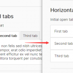 Responsive Tabs & Accordion Component In Vanilla JavaScript
 Accessible Tabs & Accordion Component In JavaScript – a11y-accordion-tabs
 Responsive CSS Only Accordion & Tabs Component
 Create A Responsive Tabs Component Using CSS and Radio Input
 CSS-Only Inverted Corner Tabs With Anchor Positioning
 Convert Sectioned Contents Into Tabs – tinytabs
 Lightweight Pure JavaScript Tabs With URL Persistence – Tabzy.js