


A pure CSS implementation of an automatic 3D image carousel/rotator using CSS transform properties like rotateY, Scale, and perspective.
How to use it:
1. Add images to the 3D carousel.
<div class="slider-box">
  <div class="carousel">
    <div class="carousel-item it1">
     <img class="img" src="1.webp">
    </div>
    <div class="carousel-item it2">
      <img class="img" src="2.webp">
    </div>
    <div class="carousel-item it3">
      <img class="img" src="3.webp">
    </div>
    ...
  </div>
</div>
2. Add the following CSS snippets to the page.
.slider-box {
  width: 30vh;
  perspective: 1000px;
  position: relative;
  top: -17vh; /* height to top */
  padding-top: 10vh;
}
.carousel {
  width: 100%;
  transform-style: preserve-3d;
  animation: rotate 20s infinite linear; /*  speed:  */
}
.carousel .carousel-item {
  width: 100%;
  height: 25vh;
  position: absolute;
  overflow: hidden;
}
.carousel-item {
  box-shadow: 0px 0px 20px 0px #000;
  border-radius: 3vh;
}
.carousel .img {
  transition: ease-in-out 0.5s;
  width: 100%;
  height: 100%;
}
.carousel .img:hover {
  transform: scale(1.1);
  transition: all 0.5s;
  position: absolute;
}
.carousel:hover {
  animation-play-state: paused;
  cursor: pointer;
}
/* animation rotate */
@keyframes rotate {
  from {
    transform: rotateY(0deg);
  }
  to {
    transform: rotateY(360deg);
  }
}
.it1 {
  transform: rotateY(0deg) translateZ(50vh);
}
.it2 {
  transform: rotateY(40deg) translateZ(50vh);
}
.it3 {
  transform: rotateY(80deg) translateZ(50vh);
}
.it4 {
  transform: rotateY(120deg) translateZ(50vh);
}
.it5 {
  transform: rotateY(160deg) translateZ(50vh);
}
.it6 {
  transform: rotateY(200deg) translateZ(50vh);
}
.it7 {
  transform: rotateY(240deg) translateZ(50vh);
}
.it8 {
  transform: rotateY(280deg) translateZ(50vh);
}
.it9 {
  transform: rotateY(320deg) translateZ(50vh);
}
.it10 {
  transform: rotateY(360deg) translateZ(50vh);
}
See Also:
 Interactive 3D Rotating Gallery In JavaScript
 Immersive 3D Auto-Rotating Image Gallery With JavaScript & CSS3
 3D Cube Image Rotator/Carousel In JavaScript – dimage.js
 Automatic 3D Image Rotator With Pure CSS
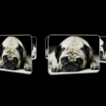 3D Perspective Image Rotator With Pure CSS
 Touch-Ready, High-Performance Vanilla JS Slider – Pagiflow
 Create Modern Mobile-friendly Carousels With Slickless.js
 Lightweight Vanilla JS Carousel with Touch Support – Driftbox