


This is an interactive image gallery that enables images to rotate manually or automatically in a 3D space.
It was built using vanilla JavaScript and CSS/CSS3. It is ideal for portfolios, product displays, and any web application that needs an eye-catching image presentation.
How to use it:
1. Add images to the gallery container. Each <span> represents an individual image, and the style="--i: [number]" attribute assigns a unique index to each image for positioning purposes.
<div class="image-container">
  <span style="--i: 1">
    <img src="1.jpg">
  </span>
  <span style="--i: 2">
    <img src="2.jpg">
  </span>
  <span style="--i: 3">
    <img src="3.jpg">
  </span>
  ...
</div>
2. Include the next and previous buttons inside the .btn-container element. These buttons allow users to manually control the rotation of the gallery.
<div class="btn-container">
  <button class="btn" id="prev">Prev</button>
  <button class="btn" id="next">Next</button>
</div>
3. The required CSS to stablish the 3D perspective, positioning, and styling of the gallery and its components.
.image-container {
  width: 200px;
  height: 200px;
  transform-style: preserve-3d;
  transform: perspective(1000px) rotateY(0deg);
  transition: transform .7s;
}
.image-container span {
  position: absolute;
  top: 0;
  left: 0;
  width: 100%;
  transform: rotateY(calc(var(--i) * 90deg)) translateZ(400px);
}
.image-container span img {
  position: absolute;
  top: 0;
  left: 0;
  width: 100%;
  aspect-ratio: 1/1;
  -o-object-fit: cover;
  object-fit: cover;
  filter: grayscale(100%);
}
.btn-container {
  position: relative;
  width: 80%;
}
.btn {
  position: absolute;
  bottom: -140px;
  background-color: slateblue;
  color: white;
  border: none;
  padding: 10px 30px;
  border-radius: 5px;
  cursor: pointer;
  font-size: 20px;
}
.btn:hover {
  filter: brightness(1.5);
}
.image-container span img:hover {
  filter: none;
}
#prev {
  left: 20%;
}
#next {
  right: 20%;
}
4. The JavaScript code powers the core functionality of the gallery:
- It selects essential DOM elements (image container, buttons).
- It initializes variables to track the current rotation degree (
x) and a timer object. - Event listeners are attached to the buttons to update the gallery state (
x) on click. - The
updateGalleryfunction applies the new rotation value to the image container using CSS transforms. It also sets a timer to automatically rotate the gallery periodically.
const imageContainerEl = document.querySelector(".image-container");
const prevEl = document.getElementById("prev");
const nextEl = document.getElementById("next");
let x = 0;
let timer;
prevEl.addEventListener("click", () => {
    x += 90;
    clearTimeout(timer);
    updateGallery();
});
nextEl.addEventListener("click", () => {
    x -= 90;
    clearTimeout(timer);
    updateGallery();
});
function updateGallery() {
    imageContainerEl.style.transform = `perspective(1000px) rotateY(${x}deg)`;
    timer = setTimeout( () => {
        x -= 90;
        updateGallery();
    }, 3000)
}
updateGallery();
See Also:
 Interactive 3D Rotating Gallery In JavaScript
 Automatic 3D Image Carousel Rotator In CSS
 3D Cube Image Rotator/Carousel In JavaScript – dimage.js
 Automatic 3D Image Rotator With Pure CSS
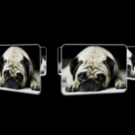 3D Perspective Image Rotator With Pure CSS
 Touch-Ready, High-Performance Vanilla JS Slider – Pagiflow
 Create Modern Mobile-friendly Carousels With Slickless.js
 Lightweight Vanilla JS Carousel with Touch Support – Driftbox