


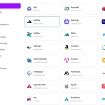
theSVG is an open-source SVG icon library with 7,600+ brand and cloud icons for websites, apps, and architecture diagrams.
It includes color, monochrome, light, dark, and wordmark variants, plus a collection of 120+ UI icons.
You can use direct SVG URLs, npm imports, or components for React, Vue, Svelte, and React Native.
Features:
- 7,600+ SVG icons across brand logos, cloud architecture assets, and authentication badges.
- 120+ UI icons in 7 styles.
- Up to seven variants per brand, including monochrome, light, dark, and wordmark options.
- Individual icon imports from typed, tree-shakeable npm packages.
- React, Vue, Svelte, Solid, Preact, Astro, and React Native component packages.
- SVG downloads and PNG exports.
- SVG delivery through the theSVG website or jsDelivr CDN.
- CLI commands for adding, listing, and searching brand and UI icons.
- Static JSON manifests for searching and filtering icons.
- An MCP server for retrieving icons through AI assistants.
How to Use theSVG:
1. Display a Brand SVG Icon in HTML
Use the SVG URL directly in an <img> element. No JavaScript or npm installation is required.
<img src="https://thesvg.org/icons/github/default.svg"
     width="32" height="32" alt="GitHub" />
<img src="https://thesvg.org/icons/github/mono.svg"
     width="32" height="32" alt="GitHub" />
For a GitHub-backed CDN URL, use jsDelivr:
<img src="https://cdn.jsdelivr.net/gh/glincker/thesvg@main/public/icons/github/default.svg"
     width="32" height="32" alt="GitHub" />
External SVGs loaded through
<img>do not inherit your page’s CSScolor. To recolor an icon that usescurrentColor, render the SVG inline or use a framework component.
2. Install Brand Icons with npm
Install thesvg to import brand icons as JavaScript objects.
npm install thesvg
# Alternative raw-data package:
npm install @thesvg/icons
Import a single icon from either package:
import github from "thesvg/github";
// Or: import github from "@thesvg/icons/github";
console.log(github.svg);        // Raw default SVG markup
console.log(github.title);      // "GitHub"
console.log(github.hex);        // "181717"
console.log(github.categories); // Brand categories
console.log(github.variants);   // Available SVG variants
3. Use Brand SVG Components in React, Vue, and Svelte
Install the adapter for your framework.
# React
npm install @thesvg/react
# Vue 3
npm install @thesvg/vue
# Svelte
npm install @thesvg/svelte
React:
Use the variant prop to select an available brand mark. It defaults to "default". These SVG components also work in Next.js Server Components.
import { Github, Figma } from "@thesvg/react";
export function BrandLogos() {
  return (
    <div>
      <Github width={32} height={32} aria-label="GitHub" />
      <Figma width={32} height={32} aria-label="Figma" />
      <Github variant="mono" width={32} height={32} />
    </div>
  );
}
Vue 3:
<script setup>
import { Github, Figma } from "@thesvg/vue";
</script>
<template>
  <Github width="32" height="32" aria-label="GitHub" />
  <Figma width="32" height="32" aria-label="Figma" />
</template>
Svelte:
<script>
  import { Github, Figma } from "@thesvg/svelte";
</script>
<Github width="32" height="32" aria-label="GitHub" />
<Figma width="32" height="32" aria-label="Figma" />
React Native:
Install the icon adapter and react-native-svg:
npm install @thesvg/react-native react-native-svg
import { Github } from "@thesvg/react-native";
export function BrandIcon() {
  return <Github size={28} variant="mono" />;
}
Brand icons are also available for Solid, Preact, and Astro.
# Solid
npm install @thesvg/solid
# Preact
npm install @thesvg/preact
# Astro
npm install @thesvg/astro
4. Insert Brand Icons with Vanilla JavaScript
For a bundled JavaScript project, @thesvg/web replaces placeholder elements with inline SVGs. Install the helper and the icon data package:
npm install @thesvg/web @thesvg/icons
Add a placeholder to the HTML:
<i data-thesvg="github" data-thesvg-size="32" aria-label="GitHub"></i>
In your bundled application, run the helper after the placeholder exists in the DOM:
import github from "@thesvg/icons/github";
import { createIcons } from "@thesvg/web";
createIcons({ icons: { github } });
5. Use the UI Icons
Each UI icon has seven styles: outline, glass, duotone, offset, fill, pixel, and depth. These UI icons use currentColor and have a 24-by-24 coordinate grid.
For React 18+, install the UI adapter:
npm install @thesvg/ui-react
import {
  BellIcon,
  BellGlassIcon,
  BellPixelIcon
} from "@thesvg/ui-react";
export function Notifications() {
  return (
    <div style={{ color: "#2563eb" }}>
      <BellIcon size={24} aria-label="Notifications" />
      <BellGlassIcon size={24} />
      <BellPixelIcon size={24} />
    </div>
  );
}
For raw UI SVG files and their JSON manifest, install @thesvg/ui. JSON module imports require a runtime or bundler that accepts import attributes:
npm install @thesvg/ui
import manifest from "@thesvg/ui/ui-icons.json" with { type: "json" };
// SVG file layout: @thesvg/ui/svg/<slug>/<look>.svg
You can also embed a UI SVG file from the npm CDN:
<img src="https://cdn.jsdelivr.net/npm/@thesvg/ui/dist/svg/bell/outline.svg"
     width="24" height="24" alt="Notifications" />
For other frameworks, install the corresponding UI package.
# Vue
npm install @thesvg/ui-vue
# Svelte
npm install @thesvg/ui-svelte
# React Native
npm install @thesvg/ui-react-native react-native-svg
6. Add Icons from the CLI
# Add a brand icon
npx @thesvg/cli add github
# Save brand icons as React components
npx @thesvg/cli add github figma --format jsx
# Save a brand icon's dark variant
npx @thesvg/cli add github --variant dark
# Search brand icons
npx @thesvg/cli search "payment"
# Add a UI icon in its default outline look
npx @thesvg/cli add ui:arrow-down
# Add a UI icon in the glass look
npx @thesvg/cli add ui:arrow-down --look glass
# Browse UI icons
npx @thesvg/cli list --ui
npx @thesvg/cli search arrow --ui
7. Access the Static JSON API
# Full icon registry
curl "https://thesvg.org/api/registry.json"
# Categories with counts
curl "https://thesvg.org/api/categories.json"
# Raw SVG
curl "https://thesvg.org/icons/github/default.svg"
For browser-side filtering, fetch the registry once and search its icons array:
const response = await fetch("https://thesvg.org/api/registry.json");
const { icons } = await response.json();
const result = icons.find((icon) => icon.slug === "github");
console.log(result);
8. Connect the MCP Server to an AI Assistant
Add this entry to a MCP client that accepts the standard mcpServers configuration, such as Claude Desktop or Cursor:
{
  "mcpServers": {
    "thesvg": {
      "command": "npx",
      "args": ["-y", "@thesvg/mcp-server"]
    }
  }
}
Set
kind: "ui"when requesting UI icons. Forget_iconandget_icon_url, thelookparameter selects the UI appearance. Existing brand requests usekind: "brand"by default.
theSVG Package Reference:
Brand Icon Packages
| Package | Purpose |
|---|---|
thesvg | Brand icon data through per-icon imports. |
@thesvg/icons | Raw SVG strings and metadata for individual brand icons. |
@thesvg/react | React 18+ SVG components. |
@thesvg/vue | Vue 3.3+ SVG components. |
@thesvg/svelte | Svelte 4+ SVG components. |
@thesvg/react-native | React Native brand components; requires react-native-svg. |
@thesvg/solid | Solid 1.8+ SVG components with a reactive variant prop. |
@thesvg/preact | Preact 10.11+ SVG components. |
@thesvg/astro | Astro 3+ SVG components rendered to static markup. |
@thesvg/web | Inline SVG replacement and SVG string helpers for vanilla JavaScript. |
@thesvg/static | Raw brand SVG files and a JSON manifest for CDNs and local assets. |
UI Icon Packages
| Package | Purpose |
|---|---|
@thesvg/ui | Raw SVG files in seven looks and a JSON manifest. |
@thesvg/ui-react | React UI icon components. |
@thesvg/ui-vue | Vue 3 UI icon components. |
@thesvg/ui-svelte | Svelte UI icon components. |
@thesvg/ui-react-native | React Native UI icon components; requires react-native-svg. |
Developer Tools
| Package | Purpose |
|---|---|
@thesvg/cli | Searches, lists, and downloads SVG files or framework components from a terminal. |
@thesvg/mcp-server | Exposes brand and UI icons through five MCP tools. |
Brand Icon Data Reference:
Modules imported from thesvg/{slug} or @thesvg/icons/{slug} expose these fields:
| Field | Description |
|---|---|
slug | Identifier used in imports and icon URLs. |
title | Human-readable icon title. |
hex | Primary brand color as a hex string without #. |
categories | Array of categories for the icon. |
aliases | Alternative brand names and search terms. |
svg | Raw SVG markup of the default variant. |
variants | Object of available variant names and SVG markup. |
license | License information associated with the icon. |
url | Brand website URL, when provided. |
Brand Component Props:
Brand components accept standard SVG attributes, including sizing, classes, styles, and accessibility attributes. React uses SVGProps<SVGSVGElement> and forwards refs. Its variant prop is typed per icon.
| Prop or Attribute | Description |
|---|---|
width, height | SVG dimensions; numbers or CSS-size strings. |
className (React), class (Vue/Svelte) | CSS classes for the SVG element. |
style | Inline SVG styles. |
fill, stroke | SVG color attributes. Individual SVG paths can specify their own colors. |
viewBox | Overrides the SVG’s original view box. |
variant (React) | Selects an available brand mark; defaults to default and falls back to it for an unsupported runtime value. |
ref (React) | Forwarded reference to the rendered SVG element. |
aria-label, aria-hidden | Identify meaningful icons or hide decorative ones from assistive technologies. |
React Native Brand Component Props
These components accept react-native-svg SvgProps, with the following library-specific behavior:
| Prop | Description |
|---|---|
size | Width and height shorthand; default 24. |
color | Applies a common fill and stroke color. |
width, height | Override the corresponding dimension from size. |
fill, stroke | Override the color shorthand separately. |
variant | Brand mark variant; default default. |
ref | Reference to the underlying Svg element. |
Other Brand Framework Props
| Adapter | Public Component Props |
|---|---|
@thesvg/solid | Standard SVG attributes including width, height, and class; reactive variant, default default. |
@thesvg/preact | Standard SVG attributes including width, height, and class; typed variant, default default. Function components do not forward SVG refs directly. |
@thesvg/astro | size (number or string, default 1em), color, class, aria-label, and other SVG attributes. |
Brand Icon Variants:
| Variant | Description |
|---|---|
default | Primary brand mark, generally in brand colors. |
mono | Monochrome version; an inline SVG can inherit currentColor. |
light | Light mark for dark backgrounds. |
dark | Dark mark for light backgrounds. |
wordmark | Wordmark or logo containing the brand name. |
wordmarkLight | Light wordmark variant. |
wordmarkDark | Dark wordmark variant. |
UI Icon Looks and Component Names:
| Look | React Component Example |
|---|---|
outline | BellIcon |
glass | BellGlassIcon |
duotone | BellDuotoneIcon |
offset | BellOffsetIcon |
fill | BellFillIcon |
pixel | BellPixelIcon |
depth | BellDepthIcon |
UI Component Props
Web UI components use currentColor, a 24 default size, and the standard SVG attributes of their framework. React forwards a ref to the SVG. An icon with meaningful content should receive an accessible label.
| Prop or Attribute | Description |
|---|---|
size | Number or string; sets both SVG dimensions, default 24. |
width, height | Standard SVG dimensions for React, Vue, and Svelte; override size individually. |
className / class, style | Standard framework SVG styling attributes. |
aria-label, aria-hidden | Label a meaningful icon or identify a decorative one. |
ref (React) | Forwarded reference to the SVG element. |
React Native UI components render through react-native-svg and accept the following props:
| Prop | Description |
|---|---|
size | Number or string; icon dimensions, default 24. |
color | String; substitutes for currentColor, default #000000. |
Other SvgProps | Forwarded to the SvgXml component, apart from the special sizing and color inputs above. |
Vanilla JavaScript Helper Reference:
The @thesvg/web package exposes two public functions.
| Function | Parameters and Return |
|---|---|
createIcons(options) | Replaces matching placeholders with inline SVGs. options.icons (required) maps names to icon modules; nameAttr defaults to data-thesvg; root defaults to document. Returns the number of elements replaced. Unknown icons are left unchanged. |
getIconSvg(nameOrIcon, options?) | Returns an SVG string or undefined for unknown icons. The first argument is an icon module or a slug resolved from options.icons. Options: icons, variant, size, className, title, and attrs. |
Placeholder Attributes
| Attribute | Function |
|---|---|
data-thesvg | Identifies the icon slug. Configure a different attribute with nameAttr. |
data-thesvg-variant | Requests an available brand variant; falls back to the default. |
data-thesvg-size | Sets SVG width and height. |
class and other HTML attributes | Copied from the placeholder to the SVG element. Label meaningful icons with aria-label. |
CLI Command Reference:
| Command or Option | Description |
|---|---|
add <slug> [slug...] | Downloads one or more brand icons; prefix UI slugs with ui:. |
add --variant, -v | Requests an available brand variant key; default default. Falls back to the default if the requested variant is missing. |
add --format, -f | Output format: svg (default), jsx, or vue. |
add --dir, -d | Output directory. Autodetects public/icons, src/icons, or icons. |
add --look | UI look; default outline. Accepts the seven UI looks in the table above. |
list | Lists icons; default limit 50. |
list --category, -c | Filters the list by category. |
list --limit, -l | Sets the maximum number of results; default 50. |
list --ui | Lists UI icons. |
search <query> | Searches icon names, slugs, and keywords; default limit 20. |
search --limit, -l | Sets the maximum number of results; default 20. |
search --ui | Searches UI icon names, categories, and tags. |
Public API Endpoints:
| Endpoint | Description |
|---|---|
GET /api/registry.json | Static icon registry with identifiers, titles, aliases, categories, colors, URLs, and variant keys. |
GET /api/categories.json | Static category data with icon counts. |
GET /icons/{slug}/{variant}.svg | Returns the requested brand SVG; use its actual slug and available file variant. |
MCP Server Tools:
All five tools accept optional kind: "brand" | "ui", default "brand". On get_icon and get_icon_url, variant selects a brand mark (default default) and look selects a UI style (default outline).
| Tool | Purpose and Parameters |
|---|---|
search_icons | Finds icons by name or slug. Requires query (string); optional limit (integer 1 to 100, default 20). |
get_icon | Fetches SVG markup and metadata. Requires slug; accepts variant (default default) and UI look. |
list_variants | Lists the available brand variants or UI looks. Requires slug. |
get_icon_url | Returns a jsDelivr URL. Requires slug; accepts variant (default default) and UI look. |
list_categories | Returns category names and counts. No other parameters. |
Alternatives and Related Resources:
- Brand Logos & Tech Stack Icons for Web Dev – Coloryfy.css – A CSS class and CDN-based option for displaying technology logos.
- Animated Icon Component Library for React/Vue/Svelte/Solid/Web Component – Animated UI glyphs based on Lucide, Heroicons, and Iconoir.
- morphicons: SVG Icon Morphing for JavaScript, React, and Vue – Morphing transitions between compatible SVG icon shapes.
- JavaScript & CSS Icon – More icon resources on CSSScript.
FAQs:
Q: Do I need to change existing brand icon imports when upgrading from v3 to v4?
A: No. v4 preserves the existing brand import names and SVG files. Install the separate @thesvg/ui* packages only if you need the new UI icon collection.
Q: Why does a variant URL return 404?
A: Every brand has a default SVG, but other variants differ by icon. Inspect the icon metadata and the published file URL. Some variant filenames differ from their JavaScript property names.
Q: Why doesn’t the mono icon change color when I style an img element?
A: The external SVG is an image document and cannot inherit your page’s currentColor. Inline the SVG markup or render it as a component to control its color through CSS.
Q: Can I use these icons commercially?
A: theSVG’s code and UI icon collection are MIT-licensed. Brand logos and some architecture assets have their own licenses and trademark restrictions. Check the individual asset’s license and brand guidelines before use.
Q: How do I keep unused icons out of a JavaScript bundle?
A: Import icon modules by slug, such as @thesvg/icons/github, or use an individual component import such as @thesvg/react/github. A full barrel import from @thesvg/icons can include unused icons.
Changelog:
v4.0.3 (11/03/2026)
- Added more icons
v4.0.0 (10/27/2026)
- Added a separate set of 129 UI icons with seven looks and dedicated framework packages.
- Expanded the brand icon collection to 7,600+ icons.
- Added UI icon support to
@thesvg/cli0.8.0 and@thesvg/mcp-server0.9.0. - Preserved the brand icon import names and existing SVG files.
v3.4.2 (10/25/2026)
- Fixed missing variant files in distributed icon packages.
v3.4.1 (10/19/2026)
- Added more brand icons.
See Also:
 McIcons.css: Minecraft UI Icon Library With 1,600+ Pixel-style Icons
 morphicons: SVG Icon Morphing for JavaScript, React, and Vue
 Animate Falling Font Awesome Icons Web Component – icon-fall
 Smooth Animated UI Icons For React & TypeScript – pqoqubbw/icons
 Animated Icon Component Library for React/Vue/Svelte/Solid/Web Component
 Brand Logos & Tech Stack Icons for Web Dev – Coloryfy.css
 500+ Customizable Retina-ready Icons In CSS – css.gg
 Bootstrap 5 Icon Picker – iconpicker