


Toggle switches look simple, but the right library depends on the input state, markup requirements, styling depth, and accessibility needs of the form.
A settings page may only need a CSS-only checkbox switch, but a theme picker, three-state control, or reusable component needs a different approach.
The options below help you pick a JavaScript or CSS toggle switch pattern that fits your UI.
Originally Published Jan 13 2018, updated May 16 2026
Table of contents:
Comparison Table
| Library | Best For | Live Demo |
|---|---|---|
| el-checkbox | Checkbox, radio, and switch styling. | Live Demo |
| vc-toggle-switch.css | Gooey iOS-style checkbox switches. | Live Demo |
| slider.css | Two-state and three-state radio toggles. | Live Demo |
| CSS3 iOS Switch Button | Large iOS-style CSS switch buttons. | Live Demo |
| a8z | Checkbox switches with style variants. | Live Demo |
| Creative Animated Toggle Switch | Animated light and dark mode switches. | Live Demo |
| Accessible Switch Controls | SCSS-based switch controls. | Live Demo |
| Toggle Switchy | Responsive checkbox switches with labels. | Live Demo |
| CSS Flexbox iOS Toggle | Minimal checkbox switches with flexbox. | Live Demo |
| SlideOn | Small JavaScript slide switches. | Live Demo |
Toggle Switch Libraries
1. el-checkbox
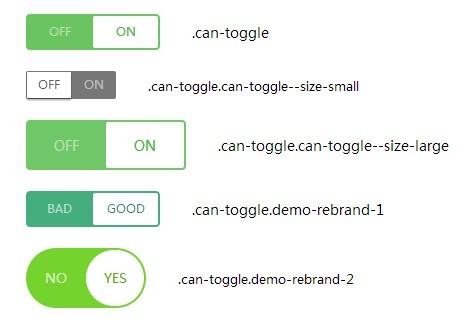
Best For: Projects that need one CSS package for custom checkboxes, radio buttons, and iOS-style switches.

el-checkbox is a pure CSS library for styling native checkboxes, radio buttons, and iOS-style switch controls. It keeps the underlying input model intact and changes the visual presentation through CSS classes. Choose it for forms that need consistent checkbox, radio, and switch styling from one stylesheet.
Key Features:
- Styles native checkbox inputs.
- Styles native radio inputs.
- Adds iOS-style switch controls.
- Includes default, red, green, and yellow themes.
- Provides default, small, and large sizes.
- Uses CSS/CSS3 styling rather than JavaScript initialization.
Recommended Use Case: Use el-checkbox for form pages that need checkboxes, radio buttons, and switches to share one visual language.
2. vc-toggle-switch.css
Best For: iOS-style toggle switches that need on/off text and CSS variable theming.

vc-toggle-switch.css is a pure CSS library that turns a standard checkbox into a smooth iOS-style switch. It adds a handle, animated state change, and optional on/off text through markup and CSS variables. Pick it for settings panels, preference forms, and admin controls that need clear binary labels.
Key Features:
- Transforms checkbox inputs into iOS-style toggle switches.
- Adds a soft handle motion with a gooey visual effect.
- Supports on and off text through data attributes.
- Uses CSS variables for colors, switch dimensions, handle size, fonts, and animation timing.
- Works with native checkbox state.
- Requires no JavaScript for the switch animation.
Recommended Use Case: Use vc-toggle-switch.css for settings UI where each switch needs readable on/off states and themeable CSS values.
3. slider.css
Best For: Radio-based toggle controls that need two-state or three-state choices.

slider.css is a CSS library that converts radio button groups into switch-like slider controls. It’s best for cases where a checkbox is too limited for the required form state. Choose it for approval controls, preference selectors, or status choices that need two or three mutually exclusive states.
Key Features:
- Creates toggle controls from radio button inputs.
- Supports simple on/off toggle choices.
- Supports three-state sliders with an intermediate option.
- Uses CSS variables for colors and text styling.
- Keeps each option as a radio input value.
- Fits form controls that need mutually exclusive choices.
Recommended Use Case: Use slider.css for forms that need No, Maybe, and Yes choices in a compact switch-like UI.
4. CSS3 Only iOS Switch Button
Best For: Pure CSS iOS-style switches with a larger button-like visual treatment.

CSS3 Only iOS Switch Button is a CSS/CSS3 switch pattern for turning checkbox markup into an iOS-style toggle button. It uses CSS transforms and transitions to animate the checked state. Pick it for simple preference toggles where a larger mobile-style switch fits the page design.
Key Features:
- Uses checkbox markup inside a label.
- Creates an iOS-style switch button with CSS only.
- Animates the switch handle with CSS3 transforms and transitions.
- Supports checked-state styling through CSS selectors.
- Includes focus styling for keyboard interaction.
- Works well as a small reference pattern for custom CSS switches.
Recommended Use Case: Use this switch for simple preference toggles where a large iOS-style control is acceptable.
5. a8z
Best For: Custom checkbox switches with multiple sizes, colors, shapes, and label positions.

a8z is a CSS toggle switch library for converting native checkbox inputs into styled switch controls. It uses HTML attributes and CSS classes to create size, color, shape, and label variants. Choose it for dashboards or settings pages that need compact, large, rounded, square, and colored switch styles from one library.
Key Features:
- Transforms checkbox inputs into custom switch controls.
- Supports xl, lg, sm, and xs switch sizes.
- Includes rounded and square switch styles.
- Supports multiple color themes.
- Supports hidden text for compact UI.
- Supports left or right label placement.
- Uses native checkbox state for form submission.
Recommended Use Case: Use a8z for admin interfaces that need several switch variants from one CSS library.
6. Creative Animated Toggle Switch
Best For: Theme toggle buttons that need a playful day and night animation.

Creative Animated Toggle Switch is a pure CSS switch pattern for turning a standard checkbox into a light and dark mode control. It uses CSS animations and visual elements such as sun, moon, stars, and a sliding handle. Pick it when the switch itself should communicate a theme change.
Key Features:
- Uses checkbox markup for the toggle state.
- Creates a day and night visual transition.
- Animates sun, moon, star, and background elements with CSS.
- Defines visual tokens through CSS custom properties.
- Works as a dark mode or theme toggle UI pattern.
- Requires no JavaScript for the displayed animation.
Recommended Use Case: Use this switch for dark mode controls on landing pages, demos, and personal sites.
7. Creating Accessible Switch Controls with Pure CSS (SCSS)
Best For: SCSS-based switch controls with keyboard focus, disabled state, and brand color mixins.
Creating Accessible Switch Controls with Pure CSS (SCSS) is a Sass-based pattern for converting standard form inputs into switch controls. It uses native inputs and labels, then applies switch visuals through SCSS mixins and CSS transitions. Choose it for Sass projects that need reusable switch styles with clear interaction states.
Key Features:
- Uses SCSS mixins for off, on, inactive text, and transition values.
- Works with standard input and label markup.
- Includes hover, focus, checked, and disabled-state styling.
- Uses CSS3 transitions and 3D transforms for visual state changes.
- Supports brand color customization through Sass variables or mixin values.
- Fits projects that already compile SCSS.
Recommended Use Case: Use this pattern in Sass-based projects that need switch controls with clear interaction states.
8. Toggle Switchy
Best For: Responsive checkbox switches with sizes, labels, rounded styles, square styles, and colors.

Toggle Switchy is a CSS-only library that converts native checkbox inputs into responsive switch controls. It keeps checkbox semantics in the markup and adds variants through wrapper classes and data attributes. Use it when a project needs several switch presentations without JavaScript initialization.
Key Features:
- Transforms checkbox inputs into CSS-only switch controls.
- Supports multiple sizes through the data-size attribute.
- Includes rounded and square switch styles.
- Supports hidden text, custom labels, and text placement.
- Supports color options for switch states.
- Works with native checkbox state for forms.
- Fits responsive form layouts.
Recommended Use Case: Use Toggle Switchy for CSS-only settings screens that need labels and several visual variants.
9. Minimal iOS Style Toggle Switch With CSS Flexbox
Best For: A minimal CSS checkbox switch for small demos, prototypes, and simple preference forms.

Minimal iOS Style Toggle Switch With CSS Flexbox is a small CSS pattern for building an iOS-style switch from checkbox markup. It pairs a checkbox with a label and positions the slider through flexbox. Choose it when you want a simple switch pattern that you can adapt inside your own CSS.
Key Features:
- Uses one checkbox, one label, and one slider element.
- Creates an iOS-style switch with pure CSS.
- Positions the switch handle with flexbox.
- Changes background and handle position through the checked state.
- Fits responsive layouts and small forms.
- Works well as a learning or starter pattern for custom switches.
Recommended Use Case: Use this flexbox switch for lightweight prototypes or small forms with only one or two toggles.
10. SlideOn
Best For: Small slide switches for checkbox inputs when a JavaScript component is acceptable.

SlideOn is a lightweight JavaScript UI component that converts normal checkbox inputs into customizable slide switches. It keeps the checkbox as the source state and adds a packaged switch behavior layer. Pick it when you want component-style initialization rather than writing the checkbox styling yourself.
Key Features:
- Converts checkbox inputs into slide switch components.
- Provides an iOS-style switch presentation.
- Uses a small JavaScript and CSS setup path.
- Keeps the native checkbox as the underlying state source.
- Supports custom switch styling through CSS.
- Fits projects where a small JavaScript component is acceptable.
Recommended Use Case: Use SlideOn when a JavaScript switch component is easier than writing custom checkbox styling by hand.
How to Choose
Start with the form state you need. Use checkbox-based switches such as Toggle Switchy, a8z, or vc-toggle-switch.css for true on/off values. Use slider.css when the control needs two or three mutually exclusive choices.
Pick a CSS-only library when the switch only changes a native input state. This approach works well for static forms, WordPress pages, prototypes, and admin screens where extra JavaScript would add little value.
Pick a JavaScript option when the switch needs component initialization, programmatic toggling, or a packaged behavior layer. SlideOn is the best match from this list when a small JavaScript component fits the project.
For visual range, a8z and Toggle Switchy cover the most variants. For a single animated theme toggle, use Creative Animated Toggle Switch. For Sass projects, Creating Accessible Switch Controls with Pure CSS (SCSS) offers mixins and interaction-state styling.
Keep accessibility in the decision. Favor libraries that retain a native checkbox or radio input, preserve labels, and show clear focus states. Test the final switch with keyboard navigation before publishing it in a production form.
FAQ
Q: What is the best CSS-only toggle switch library in this list?
A: Toggle Switchy is the strongest general CSS-only choice for varied sizes, labels, colors, and rounded or square styles. Use a8z when you prefer its data-attribute API and color set.
Q: Which option works best for a three-state switch?
A: slider.css is the best match for three-state controls. It uses radio inputs, so it maps better to No, unknown, and Yes choices than a checkbox.
Q: How do I install a CSS toggle switch library?
A: Most CSS-only options need a stylesheet link and native checkbox or radio markup. After that, you add the library classes or data attributes shown in the demo page.
Q: Can I use these toggle switches in React, Vue, or another framework?
A: CSS-only switches can usually fit framework templates when you preserve the required input and label structure. Check each library markup before you wrap it in a reusable component.
Q: Why does my toggle switch not change state?
A: Check that the label points to the correct input id, the input is not disabled, and the CSS selector matches the checked state. For JavaScript components such as SlideOn, confirm that the script and stylesheet both load.
Q: Which toggle switch should I use for dark mode?
A: Creative Animated Toggle Switch is the best visual match for dark mode demos. For a quieter settings control, use Toggle Switchy or a8z and connect the checkbox state to your theme logic.