


Toggle Switchy is a pure CSS library which converts the native checkbox inputs into responsive, accessible, SEO-friendly toggle switches with custom styles, sizes, colors, labels, and more.
See Also:
- Create Segmented Controls With Radio Buttons – Toggle Radios
- 10 Best Checkbox And Radio Input Replacement Libraries
- 10 Best Toggle Switch JavaScript And CSS Libraries
How to use it:
1. Just download and insert the stylesheet toggle-switchy.css into the document and done.
<link href="toggle-switchy.css" rel="stylesheet" />
2. Markup the HTML to create a basic toggle switch.
<label class="toggle-switchy" for="example" data-size="">
  <input checked type="checkbox" id="example">
  <span class="toggle">
    <span class="switch"></span>
  </span>
</label>
3. Specify the switch size in the data-size attribute:
<label class="toggle-switchy" for="example" data-size="xl">
  <input checked type="checkbox" id="example">
  <span class="toggle">
    <span class="switch"></span>
  </span>
</label>
<label class="toggle-switchy" for="example" data-size="lg">
  <input checked type="checkbox" id="example">
  <span class="toggle">
    <span class="switch"></span>
  </span>
</label>
<label class="toggle-switchy" for="example" data-size="sm">
  <input checked type="checkbox" id="example">
  <span class="toggle">
    <span class="switch"></span>
  </span>
</label>
<label class="toggle-switchy" for="example" data-size="ms">
  <input checked type="checkbox" id="example">
  <span class="toggle">
    <span class="switch"></span>
  </span>
</label>
4. Make the border rounded to create an iOS-style toggle switch.
<label class="toggle-switchy" for="example" data-size="xl" data-style="rounded">
  <input checked type="checkbox" id="example">
  <span class="toggle">
    <span class="switch"></span>
  </span>
</label>
5. Create a square toggle switch.
<label class="toggle-switchy" for="example" data-size="xl" data-style="square">
  <input checked type="checkbox" id="example">
  <span class="toggle">
    <span class="switch"></span>
  </span>
</label>
6. Hide the on/off text in the toggle switch.
<label class="toggle-switchy" for="example" data-size="xl" data-text="false">
  <input checked type="checkbox" id="example">
  <span class="toggle">
    <span class="switch"></span>
  </span>
</label>
7. Add custom labels to the toggle switch.
<label class="toggle-switchy" for="example" data-size="lg">
  <input checked type="checkbox" id="example">
  <span class="toggle">
    <span class="switch"></span>
  </span>
  <span class="label">Label on right</span>
</label>
<label class="toggle-switchy" for="example" data-size="lg" data-label="left">
  <input checked type="checkbox" id="example">
  <span class="toggle">
    <span class="switch"></span>
  </span>
  <span class="label">Label on left</span>
</label>
8. Change the background color using the data-color attribute:
- red
- orange
- yellow
- green
- blue
- purple
- gray
<label class="toggle-switchy" for="example" data-size="lg" data-color="red">
  <input checked type="checkbox" id="example">
  <span class="toggle">
    <span class="switch"></span>
  </span>
</label>
Changelog:
v1.14 (08/21/2020)
- fixing a toggle alignment issue present on non-bootstrap websites
03/17/2020
- Fixed the inline-flex bottom spacing issue
See Also:
 Checkbox Based Toggle Buttons with Pure JavaScript
 Create A Realistic Switch With Pure CSS & CSS3
 Simple CSS Toggle Switch Library – a8z
 CSS Only Interactive Toggle Switches – toggle-switch.css
 CSS Switch Control Extension For Bulma Framework
 Create Stunning Checkboxes And Radio Buttons With Magic-Input CSS Library
 12 Animated Accessible Toggle Controls – Theme Toggles
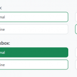 Convert Checkboxes & Radio Buttons Into Grouped Buttons – boxed-check.css