


This is a responsive, accessible, touch-enabled image comparison slider built with HTML range input, CSS/CSS3, and a little bit JavaScript.
How to use it:
1. Create the HTML structure for the image comparison slider.
- Wrap your images in a div with the class compare.
- Include your “before” and “after” images.
- Add a range input for the slider control.
<div class="compare" style="overflow: visible;">
  <img class="compare__image-one" src="before.jpg">
  <div class="compare__mask">
    <img class="compare__image-two" src="after.jpg">
  </div>
  <div class="compare__separator">
    <svg xmlns="http://www.w3.org/2000/svg" fill="none" class="compare__icon" viewBox="0 0 16 16">
      <path d="M 6 2 L 1 8 L 6 14 M 10 2 L 15 8 L 10 14" stroke="currentColor"></path>
    </svg>
  </div>
  <input class="compare__input" type="range" min="0" step="0.5" max="100" value="50">
</div>
2. Add these CSS styles to create the comparison effect and handle the slider appearance:
.compare {
  --mask-width: 50%;
  --handle-size: 32px;
  position: relative;
  border: 1px solid rgba(0, 0, 0, 0.05);
}
.compare__separator {
  position: absolute;
  top: 0;
  height: 100%;
  left: var(--mask-width);
  width: 2px;
  margin-left: -1px;
  background: black;
  z-index: 1;
  pointer-events: none;
}
.compare__image-one {
  width: 100%;
  display: block;
}
.compare__mask {
  position: absolute;
  top: 0;
  left: 0;
  height: 100%;
  z-index: 1;
  background: white;
  overflow: hidden;
  width: var(--mask-width);
}
.compare__image-two {
  height: 100%;
  width: auto;
}
.compare__input {
  appearance: none;
  -webkit-appearance: none;
  -webkit-tap-highlight-color: transparent;
  position: absolute;
  top: 0;
  left: calc(var(--handle-size) / -2);
  width: calc(100% + var(--handle-size));
  height: 100%;
  opacity: 0;
  z-index: 2;
  cursor: col-resize;
  background-color: transparent;
}
/* Firefox */
.compare__input::-moz-range-track {
  height: 100%;
}
.compare__input::-moz-range-thumb {
  height: 100%;
  border-radius: 0;
  width: var(--handle-size);
  border: none;
}
/* Webkit */
.compare__input::-webkit-slider-runnable-track {
  height: 100%;
}
.compare__input::-webkit-slider-thumb {
  -webkit-appearance: none;
  appearance: none;
  height: 100%;
  border-radius: 0;
  width: var(--handle-size);
  border: none;
}
.compare__icon {
  position: absolute;
  z-index: 2;
  color: #333;
  width: var(--handle-size);
  height: var(--handle-size);
  top: 50%;
  left: var(--mask-width);
  transform: translate(-50%, -50%);
  padding: 6px;
  border: 2px solid currentColor;
  border-radius: 50%;
  background: white;
}
.compare__icon path {
  stroke-linecap: round;
  stroke-linejoin: round;
  stroke-width: 2px;
}
3. Link the range input to the mask width using a CSS variable. The script updates the mask position as the slider moves:
const $compare = document.querySelector(".compare");
const $input = document.querySelector(".compare input");
$input.addEventListener("input", () => {
    $compare.style.setProperty("--mask-width", `${$input.value}%`);
});
$compare.style.setProperty("--mask-width", `${$input.value}%`);
See Also:
 JS Before/After Image Comparison Slider with Touch Support
 Touch-friendly Image Comparison Slider In Vanilla JS – before-after.js
 Multi-Stage Image Comparison Carousel with CSS Scroll-timeline
 Before-After Image Comparison Slider: Lightweight Web Component
 Modern Lightweight Image Comparison Slider – image-compare-viewer
 Compare Two Images With Range Input
 Fast Accessible Image Comparison Web Component – image-compare
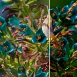 Smooth Touch-enabled Image Comparison Slider In JavaScript