


When designing elements that are going to be hovered over, displaying a reaction is always a cool effect. And in 2022, you could use CSS/CSS3 for most of the fancy effects.
This is an SCSS mixin library that provides a collection of more than 36 pretty cool hover effects for links (or any elements). It’s lightweight, fast, mobile-friendly, and modular, meaning you can pick and choose exactly which mixins you need for any particular project.
See Also:
- A Collection Of Cool Button Hover Effects – btns.css
- 60+ Image Hover Effect With Pure CSS – imagehover.css
- Creating Hover Effects with CSS3 Animations – hover.css
- Text Hover & Click Effects Pack (CSS/SCSS)
How to use it:
1. Import hover effects into your stylesheet.
@import "variables";
@import "mixins";
@import "base";
//Link Styles
@import "link-styles/link";
@import "link-styles/highlight-mix-blend-mode";
@import "link-styles/highlight-background";
@import "link-styles/crossing-triangle-waves";
@import "link-styles/background-underline-slide";
@import "link-styles/multiple-background-gradients";
@import "link-styles/clip-path-effects";
@import "link-styles/transform-underline-pseudoelement";
@import "link-styles/svg-animations";
@import "link-styles/popup-text";
@import "link-styles/fire-gif-background";
//SVG Filter Styles
@import "link-styles/svg-filter";
//Multiple Element Link Styles
@import "link-styles/fill-up-transform";
@import "link-styles/cube-rotation";
@import "link-styles/split-in-half";
2. Add the following CSS classes to link elements. That’s it.
<h2>Link Effects</h2>
<a class="link link--background-underline-from-left" href="#">Slide from left</a>
<a class="link link--background-underline-from-right" href="#">Slide from right</a>
<a class="link link--background-underline-from-strikethrough" href="#">Strikethrough slide</a>
<a class="link link--highlight-fade-in" href="#">Simple fade highlight</a>
<a class="link link--highlight-from-strikethrough" href="#">Strikethrough highlight</a>
<a class="link link--highlight-from-bottom-border" href="#">Bottom border highlight</a>
<a class="link link--multi-gradient-fill" href="#">Multiple gradient fill</a>
<a class="link link--background-crossover" href="#">Background crossover</a>
<a class="link link--four-color-background" href="#">Four color background</a>
<a class="link link--crossing-triangle-waves" href="#">Crossing Triangle Waves</a>
<a class="link link--svg-sine-wave" href="#">SVG sine wave</a>
<a class="link link--svg-large-sine-wave" href="#">SVG large sine wave</a>
<a class="link link--svg-square-wave" href="#">SVG square wave</a>
<a class="link link--popup-text" href="#">Popup text</a>
<a class="link link--fire-gif-background" href="#">Fire GIF background</a>
<h2>Inline Block Effects</h2>
<a class="link link--highlight-from-right" href="#">Fill from right</a>
<a class="link link--highlight-from-left" href="#">Fill from left</a>
<a class="link link--highlight-from-top" href="#">Fill from top</a>
<a class="link link--highlight-from-bottom" href="#">Fill from bottom</a>
<a class="link link--arrow-clip-path" href="#">Arrow effect</a>
<a class="link link--jagged-clip-path" href="#">Jagged effect</a>
<a class="link link--fine-blinds-clip-path" href="#">Blind effect</a>
<a class="link link--transform-underline-from-middle" href="#">Underline from middle</a>
<a class="link link--transform-underline-slide-over-left" href="#">Underline slide left</a>
<a class="link link--transform-underline-slide-over-right" href="#">Underline slide right</a>
<a class="link link--transform-underline-pop-up" href="#">Underline pop up</a>
<a class="link link--fire-gif-pseudoelement" href="#">Fire GIF Pseudoelement</a>
<h2>Multi Element Effects</h2>
<a class="link link--fill-up-transform" href="#">
  <span class="link--fill-up-transform__outline">Fill Up Transform</span>
  <span class="link--fill-up-transform__clip">
    <span class="link--fill-up-transform__filled">Fill Up Transform</span>
  </span>
</a>
<a class="link link--cube-rotation" href="#">
  <div class="link--cube-rotation__top">Cube Rotate Effect</div>
  <div class="link--cube-rotation__front">Cube Rotate Effect</div>
</a>
<a class="link link--split-in-half" href="#">
  <div class="link--split-in-half--top">Split in Half</div>
  <div class="link--split-in-half--bottom">Split in Half</div>
</a>
3. To use SVG filter effects, you’ll need to include the SVG below with the appropriate filter.
<svg height="0" width="0" style="position: absolute;">
  <!--Don't hide this with display: none; or the filter won't show on Firefox! -->
  <filter id="turbulenceFilter" x="-20%" y="-20%" width="140%" height="140%" filterUnits="objectBoundingBox" primitiveUnits="userSpaceOnUse" color-interpolation-filters="linearRGB">
    <feTurbulence type="turbulence" baseFrequency="0.01 0.03" numOctaves="2" seed="1337" stitchTiles="noStitch" result="turbulence"/>
    <feDisplacementMap in="SourceGraphic" in2="turbulence" scale="10" xChannelSelector="G" yChannelSelector="A" result="displacementMap"/>
  </filter>
  <filter id="outlineFilter" x="-20%" y="-20%" width="140%" height="140%" filterUnits="objectBoundingBox" primitiveUnits="userSpaceOnUse" color-interpolation-filters="linearRGB">
    <feMorphology operator="dilate" radius="2 2" in="SourceAlpha" result="morphology"/>
    <feFlood flood-color="#072AC8" flood-opacity="1" result="flood"/> <!--Add your link colour here.-->
    <feComposite in="flood" in2="morphology" operator="in" result="composite"/>
    <feComposite in="composite" in2="SourceAlpha" operator="out" result="composite1"/>
  </filter>
  <filter id="dustFilter" x="-20%" y="-20%" width="140%" height="140%" filterUnits="objectBoundingBox" primitiveUnits="userSpaceOnUse" color-interpolation-filters="linearRGB">
    <feTurbulence type="turbulence" baseFrequency="0.8 0.8" numOctaves="2" seed="4" stitchTiles="stitch" result="turbulence"/>
    <feColorMatrix type="matrix" values="0 0 0 0 0
  0 0 0 0 0
  0 0 0 0 0
  0 0 0 -35 10" in="turbulence" result="colormatrix"/>
    <!-- Increase the -35 to get more dust, decrease to get less.-->
    <feComposite in="colormatrix" in2="SourceAlpha" operator="in" result="composite"/>
    <feTurbulence type="turbulence" baseFrequency="0.001 0.001" numOctaves="1" seed="2" stitchTiles="stitch" result="turbulence1"/>
    <!-- Change the scale factor of the displacement map until it looks right. -->
    <feDisplacementMap in="composite" in2="turbulence1" scale="3" xChannelSelector="R" yChannelSelector="B" result="displacementMap"/>
    <!-- Set the link color below. -->
    <feFlood flood-color="#072AC8" flood-opacity="1" x="0%" y="0%" width="100%" height="100%" result="flood"/>
    <feComposite in="flood" in2="displacementMap" operator="in" x="0%" y="0%" width="100%" height="100%" result="composite1"/>
  </filter>
  <filter id="horizontalBlurFilter" x="-20%" y="-20%" width="140%" height="140%" filterUnits="objectBoundingBox" primitiveUnits="userSpaceOnUse" color-interpolation-filters="linearRGB">
    <feGaussianBlur stdDeviation="20 0" x="-20%" y="0%" width="140%" height="100%" in="SourceGraphic" edgeMode="none" result="blur"/>
    <!--Increase the 20 stdDeviation value for more blur.-->
    <!--Increase the x from -20% to 0% and decrease width to 100% to stop the link blurring over other text. -->
  </filter>
  <filter id="verticalBlurFilter" x="-20%" y="-20%" width="140%" height="140%" filterUnits="objectBoundingBox" primitiveUnits="userSpaceOnUse" color-interpolation-filters="linearRGB">
    <feGaussianBlur stdDeviation="0 5" x="-10%" y="-50%" width="120%" height="200%" in="SourceGraphic" edgeMode="none" result="blur"/>
  </filter>
  <filter id="stripeFilter" x="-20%" y="-20%" width="140%" height="140%" filterUnits="objectBoundingBox" primitiveUnits="userSpaceOnUse" color-interpolation-filters="linearRGB">
    <feTurbulence type="turbulence" baseFrequency="0.03 0" numOctaves="10" seed="3" stitchTiles="stitch" result="turbulence"/>
    <feColorMatrix type="saturate" values="20" in="morphology1" result="colormatrix"/>
    <feFlood flood-color="#ffeb00" flood-opacity="1" result="flood"/>
    <feComposite in="flood" in2="SourceGraphic" operator="in" result="composite"/>
    <feComposite in="colormatrix" in2="SourceGraphic" operator="in" result="composite1"/>
    <feMerge result="merge">
      <feMergeNode in="composite" result="mergeNode"/>
      <feMergeNode in="composite1" result="mergeNode1"/>
      <feMergeNode in="composite1" result="mergeNode2"/>
      <feMergeNode in="composite1" result="mergeNode3"/>
      <feMergeNode in="composite1" result="mergeNode4"/>
      <feMergeNode in="composite1" result="mergeNode5"/>
      <feMergeNode in="composite1" result="mergeNode6"/>
    </feMerge>
  </filter>
</svg>
<a class="link link--svg-filter-turbulence" href="">Turbulence Distortion Effect</a> <a class="link link--svg-filter-outline" href="">Link Outline Effect</a> <a class="link link--svg-filter-dust" href="">Dust Effect</a> <a class="link link--svg-filter-horizontal-blur" href="">Horizontal Blur Effect</a> <a class="link link--svg-filter-vertical-blur" href="">Vertical Blur Effect</a> <a class="link link--svg-filter-colourful-stripe" href="">Colourful Stripe Effect</a>
4. Override the default CSS variables.
/* Color Scheme */
$color--black: rgb(0, 0, 0);
$color--grey: rgb(150, 160, 161);
$color--white: rgb(255, 255, 255);
$color--dark-blue: rgb(7, 42, 200);
$color--blue: rgb(30, 150, 252);
$color--light-blue: rgb(162, 214, 249);
$color--yellow: rgb(252, 243, 0);
$color--dark-yellow: rgb(255, 189, 0);
$color--primary: $color--yellow;
$color--secondary: $color--dark-blue;
/* Typography */
$font-primary: Nanum Gothic, Helvetica, sans-serif;
$font-size--heading: 46px;
$font-size--heading-mobile: 34px;
$font-size--subheading: 28px;
$font-size--paragraph: 20px;
$font-size--paragraph-mobile: 18px;
.bold {
font-weight: 700;
}
$underline-height: 0.3ex;
$thick-underline-height: 0.4ex;
See Also:
 7 Creative Hover Effects Using CSS Box-Shadow
 150+ CSS Hover Effects for Modern Web Apps – ChangeHover.css
 Create Interactive Pixelated Image Transitions with JavaScript
 Interactive 3D Parallax Effect on Hover with Pure CSS/CSS3
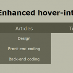 Determine User Intent Using Vanilla JavaScript – sv-hover-intent
 Minimal Ripple Click & Hover Effect – ripple.js
 3D Hover-triggered Wave Effect With Pure CSS/CSS3
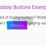 Custom Cursor That Interacts With Buttons – Wobbly Buttons