


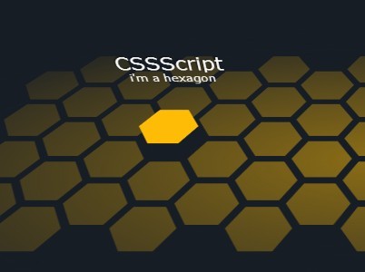
A 3D hexagon(honeycomb) grid layout with cool hover effects, built on top of CSS3 transitions and transforms. Created by the-mo.
How to use it:
Create the Html for a hexagon grid layout.
<div class="container">
  <div class="honeycomb">
    <div class="hexes-1 column"> <a class="hex">
      <div class="wrapper">
        <div class="hexagon color-1"></div>
      </div>
      <span class="content"> <strong>Hello!</strong> <small>i'm a hexagon</small> </span> </a> <a class="hex">
      <div class="wrapper">
        <div class="hexagon color-1"></div>
      </div>
      <span class="content"> <strong>Hello!</strong> <small>i'm a hexagon</small> </span> </a> <a class="hex">
      <div class="wrapper">
        <div class="hexagon color-1"></div>
      </div>
      <span class="content"> <strong>Hello!</strong> <small>i'm a hexagon</small> </span> </a> <a class="hex">
      <div class="wrapper">
        <div class="hexagon color-1"></div>
      </div>
      <span class="content"> <strong>Hello!</strong> <small>i'm a hexagon</small> </span> </a> </div>
    ...
    <div class="hexes-n column">
      ...
    </div>

    <div class="shadows"></div>
  </div>
</div>
The required CSS/CSS3 styles.
.container {
  position: relative;
  -webkit-transition: all 0.3s ease-out;
  transition: all 0.3s ease-out;
  height: 500px;
  -webkit-perspective: 700px;
  perspective: 700px;
  z-index: 10;
  overflow: hidden;
}
.container .honeycomb {
  display: block;
  position: absolute;
  margin-left: -465px;
  padding-left: 18px;
  left: 50%;
  text-align: center;
  height: 450px;
  width: 930px;
  -ms-transform: rotateX(45deg) rotateY(0deg);
  -webkit-transform: rotateX(45deg) rotateY(0deg);
  transform: rotateX(45deg) rotateY(0deg);
  -webkit-transform-style: preserve-3d;
  transform-style: preserve-3d;
  -ms-transform-origin: center 65%;
  -webkit-transform-origin: center 65%;
  transform-origin: center 65%;
  z-index: 5;
}
.container .honeycomb .column {
  display: block;
  float: left;
  width: 62px;
}
.container .honeycomb .column:nth-child(odd) { margin-top: 36px; }
.container .honeycomb .hex {
  display: block;
  position: relative;
  float: left;
  margin: 0;
  height: 72px;
  width: 62px;
  color: #fff;
  cursor: pointer;
  text-decoration: none;
  -webkit-transform-style: preserve-3d;
  transform-style: preserve-3d;
  -webkit-transition: all 0.3s ease-out;
  transition: all 0.3s ease-out;
 filter: progid:DXImageTransform.Microsoft.Alpha(Opacity=50);
  opacity: 0.5;
}
.container .honeycomb .hex:hover {
  opacity: 1;
  -ms-transform: translateZ(20px);
  -webkit-transform: translateZ(20px);
  transform: translateZ(20px);
  -webkit-transition-duration: 200ms;
  transition-duration: 200ms;
}
.container .honeycomb .hex:hover .content {
 filter: progid:DXImageTransform.Microsoft.Alpha(enabled=false);
  opacity: 1;
  -ms-transform: rotateX(-90deg) translateZ(-40px) translateY(-50px);
  -webkit-transform: rotateX(-90deg) translateZ(-40px) translateY(-50px);
  transform: rotateX(-90deg) translateZ(-40px) translateY(-50px);
}
.container .honeycomb .hex .wrapper {
  display: block;
  position: absolute;
  top: 0;
  left: 0;
  height: 100%;
  width: 100%;
}
.container .honeycomb .hex .wrapper .color-1 { background: #ffbc06; }
.container .honeycomb .hex .wrapper .color-1:before { border-right-color: #ffbc06; }
.container .honeycomb .hex .wrapper .color-1:after { border-left-color: #ffbc06; }
.container .honeycomb .hex .content {
  display: block;
  position: absolute;
  top: 0;
  left: -80px;
  text-align: center;
  width: 200px;
 filter: progid:DXImageTransform.Microsoft.Alpha(Opacity=0);
  opacity: 0;
  -moz-transition: all 0.3s ease-out 0.1s;
  -o-transition: all 0.3s ease-out 0.1s;
  -webkit-transition: all 0.3s ease-out;
  -webkit-transition-delay: 0.1s;
  -webkit-transition: all 0.3s ease-out 0.1s;
  transition: all 0.3s ease-out 0.1s;
  -ms-transform: rotateX(-90deg) translateZ(-40px) translateY(-40px);
  -webkit-transform: rotateX(-90deg) translateZ(-40px) translateY(-40px);
  transform: rotateX(-90deg) translateZ(-40px) translateY(-40px);
  pointer-events: none;
  -webkit-font-smoothing: antialiased;
}
.container .honeycomb .hex .content strong {
  display: block;
  font: 600 26px/1.1 verdana, sans-serif;
  overflow: hidden;
  text-overflow: ellipsis;
  white-space: nowrap;
  text-shadow: -1px -1px 2px rgba(0, 0, 0, 0.8);
}
.container .honeycomb .hex .content small {
  display: block;
  font: 15px/1.1 verdana, sans-serif;
}
.container .honeycomb .shadows {
  display: block;
  position: absolute;
  top: -15%;
  left: -15%;
  height: 130%;
  width: 130%;
  background-image: -webkit-radial-gradient(closest-side, rgba(23, 29, 37, 0), #171d25);
  background-image: radial-gradient(closest-side, rgba(23, 29, 37, 0), #171d25);
 filter: progid:DXImageTransform.Microsoft.Alpha(Opacity=90);
  opacity: 0.9;
  -ms-transform: translateZ(10px);
  -webkit-transform: translateZ(10px);
  transform: translateZ(10px);
  pointer-events: none;
}
.hexagon {
  display: block;
  position: absolute;
  width: 36px;
  height: 62px;
  background-color: #ffffff;
}
.hexagon:before,
.hexagon:after {
  content: "";
  position: relative;
  float: left;
  border-top: 31px solid transparent;
  border-bottom: 31px solid transparent;
}
.hexagon:before {
  border-right: 18px solid #ffffff;
  left: -18px;
}
.hexagon:after {
  border-left: 18px solid #ffffff;
  right: -18px;
}
.hidden { display: none; }
See Also:
 Responsive Hexagon Grid Layout Using CSS Grid and Container Queries
 Create Flexible Hexagonal Grids with HoneyCombLayoutJs
 Responsive Fluid Hexagon Grid Layout In CSS/SASS – Hextile
 Responsive Hexagon Grid In Pure CSS
 Responsive Hexagon Layout In Pure CSS – Hexi-Flexi Grid
 JavaScript Video Conference Grid Layout Library with Gallery & Spotlight Modes
 Neat Block Grid In Pure CSS – wall.css
 Responsive Masonry Layouts with CSS Grid and Mason-it.js
if i want to put a background image? can i?