


WebTUI is a modular CSS library that gives your web projects the distinct look and feel of a Terminal User Interface (TUI).
It’s not a full-blown framework like Bootstrap or Tailwind; think of it more as a focused styling layer.
Its main function is to provide base styles, components, and utilities that evoke that classic terminal vibe using modern CSS features like layers.
You may also find these CLI AI coding agents useful for code review, refactoring, and command-line workflows.
Features:
- Modular Design: Import only the CSS components and utilities you actually need. Keeps things lightweight.
- CSS Layer Control: Leverages
@layerfor predictable style precedence. This drastically reduces the need for!importanthacks. - Minimal Markup: Designed to work with simple HTML structures and attributes, avoiding excessive class names.
- Theming: Comes with basic light/dark modes and supports theme plugins (like Catppuccin, Nord) or custom CSS variables.
- Plugins: Extend functionality with things like Nerd Font icons for specific components.
- Pure CSS: It provides the styles; you still structure your HTML and might write some layout CSS.
How to use it:
1. Install the package using your preferred package manager:
bun add @webtui/css
npm install @webtui/css
yarn add @webtui/css
pnpm add @webtui/css
2. In your main CSS file (e.g., global.css, index.css), you must define the layer order before any WebTUI imports. This tells the browser how to prioritize the styles.
/* Define the layers first */
@layer base, utils, components;
/* Import the base styles */
@import "@webtui/css/base.css";
/* Now import only the utilities and components you need */
/* Utils */
@import "@webtui/css/utils/box.css"; /* For box borders */
/* Components */
@import "@webtui/css/components/button.css";
@import "@webtui/css/components/typography.css";
@import "@webtui/css/components/badge.css";
@import "@webtui/css/components/input.css";
/* If using a theme plugin, import it last */
@import "@webtui/theme-catppuccin";
@import '@webtui/theme-nord';
/* If using the Nerd Font plugin, import it after components/themes */
@import "@webtui/plugin-nf";
3. Or load the library from a CDN.
<style>
  @layer base, utils, components;
</style>
<!-- Import specific versions from CDN -->
<link rel="stylesheet" href="https://cdn.jsdelivr.net/npm/@webtui/css@VERSION/dist/base.css" />
<link rel="stylesheet" href="https://cdn.jsdelivr.net/npm/@webtui/css@VERSION/dist/utils/box.css" />
<link rel="stylesheet" href="https://cdn.jsdelivr.net/npm/@webtui/css@VERSION/dist/components/button.css" />
<!-- Add other components/themes/plugins as needed -->
<link rel="stylesheet" href="https://cdn.jsdelivr.net/npm/@webtui/theme-catppuccin@VERSION/dist/index.css" />
<link rel="stylesheet" href="https://cdn.jsdelivr.net/npm/@webtui/plugin-nf@VERSION/dist/index.css" />
</head>
<!-- Full Library Import: -->
<link rel="stylesheet" href="https://cdn.jsdelivr.net/npm/@webtui/css@VERSION/dist/full.css" />
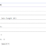
4. WebTUI applies styles based on standard HTML elements and custom attributes like is-, box-, variant-, size-, and cap-.
- Typography: Styles
h1–h6,p,a,code, etc. Import@webtui/css/components/typography.css. - Badge: Use
<span is-="badge">. Customize withvariant-(matches theme colors). Extend styles via CSS variables (--badge-color,--badge-text) or add new variants in thecomponentslayer. Nerd Font plugin addscap-attribute for different end styles. Import@webtui/css/components/badge.css. - Button: Use
<button>or any element withis-="button". Customize withvariant-,size-. Usebox-(requires@webtui/css/utils/box.css) for borders (square,round,double). Style via--button-primary,--button-secondary. Import@webtui/css/components/button.css. - Input: Styles
<input>. Forbox-borders, wrap the input in a<div box-="...">because inputs don’t support pseudo-elements needed for the box effect. Alternatively, use<div contenteditable box-="...">. Import@webtui/css/components/input.css.
<!-- Typography (styles H1-H6, p, etc.) -->
<h1>Main Heading</h1>
<h2>Subheading</h2>
<p>Some text with <code>inline code</code> and a <a href="#">link</a>.</p>
<!-- Button -->
<button>Default Button</button>
<button variant-="foreground1">Colored Button</button>
<button size-="small">Small Button</button>
<button disabled>Disabled</button>
<!-- Button with Box Utility -->
<button box-="square">Square Border</button>
<button box-="round" variant-="background2">Round & Colored</button>
<!-- Badge -->
<span is-="badge">Info</span>
<span is-="badge" variant-="foreground2">Low Priority</span>
<!-- Input (requires wrapping for box-) -->
<div box-="round">
  <input type="text" placeholder="Enter text..." />
</div>
<!-- Box Utility on a Div -->
<div box-="double">
  <p>Content inside a double-lined box.</p>
</div>
5. Check out the official documentation for more usage of Themes and Plugins.
Changelog:
v0.1.8 (06/13/2026)
- Applies word-break: break-all to html, body
- Adds initial values for the progress component so that it works with lightningcss
- Fixes table borders (yet again)
- Adds a variant- attribute to the Separator Component
- Adds a variant- attribute to the Table Component
- Adds a round-tree marker variant to the List Component
- Adds a –list-marker-color CSS variable to the List Component
- Adds a –blockquote-indent-color CSS variable to the Blockquote Component
v0.1.6 (01/08/2026)
- Properly displays the Table Component
- Adds a new Accordion Component
- Updates the Progress Component to use CSS variables for better cross-browser compatibility.
- Bugfixes
v0.1.5 (08/21/2025)
- Added the View Component
- Added the Progress Component
- Removed the arrow marker from the Popover Component on Safari
v0.1.4 (07/15/2025)
- Corrects an input styling regression introduced in 0.1.3
v0.1.3 (07/10/2025)
- Added the Spinner Component
- Added the Range Component
- Fixed table borders
- Fixed input component scoping
v0.1.2 (06/27/2025)
- Switches appear dimmer when unchecked
- Switches correctly show the track when the <input> stylesheet is imported
- Added edge/bisecting caps to the Separator Component
- Properly aligns Badges vertically
- Removes an invalid initial-value property from the Dialog Component
- Removes the markdown-like # markers prefixing heading elements <h1>-<h6>
- Allows the –box-border-color CSS to be inherited and controlled with CSS variables
- Allows the –table-border-color CSS to be inherited and controlled with CSS variables
- Allows the –separator-color CSS to be inherited and controlled with CSS variables
v0.1.1 (05/26/2025)
- New Switch Component
- Tooltips remain shown when you hover your mouse over the tooltip content
v0.1.0 (05/26/2025)
- Removed the contain:* keyword from the box- utility property in favor of shear
- Adds the pre Component
- Adds the Tooltip Component
- Adds the Table Component
- Adds the Dialog Component
- Adds a half-block height variants to Buttons so they don’t appear so tall
See Also:
 Terminal Style CSS Framework – terminal.css
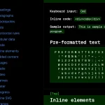 Classless Themeable CSS Framework For Modern Web Design – Dev.css
 CSS Framework With Almost No Classes – no.css
 Build Terminal UI with Terminal.css CSS Framework
 Classless CSS Framework with Georgia & Verdana Typography System – MCSS
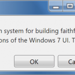 7.css: Windows 7 CSS Framework
 Minimalist CSS Framework For Creating Modern Web Pages – Mgplus
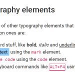 Minimal Classless CSS Framework – Simple.css