


A pie-like time clock in the flat style, built on top of SVG, CSS, CSS3 transforms and a little bit Javascript. Can be used as a timer or a loader to indicate the loading progress.
Getting started:
Draw a time clock using SVG element.
<svg class="rotate" viewbox="0 0 250 250">
    <path id="loader" transform="translate(125, 125)"/>
</svg>
Create dots for the time clock.
<div class="dots">
    <span class="time deg0"></span>
    <span class="time deg45"></span>
    <span class="time deg90"></span>
    <span class="time deg135"></span>
</div>
Wrap them into a container element with CSS class of ‘timer’.
<div class="timer">
  <svg class="rotate" viewbox="0 0 250 250">
    <path id="loader" transform="translate(125, 125)"/>
  </svg>
  <div class="dots">
    <span class="time deg0"></span>
    <span class="time deg45"></span>
    <span class="time deg90"></span>
    <span class="time deg135"></span>
  </div>
</div>
The CSS rules.
.timer {
  width: 300px;
  height: 300px;
  overflow: hidden;
  margin: 0 auto;
  position: relative;
}
.timer .rotate {
  width: 100%;
  height: 100%;
  display: block;
  position: relative;
  z-index: 10;
}
.timer .rotate #loader {
  fill: #ff6d69;
}
.timer .dots {
  width: 100%;
  height: 100%;
  position: absolute;
  z-index: 15;
  top: 0;
  left: 0;
}
.timer .dots .time {
  height: 100%;
  width: 6%;
  display: block;
  background-image: -moz-linear-gradient(#ffc8c6, #ffc8c6 16%, rgba(0, 0, 0, 0) 16%, rgba(0, 0, 0, 0) 84%, #ffc8c6 84%, #ffc8c6);
  background-image: -webkit-linear-gradient(#ffc8c6, #ffc8c6 16%, rgba(0, 0, 0, 0) 16%, rgba(0, 0, 0, 0) 84%, #ffc8c6 84%, #ffc8c6);
  background-image: linear-gradient(#ffc8c6, #ffc8c6 16%, rgba(0, 0, 0, 0) 16%, rgba(0, 0, 0, 0) 84%, #ffc8c6 84%, #ffc8c6);
  margin-left: -3%;
  left: 50%;
  position: absolute;
}
.timer .dots .time.deg45 {
  -moz-transform: rotate(45deg);
  -ms-transform: rotate(45deg);
  -webkit-transform: rotate(45deg);
  transform: rotate(45deg);
}
.timer .dots .time.deg90 {
  -moz-transform: rotate(90deg);
  -ms-transform: rotate(90deg);
  -webkit-transform: rotate(90deg);
  transform: rotate(90deg);
}
.timer .dots .time.deg135 {
  -moz-transform: rotate(135deg);
  -ms-transform: rotate(135deg);
  -webkit-transform: rotate(135deg);
  transform: rotate(135deg);
}
The javascript to enable the time clock.
var seconds = 10;
var doPlay = true;
var loader = document.getElementById('loader')
  , α = 0
  , π = Math.PI
  , t = (seconds/360 * 1000);
(function draw() {
  α++;
  α %= 360;
  var r = ( α * π / 180 )
    , x = Math.sin( r ) * 125
    , y = Math.cos( r ) * - 125
    , mid = ( α > 180 ) ? 1 : 0
    , anim = 'M 0 0 v -125 A 125 125 1 '
           + mid + ' 1 '
           +  x  + ' '
           +  y  + ' z';
  //[x,y].forEach(function( d ){
  //  d = Math.round( d * 1e3 ) / 1e3;
  //});
  loader.setAttribute( 'd', anim );
  if(doPlay){
    setTimeout(draw, t); // Redraw
  }
})();
See Also:
 Creating A Flat Clock with CSS3 Transitions and Transforms
 Create A Simple Fashion Clock with Javascript and CSS3
 Build 3D Voxel Art in SVG with heerich.js
 Generate Highly Customizable SVG Waves With Dynamowaves.js
 Animated Analog Clocks for Vanilla JS, React & Vue.js – Clock UI
 Save SVG Data To A File Using the svg-export JavaScript library
 Neumorphism-style Domino Clock with JavaScript and CSS
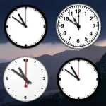 Create Customizable Analog Clocks With JavaScript – MagicClock
Thanks!