Float: left Based Responsive CSS Layout – floaty.css
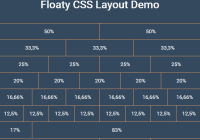
The floaty.css library helps web developers to create a cross-browser responsive layout based on CSS float: left property.


The floaty.css library helps web developers to create a cross-browser responsive layout based on CSS float: left property.

PSone.css is a Playstation 1 style, 16-bit CSS Framework created for y generation (80s and 90s). Inspired by the NES.css 8-bit CSS framework.

The medium.css CSS library brings the Medium.com layout and typography to your web project.

Yet another CSS library which applies Instagram inspired filters to your images.
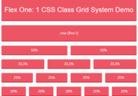
Flex One is a dead simple CSS class to create infinite responsive grid systems based on CSS flexbox layout.
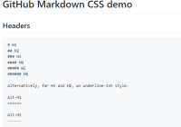
markdown.css is an ultra-light CSS library to replicate the Github markdown style similar to the familiar github-markdown-css.

Mustard UI is a lightweight, beautiful starter CSS framework for faster modern web app development.
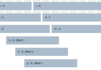
CSSGridSys is a small CSS library used for creating responsive, cross-platform, 12-column grid layout for modern web design.

A responsive, customizable, modular and open source HTML5/CSS/SCSS framework for creating modern clean web pages and web applications.

A set of 5 modern, smooth image hover effects for portfolio items. Based on pure CSS/CSS3.