


| Author: | liedekef |
|---|---|
| Views Total: | 125 views |
| Official Page: | Go to website |
| Last Update: | September 3, 2025 |
| License: | MIT |
Preview:

Description:
fdatepicker is a lightweight Vanilla JS date/time/date range picker that creates feature-rich date selection interfaces without framework dependencies like jQuery.
You can get it running in seconds using simple HTML data- attributes directly in your markup, or you can use its straightforward JavaScript API for more complex configurations.
Features:
- Flexible Date Selection: Supports single date, multiple dates, and date range picking.
- Time Picker: Includes a fully configurable time selector with 12-hour or 24-hour formats.
- Customization & Theming: Provides clean CSS classes for easy styling to match your application’s look and feel.
- Localization: Comes with built-in support for over 25 languages and allows for custom language configurations.
- Accessibility: Full keyboard navigation support is included out of the box.
How to use it:
1. Include the FDatepicker’s JavaScript and Stylesheet on the web page.
<link href="dist/css/fdatepicker.min.css" rel="stylesheet" type="text/css">
<script src="dist/js/fdatepicker.min.js"></script>
2. You’ll also need to include a language file:
fdatepicker.ar.js– Arabicfdatepicker.cs.js– Czechfdatepicker.da.js– Danishfdatepicker.de.js– Germanfdatepicker.el.js– Greekfdatepicker.en.js– English (default)fdatepicker.es.js– Spanishfdatepicker.fi.js– Finnishfdatepicker.fr.js– Frenchfdatepicker.hu.js– Hungarianfdatepicker.hy.js– Armenianfdatepicker.it.js– Italianfdatepicker.ka.js– Georgianfdatepicker.ko.js– Koreanfdatepicker.nl.js– Dutchfdatepicker.nl-BE.js– Dutch (Belgium)fdatepicker.pl.js– Polishfdatepicker.pt.js– Portuguesefdatepicker.pt-BR.js– Portuguese (Brazil)fdatepicker.ro.js– Romanianfdatepicker.ru.js– Russianfdatepicker.si.js– Slovenianfdatepicker.sk.js– Slovakfdatepicker.sv.js– Swedishfdatepicker.th.js– Thaifdatepicker.tr.js– Turkishfdatepicker.uk.js– Ukrainianfdatepicker.zh.js– Chinese
<script src="dist/js/i18n/fdatepicker.en.js"></script>
3. Create an input field for your date picker.
<input type="text" class="fdatepicker-input" id="example" >
4. Initialize the date picker with default options.
const myElement = document.getElementById('example');
const datepicker = new FDatepicker(myElement, {
  // options here
});
5. You can customize the date picker by passing configuration options via JavaScript or HTML Data attributes.
format: Sets the date display format in the input field. (Default:'m/d/Y')altFormat: Defines the format for thealtField, typically a machine-readable format like'Y-m-d'.altField: Specifies the ID of an alternative (often hidden) input to store the date in thealtFormat.startView: Determines the initial view when the picker opens. Options are'days','months', or'years'. (Default:'days')minDate: The earliest date a user can select. Can be a Date object or a string like'2025-01-01'.maxDate: The latest date a user can select.disabledDates: An array of date strings (e.g.,['2025-12-25']) to make specific dates unselectable.range: Set totrueto enable date range selection. (Default:false)multiple: Set totrueto allow selecting multiple, non-consecutive dates. (Default:false)multipleSeparator: The character used to separate dates in the input field whenmultipleis true. (Default:',')altFieldMultipleDatesSeparator: The separator for multiple dates in the alternative field. (Default:',')multipleDisplaySelector: A CSS selector for an element where information about multiple selected dates will be displayed.timepicker: Set totrueto enable the time selection interface. (Default:false)ampm: Set totruefor a 12-hour clock with an AM/PM toggle;falsefor a 24-hour clock. (Default:true)timepickerDefaultNow: Iftrue, the time picker defaults to the current time. (Default:true)hoursStep: The increment value for the hours input. (Default:1)minutesStep: The increment value for the minutes input (e.g.,15for 15-minute intervals). (Default:1)minHours: The earliest hour that can be selected.maxHours: The latest hour that can be selected.minMinutes: The earliest minute that can be selected.maxMinutes: The latest minute that can be selected.autoClose: Iftrue, the datepicker closes automatically after a date is selected. (Default:true)firstDayOfWeek: Sets the starting day of the week, where0is Sunday and1is Monday. (Default:0)todayButton: Set totrueto display a button that jumps to today’s date. (Default:true)clearButton: Set totrueto show a button that clears the selected date. (Default:true)closeButton: Set totrueto display a button that closes the datepicker. (Default:true)
<input type="text" class="fdatepicker-input" id="example" data-format="m/d/Y" data-auto-close="false">
// OR
const datepicker = new FDatepicker(myElement, {
  format: '',
  startView: 'days',
  minDate: null,
  maxDate: null,
  disabledDates: [],
  altField: null,
  altFormat: 'Y-m-d',
  range: true,
  multiple: true,
  multipleSeparator: ',',
  altFieldMultipleDatesSeparator: ',',
  multipleDisplaySelector: '.selected-dates-display',
  autoClose: true,
  firstDayOfWeek: 0, // 0 = Sunday, 1 = Monday, etc.
  timepickerDefaultNow: true,
  todayButton: true,
  clearButton: true,
  closeButton: true,
  timepicker: false,
  timeOnly: false,
  ampm: false,
  hoursStep: 1,
  minutesStep: 1,
  minHours: null,
  maxHours: null,
  minMinutes: 0,
  maxMinutes: 59,
});
6. API methods.
FDatepicker.setMessages(customMessages): Sets or overrides global localization strings (e.g., month names, button labels) for all subsequent datepicker instances.FDatepicker.destroyAll(): Destroys all active fdatepicker instances on the page and removes their associated event listeners. This is useful for cleanup in single-page applications.FDatepicker.formatDate(date, format, locale): A utility function to format a JavaScriptDateobject into a string based on a given format, using the specified locale if provided.instance.open(): Opens the datepicker pop-up.instance.close(): Closes the datepicker pop-up.instance.toggle(): Toggles the visibility of the datepicker pop-up (opens it if closed, closes it if open).instance.destroy(): Removes a single datepicker instance, cleans up its DOM elements, and detaches all event listeners.instance.update(option, value)orupdate({option: value}): Changes one or more configuration options on an already initialized datepicker.instance.render(): Re-renders the datepicker’s internal state. This is useful after manually changing options to ensure the UI reflects the changes.
FAQs:
Q: How do I handle form validation with FDatepicker?
A: FDatepicker updates the input value on selection, triggering standard form validation events. For custom validation, listen to the ‘change’ event on the input element. When using altField, validate against the hidden field value for consistent server-side processing.
Q: How does FDatepicker handle timezone considerations?
A: FDatepicker works with local browser time and doesn’t perform timezone conversions. For applications requiring timezone handling, process the selected date values server-side or use a separate timezone library like moment-timezone.
Q: How do I implement server-side date validation?
A: When using altField with altFormat, validate against the alternative field value since it uses a consistent format. For direct input validation, parse the display format on the server side matching your client-side format configuration.
Changelog:
09/03/2025
- v3.0.22: AM/PM also in the correct case on the buttons
08/22/2025
- v3.0.16: bugfix
08/15/2025
- v3.0.14: bugfix
08/13/2025
- v3.0.13: better year nav
08/11/2025
- v3.0.12: make today work as expected and force dayview if value is present
08/08/2025
- v3.0.11: CSS finetuning
08/07/2025
- v3.0.10: better focus for timepicker
See Also:
 Powerful, Customizable JavaScript Date Picker – Datelite
 Easy Datetime & Date Range Pickers in Vanilla JavaScript
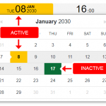 Feature-rich Datetime Picker Component With JavaScript
 Versatile Datetime Picker For Bulma – bulma-calendar
 Full-featured Data & Time Picker Component – Easepick
 Flat Style JavaScript Date Picker – flatpickr
 Lightweight Accessible Date Picker Component – WC Datepicker
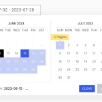 Elegant Accessible Date Range Picker In JavaScript – Hotel Datepicker