


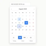
Easepick is a modular, customizable, multilingual, feature-rich date & time picker library built using the latest web technologies (like Shadow DOM).
It is designed to be highly modular, which means that you only have to include the specific modules you need for your date picker. With Easepick, you can easily create a variety of date pickers, including time pickers, date range pickers, hotel calendars, and much more.
How to use it:
1. Installation.
// Modular
// Core
npm install @easepick/core
// Plugins
npm install @easepick/amp-plugin
npm install @easepick/range-plugin
npm install @easepick/lock-plugin
npm install @easepick/preset-plugin
npm install @easepick/kbd-plugin
npm install @easepick/time-plugin
// CDN
<script src="https://cdn.jsdelivr.net/npm/@easepick/core@Version/dist/index.umd.min.js"></script>
<script src="https://cdn.jsdelivr.net/npm/@easepick/datetime@Version/dist/index.umd.min.js"></script>
<script src="https://cdn.jsdelivr.net/npm/@easepick/base-plugin@Version/dist/index.umd.min.js"></script>
<script src="https://cdn.jsdelivr.net/npm/@easepick/amp-plugin@Version/dist/index.umd.min.js"></script>
<script src="https://cdn.jsdelivr.net/npm/@easepick/range-plugin@Version/dist/index.umd.min.js"></script>
<script src="https://cdn.jsdelivr.net/npm/@easepick/lock-plugin@Version/dist/index.umd.min.js"></script>
<script src="https://cdn.jsdelivr.net/npm/@easepick/preset-plugin@Version/dist/index.umd.min.js"></script>
<script src="https://cdn.jsdelivr.net/npm/@easepick/kbd-plugin@Version/dist/index.umd.min.js"></script>
<script src="https://cdn.jsdelivr.net/npm/@easepick/time-plugin@Version/dist/index.umd.min.js"></script>
// Bundle
npm install @easepick/bundle
// CDN
<script src="https://cdn.jsdelivr.net/npm/@easepick/bundle@Version/dist/index.umd.min.js"></script>
2. Create an input field on the page.
<input id="datepicker"/>
3. Create a new date picker instance.
const picker = new easepick.create({
      element: "#datepicker",
      css: [
        "https://cdn.jsdelivr.net/npm/@easepick/bundle@Version/dist/index.css"
      ],
})
4. Register plugins. Available plugins:
- AmpPlugin: Extra configs
- RangePlugin: Date range selection
- LockPlugin: Disable days
- PresetPlugin: Predefined date ranges
- KbdPlugin: Keyboard navigation
- TimePlugin: Time picker
const picker = new easepick.create({
      element: "#datepicker",
      css: [
        "https://cdn.jsdelivr.net/npm/@easepick/bundle@Version/dist/index.css"
      ],
      plugins: [
        "AmpPlugin",
        "RangePlugin",
        "LockPlugin",
        "PresetPlugin",
        "KbdPlugin",
        "TimePlugin"
      ]
})
5. Core options.
const picker = new easepick.create({
      doc: document, // pass ShadowRoot
      css: [],
      element: null,
      firstDay: 1, // 0 - Sunday, 1 - Monday, 2 - Tuesday
      grid: 1, // Number of calendar columns
      calendars: 1, // Number of visible months.
      lang: 'en-US',
      date: null, // Preselect date
      format: 'YYYY-MM-DD',
      readonly: true,
      autoApply: true,
      header: false,
      inline: false,
      scrollToDate: true,
      locale: {
        nextMonth: '<svg width="11" height="16" xmlns="http://www.w3.org/2000/svg"><path d="M2.748 16L0 13.333 5.333 8 0 2.667 2.748 0l7.919 8z" fill-rule="nonzero"/></svg>',
        previousMonth: '<svg width="11" height="16" xmlns="http://www.w3.org/2000/svg"><path d="M7.919 0l2.748 2.667L5.333 8l5.334 5.333L7.919 16 0 8z" fill-rule="nonzero"/></svg>',
        cancel: 'Cancel',
        apply: 'Apply',
      },
      documentClick: this.binds.hidePicker,
      plugins: [],
})
6. Plugin options.
const picker = new easepick.create({
      // AmpPlugin
      AmpPlugin: {
        dropdown: {
          months: false,
          years: false,
          minYear: 1950,
          maxYear: null,
        },
        darkMode: true,
        locale: {
          resetButton: `<svg xmlns="http://www.w3.org/2000/svg" height="24" width="24"><path d="M13 3c-4.97 0-9 4.03-9 9H1l3.89 3.89.07.14L9 12H6c0-3.87 3.13-7 7-7s7 3.13 7 7-3.13 7-7 7c-1.93 0-3.68-.79-4.94-2.06l-1.42 1.42C8.27 19.99 10.51 21 13 21c4.97 0 9-4.03 9-9s-4.03-9-9-9zm-1 5v5l4.28 2.54.72-1.21-3.5-2.08V8H12z"/></svg>`
        },
      },
      // KbdPlugin
      KbdPlugin: {
        unitIndex: 1,
        dayIndex: 2,
      },
      // LockPlugin
      LockPlugin: {
        minDate: null,
        maxDate: null,
        minDays: null,
        maxDays: null,
        selectForward: null,
        selectBackward: null,
        presets: true,
        inseparable: false,
        filter: null,
      },
      // PresetPlugin
      PresetPlugin: {
        customLabels: ['Today', 'Yesterday', 'Last 7 Days', 'Last 30 Days', 'This Month', 'Last Month'],
        customPreset: {},
        position: 'left',
      },
      // RangePlugin
      RangePlugin: {
        elementEnd: null,
        startDate: null,
        endDate: null,
        repick: false,
        strict: true,
        delimiter: ' - ',
        tooltip: true,
        tooltipNumber: (num: number) => {
          return num;
        },
        locale: {
          zero: '',
          one: 'day',
          two: '',
          few: '',
          many: '',
          other: 'days',
        },
        documentClick: this.hidePicker.bind(this),
      },
      // TimePlugin
      TimePlugin: {
        native: false,
        seconds: false,
        stepHours: 1,
        stepMinutes: 5,
        stepSeconds: 5,
        format12: false,
      },
})
7. API methods.
// return version of picker.
picker.version
// determine if the picker is visible or not.
picker.isShown()
// show the picker.
picker.show()
// hide the picker.
picker.hide()
// clear the picker selection.
picker.clear()
// goto a date
picker.gotoDate(date)
// set a date
picker.setDate(date)
// get the selected date
picker.getDate() Get selected date.
// bind/unbind listeners
picker.on(type, listener, options)
picker.off(type, listener, options)
// dispatch an event.
picker.trigger(type, detail)
// redraw the calendar layout.
picker.renderAll()
// destroy the picker
picker.destroy()
8. Events.
picker.on('view', (e) => {
  const { view, date, target } = e.detail;
  // do something
});
picker.on('render', (e) => {
  // do something
});
picker.on('preselect', (e) => {
  // do something
});
picker.on('select', (e) => {
  // do something
});
picker.on('clear', (e) => {
  // do something
});
Changelog:
v1.2.1 (02/22/2023)
- Update
See Also:
 Accessible Customizable Date/Time/Date Picker for Modern Web App – FDatepicker
 Versatile Datetime Picker For Bulma – bulma-calendar
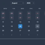 Powerful, Customizable JavaScript Date Picker – Datelite
 Easy Datetime & Date Range Pickers in Vanilla JavaScript
 Feature-rich Datetime Picker Component With JavaScript
 Flat Style JavaScript Date Picker – flatpickr
 Persian Jalali & Gregorian Date Picker in Vanilla JS – Azar Datepicker
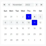 Lightweight Accessible Date Picker Component – WC Datepicker