


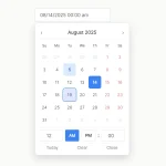
A responsive, multilingual, feature-rich, and easy-to-customize date, time, and date range picker component written in JavaScript.
How to use it:
1. Install and download the NPM.
# NPM
$ npm i date-time-picker-component --save
2. Import the Datetime Picker Component.
// using a bundler
import 'date-time-picker-component/dist/css/date-time-picker-component.min.css';
import { DatePicker, DateTimePicker, DateRangePicker, DateTimeRangePicker } from "date-time-picker-component/dist/js/date-time-picker-component.min";
// browser <link href="dist/css/date-time-picker-component.min.css" rel="stylesheet" /> <script src="dist/js/date-time-picker-component.min.js"></script>
3. Create a basic date picker.
<div id="datepicker"></div>
new DatePicker('datepicker');
// browser
new DateTimePickerComponent.DatePicker('datepicker');
4. Create a basic date & time picker.
<div id="datetimepicker"></div>
new DateTimePicker('datetimepicker');
// browser
new DateTimePickerComponent.DateTimePicker('datetimepicker');
5. Create a basic date range picker.
<div id="start1"></div>
<div id="end1"></div>
new DateRangePicker('start1', 'end1');
// browser
new DateTimePickerComponent.DateRangePicker('start1', 'end1');
6. Create a basic date & time range picker.
<div id="start2"></div>
<div id="end2"></div>
new DateTimeRangePicker('start2', 'end2');
// browser
new DateTimePickerComponent.DateTimeRangePicker('start2', 'end2');
7. Customize the Datetime Picker component.
new DateTimePickerComponent.DateRangePicker('start1', 'end1',{
    // first date
    first_date: "2030-01-02",
    // last date
    last_date: new Date( 2030, 0, 29 ),
    // start date
    start_date: "2030-01-05",
    // only for range picker
    end_date: "2030-10-05",
    // 0 = Sunday, 1 = Monday
    first_day_no: 1,
    // "short_ISO" or "full_ISO"
    date_output: "timestamp",
    // only for range picker
    min_range_hours: 1,

});
8. Localize the Datetime Picker component.
new DateTimePickerComponent.DateRangePicker('start1', 'end1',{
    l10n: {
      'jan':'Gen',
      'feb':'Feb',
      'mar':'Mar',
      'apr':'Apr',
      'may':'Mag',
      'jun':'Giu',
      'jul':'Lug',
      'aug':'Ago',
      'sep':'Set',
      'oct':'Ott',
      'nov':'Nov',
      'dec':'Dic',
      'jan_':'Gennaio',
      'feb_':'Febbraio',
      'mar_':'Marzo',
      'apr_':'Aprile',
      'may_':'Maggio',
      'jun_':'Giugno',
      'jul_':'Luglio',
      'aug_':'Agosto',
      'sep_':'Settembre',
      'oct_':'Ottobre',
      'nov_':'Novembre',
      'dec_':'Dicembre',
      'mon':'Lun',
      'tue':'Mar',
      'wed':'Mer',
      'thu':'Gio',
      'fri':'Ven',
      'sat':'Sab',
      'sun':'Dom',
      'mon_':'Lunedì',
      'tue_':'Martedì',
      'wed_':'Mercoledì',
      'thu_':'Giovedì',
      'fri_':'Venerdì',
      'sat_':'Sabato',
      'sun_':'Domenica',
    };
});
9. Apply custom styles to the Datetime Picker component.
new DateTimePickerComponent.DateRangePicker('start1', 'end1',{
    styles: {
      active_background: '#e34c26',
      active_color: '#fff',
      inactive_background: '#0366d9',
      inactive_color: '#fff'
    },
});
10. Store the datetime selection in a hidden input.
<!-- Date Picker -->
<div id="datepicker">
  <input type="hidden" class="date_output" value="2030-05-22">
</div>
<!-- Date Range Picker -->
<div id="start1">
  <!-- Overwrites start_date -->
  <input type="hidden" class="date_output" value="2030-05-22">
</div>
<div id="end1">
  <!-- Overwrites end_date -->
  <input type="hidden" class="date_output" value="2030-05-22T10:00:00">
</div>
Changelog:
03/14/2023
- v1.1.10
12/06/2022
- v1.1.8
11/29/2022
- v1.1.7
07/29/2022
- v1.1.5: Update
07/02/2021
- v1.1.2: Fixed settings.date_output result when set to timestamp. Now the same value is always returned regardless of the user’s time zone.
06/09/2021
- v1.1.0: Added an alternative time picker with two select elements, one for the hours and one for the minutes. Minutes are rounded to the round_to value and his multiples
06/09/2021
- v1.0.10
06/04/2021
- v1.0.9
06/03/2021
- v1.0.8
See Also:
 Accessible Customizable Date/Time/Date Picker for Modern Web App – FDatepicker
 Versatile Datetime Picker For Bulma – bulma-calendar
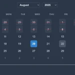 Powerful, Customizable JavaScript Date Picker – Datelite
 Easy Datetime & Date Range Pickers in Vanilla JavaScript
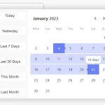 Full-featured Data & Time Picker Component – Easepick
 Flat Style JavaScript Date Picker – flatpickr
 Persian Jalali & Gregorian Date Picker in Vanilla JS – Azar Datepicker
 Lightweight Accessible Date Picker Component – WC Datepicker
Not working. JS loads but script returns [component name] not found errors