


A pure HTML / CSS full width page slider that splits your website into several pages so the user can navigate through them by clicking on the top navigation. The goal is to use HTML radio input and label hacks to switch between content sections.
How to use it:
Add label based top navigation and content sections to the webpage.
<div class="page-slider">
  <header>
    <label for="slide-1-trigger">Section One</label>
    <label for="slide-2-trigger">Section Two</label>
    <label for="slide-3-trigger">Section Three</label>
  </header>
  <input id="slide-1-trigger" type="radio" name="slides" checked>
  <section class="slide slide-one">
    <h1>Section One</h1>
  </section>
  <input id="slide-2-trigger" type="radio" name="slides">
  <section class="slide slide-two">
    <h1>Section Two</h1>
  </section>
  <input id="slide-3-trigger" type="radio" name="slides">
  <section class="slide slide-three">
    <h1>Section Three</h1>
  </section>
</div>
Make the page slider full width and height.
html, body {
  height: 100%;
  width: 100%;
  margin: 0;
  padding: 0;
}
.page-slider {
  height: 100%;
  width: 100%;
  position: relative;
  overflow: hidden;
  background: #120103;
  color: #fff;
  text-align: center;
}
The CSS styles for the top navigation.
header {
  background: #3e474f;
  box-shadow: 0 0.5em 1em #111;
  position: absolute;
  top: 0;
  left: 0;
  z-index: 900;
  width: 100%;
}
header label {
  color: #788188;
  cursor: pointer;
  display: inline-block;
  line-height: 4.25em;
  font-size: 1em;
  font-weight: bold;
  padding: 0 1em;
}
header label:hover { background: #2e353b; }
The CSS styles for the content sections.
.slide {
  height: 100%;
  width: 100%;
  position: absolute;
  top: 0;
  left: 100%;
  z-index: 10;
  padding: 8em 1em 0;
  background-color: #120103;
  background-position: 50% 50%;
  background-size: cover;
  transition: left 0s 0.75s;
}
Add background images to the sections.
.slide-one { background-image: url(bg1.jpg); }
.slide-two { background-image: url(bg2.jpg); }
.slide-three { background-image: url(bg3.jpg); }
The radio input + label hacks.
[id^="slide"]:checked + .slide {
  left: 0;
  z-index: 100;
  transition: left 0.65s ease-out;
}
[id^="slide"]:checked + .slide h1 {
  opacity: 1;
  transform: translateY(0);
  transition: all 0.5s 0.5s;
}
See Also:
 TailwindCSS HTML Presentation Library – tw-slide
 Build Smooth One-Page Scrolling Websites With ScrollFlow.js
 Enhance One-Page Websites with JavaScript Fullpage Slider
 Fluid SVG Page Transitions with GSAP
 Mobile-friendly Fullpage Slider Library – Horizontally.js
 Responsive One Page Scroll JavaScript Plugin – fullpage-scroll.js
 Touch-enabled Slider & Scroller – JPage
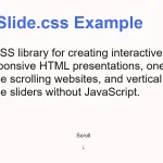 CSS Only Presentation Library – slide.css
this pure css page slide is Purely amazing! does this work for older browsers?
Cordially Thanks. For this CSS Script Sliding Effect