


| Author: | hasielhassan |
|---|---|
| Views Total: | 55 views |
| Official Page: | Go to website |
| Last Update: | March 21, 2025 |
| License: | MIT |
Preview:

Description:
HoneyCombLayoutJs is a lightweight JavaScript library that transforms standard HTML elements into a honeycomb (hexagonal) grid layout.
It handles all the complex math involved in positioning elements in a hexagonal pattern and allows you to control orientation, size, spacing, and grid dimensions with HTML data attributes.
How to use it:
1. Load the HoneyCombLayoutJs’ JavaScript and CSS files in the document.
<script src="/script.js"></script>
<link rel="stylesheet" href="/styles.css">
2. Add a <div> with a class (e.g., honeycomb-container) and set the layout parameters using data- attributes:
- data-orientationlabel:
"flat-top"or"pointy-top". - data-rowsrange: Number of rows (integer).
- data-colsrange: Number of columns (integer).
- data-sizerange: Hexagon radius (pixels, center to corner).
- data-spacingrange: Spacing between hexagon centers (pixels).
- data-heightmargin: Margin (in pixels) to extend div height
<div class="honeycomb-container"
     data-orientationlabel="flat-top"
     data-rowsrange="2"
     data-colsrange="5"
     data-sizerange="80"
     data-spacingrange="10"
     data-heightmargin="10"
>
  ...
</div>
3. Add your own items to the container.
- Use SVG icons whenever possible for crisp rendering at any size.
- If you’re using non-hexagonal images, consider adding CSS to clip them to a hexagonal shape (using
clip-path, for example). - Use meaningful
altattributes on your images for accessibility.
<div class="honeycomb-container" ...>
  <a href="#">
    <img src="icon1.svg" alt="Image 1">
  </a>
  <a href="#">
    <img src="icon2.svg" alt="Image 2">
  </a>
  <a href="#">
    <img src="icon3.svg" alt="Image 3">
  </a>
  ...
</div>
4. Call buildHoneycomb() after the DOM is loaded, and pass the container’s selector:
document.addEventListener('DOMContentLoaded', function() {
  buildHoneycomb('.honeycomb-container');
});
FAQs
Q: Can I use this with a responsive design?
A: Out of the box, the layout uses fixed values for rows, columns, and size. For a responsive layout, you’ll need to call buildHoneycomb() again within a window.onresize event handler, updating the data attributes with new values based on the viewport size. I typically use media queries to define different layout configurations for different screen sizes.
Q: What happens if I have fewer items than rows * cols?
A: The container will still be sized as if it were a full grid. If you need the container to shrink to fit the actual number of items, you’ll need to modify the buildHoneycomb function to calculate the container size based on the last item’s position, rather than the theoretical maximum.
Q: Why use absolute positioning instead of CSS Grid?
A: Hexagonal layouts require offset positioning that CSS Grid can’t handle natively. Absolute positioning gives precise control over each element’s placement.
Q: Can I use non-hexagonal images?
A: Yes, but set overflow: hidden on the anchor CSS and use appropriate padding to create hexagonal masks.
See Also:
 Neat Block Grid In Pure CSS – wall.css
 Build Interactive Draggable Layouts With JavaScript – Swapy
 Create Responsive Slanted Grid Gallery With CSS Clip-path
 Responsive CSS Masonry Grid Layout – Grid Overflow
 Dynamic Grid Layout Generator – Magic Grid
 Bootstrap-like Responsive Grid Layout System – CSSColumnPro.css
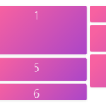 Minimal Masonry Web Layout In Pure JavaScript – MiniMasonry.js
 Responsive Dynamic Justified Grid Layout Plugin – uhugrid