


A CSS library for creating responsive Masory- and Mosaic-style grid layouts with optional 3D hover effects.
How to use it:
1. Download and import the GridOverflow3D.css.
<link rel="stylesheet" href="path/to/GridOverflow3D.css" />
2. Create a grid layout using the following CSS classes:
- gridOverflow: Required
- go-3Dfx: Enables 3D hover effects
- go-actionIcon: Add an action icon to the grid items
- go_gridItem: Selector of grid items
- go_caption: Selector of captions
- go_caption-full: Make captions full width
- go_gridItem-panorama: Horizontal rectangle
- go_gridItem-vertigo: Vertical rectangle
- go_gridItem-VIP: Large square
- go_gridItem-centered: Make the content centered
<div class="gridOverflow go-3Dfx go-actionIcon">
  <a class="go_gridItem href="#">
    Grid Item 1
    <span class="go_caption go_caption-full">
      Caption 1
    </span>
  </a>
  <a class="go_gridItem go_gridItem-panorama" href="#">
    Grid Item 2
    <span class="go_caption go_caption-full">
      Caption 2
    </span>
  </a>
  <a class="go_gridItem go_gridItem-vertigo" href="#">
    Grid Item 3
    <span class="go_caption go_caption-full">
      Caption 3
    </span>
  </a>
  <a class="go_gridItem go_gridItem-VIP" href="#">
    Grid Item 4
    <span class="go_caption go_caption-full">
      Caption 4
    </span>
  </a>
  <div class="go_gridItem go_gridItem-centered" href="#">
    Grid Item 5
    <span class="go_caption go_caption-full">
      Caption 5
    </span>
  </div>
</div>
3. To create a Masonry layout, just add the go-masonry class to the parent container.
<div class="gridOverflow go-masonry go-3Dfx go-actionIcon">
  ...
</div>
4. Override the default CSS variables to create your own layout styles.
.gridOverflow {
  --itemMinWidth: 200px;
  --itemAspectRatio: 1;
  --gridGap: 10px;
  --mobileRowItemsCount: 2;
  --linkActionIcon: "⤢";
  --itemRounding: 6px;
  --masonryItemHeight: 180px;
}
Changelog:
v1.2.7 (08/24/2023)
- bugfixes
v1.2.4 (06/27/2023)
- zoom effect, info update
v1.2.3 (05/21/2023)
- no JS workaround nedeed for Apple Safari
v1.2.2 (05/17/2023)
- bugfix
v1.2.1 (05/10/2023)
- mobileRowItemsCount doesn’t depend on resolution
See Also:
 Responsive Masonry Layouts with CSS Grid and Mason-it.js
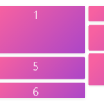 Minimal Masonry Web Layout In Pure JavaScript – MiniMasonry.js
 Easy Responsive Masonry Grid Library – Stackgrid
 Minimalist Masonry Gallery Layout With CSS Grid – mm-masonry.css
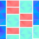 Tiny Responsive Masonry Grid Library – stack-up.js
 Simple Masonry Grid Layout With Flexbox – simple-masonry.js
 Mosaic Tiling With Image Lazy Loading – mosaicLayout
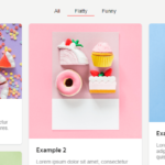 Filterable Masonry Grid In JavaScript – Isolde