


Plotteus is a powerful data visualization JavaScript library for immersive, interactive data storytelling. It offers a range of chart types to choose from, including Bar (horizontal & vertical), Beeswarm, Bubble, Pie, Scatter, and Treemap.
Unlike typical data storytelling tools that offer static charts or rely on triggers for animations, Plotteus creates a set of interpolators. This allows you to render parts of your story based on any progress metric, such as user scrolling or a slider control. You could also opt for the trigger approach, providing a fully rendered view over a specified duration.
This library is also exceptional at maintaining data context, especially when transitioning between different chart types. It offers the capability to animate from one chart type to another seamlessly, keeping your data in context and maintaining the user’s focus.
How to use it:
1. Install and import the Plotteus.
# NPM
$ npm i plotteus
// ES Module
import { makeStory } from "plotteus";
// Browser
<script type="module">
import { makeStory } from "https://cdn.jsdelivr.net/npm/plotteus";
</script>
2. Create an empty container to hold the chart.
<div id="storytelling"></div>
3. Define steps of your data story as follows:
const steps = [
  {
    // global parameters
    key: string;
    title?: string;
    titleAnchor?: "start" | "middle" | "end";
    subtitle?: string;
    subtitleAnchor?: "start" | "middle" | "end";
    // If true, shares the color domain between groups.
    shareDomain?: boolean;
    showLegend?: boolean;
    legendTitle?: string;
    legendAnchor?: "start" | "middle" | "end";
    showValues?: boolean;
    showDatumLabels?: boolean;
    palette?: "default" | "pastel" | "vivid" | "oranges" | "tableau";
    // If true, enables hand-drawn look.
    cartoonize?: boolean;
    // Bar chart
    chartType: "bar";
    chartSubtype?: "grouped" | "stacked";
    valueScale?: {
      // Compares the maximum value set by the user with the maximum value
      // found within the group.
      maxValue?: number;
    };
    groups: [
      {
        key: string;
        opacity?: number;
        data: [{
          key: string;
          value: number;
          // Used to teleport datum between groups. Formatted as "groupKey:datumKey".
          teleportFrom?: string;
          // HEX, e.g. "#CCCCCC"
          fill?: string;
          opacity?: number;
        }],
      },
    ],
    layout?: "vertical";
    verticalAxis?: {
      show?: boolean;
      title?: string;
      tickFormat?: (d: number) => string;
    };
    layout?: "horizontal";
    horizontalAxis?: {
      show?: boolean;
      title?: string;
      tickFormat?: (d: number) => string;
    };
  },
  // Beeswarm Chart
  {
    chartType: "beeswarm";
    positionScale?: {
      minValue?: number;
      maxValue?: number;
    };
    groups: [
      {
        key: string;
        opacity?: number;
        data: [{
          key: string;
          position: number;
          teleportFrom?: string;
          fill?: string;
          opacity?: number;
        }],
      },
    ],
    layout?: "vertical";
    verticalAxis?: {
      show?: boolean;
      title?: string;
      tickFormat?: (d: number) => string;
    };
    layout?: "horizontal";
    horizontalAxis?: {
      show?: boolean;
      title?: string;
      tickFormat?: (d: number) => string;
    };
  },
  // Bubble/Pie/Treemap Chart
  {
    chartType: "bubble" | "pie" | "treemap";
    valueScale?: {
      maxValue?: number;
    };
    groups: [
      {
        key: string;
        opacity?: number;
        data: [{
          key: string;
          value: number;
          teleportFrom?: string;
          fill?: string;
          opacity?: number;
        }],
      },
    ],
  },
  // Scatter Chart
  {
    chartType: "scatter";
    xScale?: {
      // Useful for fixing the x scale domain to show evolution of values.
      minValue?: number;
      maxValue?: number;
    };
    yScale?: {
      // Useful for fixing the y scale domain to show evolution of values.
      minValue?: number;
      maxValue?: number;
    };
    horizontalAxis?: {
      show?: boolean;
      title?: string;
      tickFormat?: (d: number) => string;
    };
    verticalAxis?: {
      show?: boolean;
      title?: string;
      tickFormat?: (d: number) => string;
    };
    groups: [
      {
        key: string;
        opacity?: number;
        data: [{
          key: string;
          x: number;
          y: number;
          teleportFrom?: string;
          fill?: string;
          opacity?: number;
        }],
      },
    ],
  },
];
4. Create a story instance.
const myStory = document.querySelector("#storytelling");
const story = makeStory(myStory, steps);
5. Render the chart on the page.
Story.render = (
  // key of the step to render
  stepKey: string,
  // progress of the step to render (0-1)
  progress: number,
  // whether to indicate progress (left border)
  indicateProgress?: boolean
):
6. Customize the background of the story.
const story = makeStory(myStory, steps,{
      svgBackgroundColor?: string;
});
7. This example shows how to use a range input to transition between chart types.
<input type="range" value="0.5" min="0" max="1" step="0.1" id="range_input" />
story.render("stepKey1", 1);
let input = document.getElementById('range_input');
  input.addEventListener('input', (event) => {
    if (event.target.value < 0.5) {
    story.render("stepKey1", event.target.value * 2);
  } else {
    story.render("stepKey2", (event.target.value - 0.5) * 2);
  }
})
Changelog:
v1.5.0 (08/06/2023)
- feat: Add annotation lines
v1.4.6 (07/16/2023)
- Bugfixes
See Also:
 Replicate iOS Calculator With Plain JavaScript
 Vanilla JS Gallery Lightbox with Touch Support – Web-Thread Lightbox
 Fullscreen CSV Viewer In JavaScript – Heiho
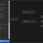 Render and Edit JSON as an Interactive Flowchart – SenangWebs Unfold
 Responsive Animated Timeline With JavaScript And CSS3
 Animated Gradient Border In Pure CSS
 Hierarchical Table Of Contents In JavaScript – Easy-TOC
 Pure JavaScript Toast & Dialog Popup Library – Alerty