


A pure CSS/CSS3-based loading spinner with a full-screen overlay inspired by Apple’s iOS & OS X.
How to use it:
Create the Html for the loading spinner wrapped in an overlay container.
<div class="overlay">
  <div class="spinner center">
    <div class="spinner-blade"></div>
    <div class="spinner-blade"></div>
    <div class="spinner-blade"></div>
    <div class="spinner-blade"></div>
    <div class="spinner-blade"></div>
    <div class="spinner-blade"></div>
    <div class="spinner-blade"></div>
    <div class="spinner-blade"></div>
    <div class="spinner-blade"></div>
    <div class="spinner-blade"></div>
    <div class="spinner-blade"></div>
    <div class="spinner-blade"></div>
  </div>
</div>
The CSS/CSS3 (SASS) rules to animate the loading spinner. You can easily change the color & size in the mixins.
$spinner-color: #69717d !default
$spinner-size: 48px !default
.overlay
  background: rgba(black,.8)
  height: 100vh

.spinner
  font-size: $spinner-size
  position: relative
  display: inline-block
  width: 1em
  height: 1em
  &.center
    position: absolute
    left: 0
    right: 0
    top: 0
    bottom: 0
    margin: auto
  .spinner-blade
    position: absolute
    left: .4629em
    bottom: 0
    width: .074em
    height: .2777em
    border-radius: .0555em
    background-color: transparent
    transform-origin: center -.2222em
    animation: spinner-fade 1s infinite linear
    $animation-delay: 0s
    $blade-rotation: 0deg
    @for $i from 1 through 12
      &:nth-child(#{$i})
        animation-delay: $animation-delay
        transform: rotate($blade-rotation)
        $blade-rotation: $blade-rotation + 30
        $animation-delay: $animation-delay + .083
@keyframes spinner-fade
  0%
    background-color: $spinner-color
  100%
    background-color: transparent
Alternatives:
- iOS Style Loading Spinner with Pure CSS – ispinner
- 10 Best Loading Spinner/Indicator Libraries for Pure CSS & Vanilla JS
- 80+ Best Pure CSS Loading Spinners For Front-end Developers
See Also:
 Material Design 3 Expressive Loading Indicator to React/Vue/Svelte/Vanilla JS
 Math Curve Loaders: Mathematical SVG Loading Animations in CSS & JS
 12+ Lightweight CSS Loading Animations – NanoLoader
 Animated Loading Spinner with Smart AJAX Support – VanillaSpin
 Slick Content Loader With Vanilla JavaScript – slick-loader
 100+ Open-source Animated SVG Loading Spinners
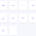 Fancy Three-dots Loading Spinners With Pure CSS – Three Dots
 Animated Snowball Loading Spinner With Pure CSS
How do we increase speed?