


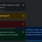
A minimal yet customizable JavaScript library to generate success, error, warning, and info toast messages with one JS call.
The toast-style alerts are accompanied by a countdown progress bar indicating the remaining time before the alert disappears. OPTIONAL.
How to use it:
1. Install and import the alert component.
# NPM
$ npm i @bjnstnkvc/alert
import Alert from '@bjnstnkvc/alert'
// default styles
import '@bjnstnkvc/alert/src/alert.css'
<!-- OR -->
<link rel="stylesheet" href="src/alert.css" />
<script src="lib/Alert.js"></script>
2. Create success, error, warning, and info toast messages.
new Alert({
    type: 'success',
    message: 'Toast Message Here',
})
new Alert({
    type: 'error',
    message: 'Toast Message Here',
})
new Alert({
    type: 'warning',
    message: 'Toast Message Here',
})
new Alert({
    type: 'info',
    message: 'Toast Message Here',
})
3. Determine whether to display a countdown bar under the alert. Default: false.
new Alert({
    type: 'success',
    message: 'Toast Message Here',
    withProgress: true,
})
4. Specify the parent container in which the alerts are placed. Default: body.
new Alert({
    type: 'success',
    message: 'Toast Message Here',
    container: '.anotherElement',
})
5. Determine whether to auto-dismiss the alerts after a timeout. Default: true.
new Alert({
    type: 'success',
    message: 'Toast Message Here',
    expires: true,
    duration: 10,
})
6. Determine whether to display a close button inside the alerts. Default: true.
new Alert({
    type: 'success',
    message: 'Toast Message Here',
    close: false,
})
7. Replace the default icons.
new Alert({
    type: 'info',
    message: 'Toast Message Here',
    info: '',
}
8. Override the default CSS varaibles to create your own styles/types.
:root {
  --alert-success : rgba(118, 189, 87, 1);
  --alert-error   : rgba(214, 45, 48, 1);
  --alert-warning : rgba(238, 146, 19, 1);
  --alert-info    : rgba(63, 175, 239, 1);
}
See Also:
 Advanced Alert Notification System For Bootstrap 5 – AvalynxAlert.js
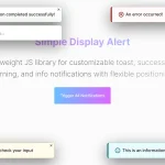 Lightweight JavaScript Notification System – Simple Display Alert
 Sleek Toast & Growl Alert Notification Library – Nostfly.js
 Create iOS-Style Popups & Notifications With Popup JS Library
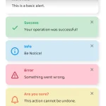 Simple & Stylish JavaScript Alert Notifications – SnapAlert.js
 Notification/Dialog/Loading Indicator JavaScript Library – Fnon
 JavaScript Plugin For Custom Toast Notifications – Simple Notify
 Customizable Alerts & Dialogs Made Easy – Yoyo Popup