


Fnon is a multifunctional popup box library for creating toast notifications, alert/confirm dialog boxes, and various types of loading indicators on the web app.
Features:
- 5 awesome animations.
- 7 built-in themes.
- 16 loading indicator styles.
- Fully customizable.
- Written in Vanilla JavaScript.
Table Of Contents:
Install & Import
To begin with, insert the Fnon’s JavaScript and Stylesheet into the HTML.
<link rel="stylesheet" href="fnon.min.css" />
<script src="fnon.min.js"></script>
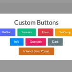
Alert:

1. Create an alert dialog with the Fnon.Alert.Theme method.
Fnon.Alert.Light('Alert Message','Alert Title','Ok Button',()=>{
  // callback
});
Fnon.Alert.Dark('Alert Message','Alert Title','Ok Button',()=>{
  // callback
});
Fnon.Alert.Primay('Alert Message','Alert Title','Ok Button',()=>{
  // callback
});
Fnon.Alert.Success('Alert Message','Alert Title','Ok Button',()=>{
  // callback
});
Fnon.Alert.Danger('Alert Message','Alert Title','Ok Button',()=>{
  // callback
});
Fnon.Alert.Warning('Alert Message','Alert Title','Ok Button',()=>{
  // callback
});
Fnon.Alert.Info('Alert Message','Alert Title','Ok Button',()=>{
  // callback
});
// or
Fnon.Alert.Light({
     title:'Alert Message',
     message:'Alert Title',
     callback:()=>{
       // callback
     }
});
2. Override the default alert settings.
Fnon.Alert.Init({
    message: "", // can be a string or an HTMLElement
    title: "",
    titleColor: GColors.Dark,
    titleBackground: GColors.Light,
    color: "#2b2b2b",
    background: "rgba(0, 0, 0, 0.1)",
    fontFamily: '"Quicksand", sans-serif',
    width: "nl", // Normarl 'nl', Small 'sm', Large 'lg', X-Large 'xl'.
    closeButton: true,
    animation: "slide-top", // 'fade', 'slide-top', 'slide-bottom', 'slide-right' and 'slide-left'
    closeButton: false,
    callback: undefined,
    icon: undefined,
    iconColor: "#000",
    showIcon: false,
    btnOkText: "Ok",
    btnOkColor: "#d4d4d4",
    btnOkBackground: "#d4d4d4",
    btnOkShadow: "rgba(0, 0, 0, 0.2)",
    btnOkBorderColor: "#d4d4d4",
    delButtons: false,
    autoFocus: false, // focus when model is loaded otherwise first button will be focused
    autoFocusTag: "input:not([disabled])", // default focus to input which is not disabled
    autoFocusDelay: 0, //if u need to dealy the focus
    zIndex: 4000,
    showMaxMin: false, // show maximize - minimize button if title bar exists
    // Functions
    beforeShow: undefined,
    afterShow: undefined,
    defaultBefore: undefined,
    defaultAfter: undefined,
    // Extra Functions
    onInit: undefined, // Fires once the Layout is rendered but your body content is not
    onClosing: undefined, // Fires on closing but the html element still exists
    onClosed: undefined, // Fires once the html is removed
    layout: "hbf", // Layout h: header b:body f:footer
});
Confirm Dialog:

1. Create a confirmation dialog with the Fnon.Ask.Theme method.
Fnon.Ask.Light('Confirm Message','Confirm Title','Ok Button', 'Cancel Button', (result)=>{
  // callback
});
Fnon.Ask.Dark('Confirm Message','Confirm Title','Ok Button', 'Cancel Button', (result)=>{
  // callback
});
Fnon.Ask.Primay('Confirm Message','Confirm Title','Ok Button', 'Cancel Button', (result)=>{
  // callback
});
Fnon.Ask.Success('Confirm Message','Confirm Title','Ok Button', 'Cancel Button', (result)=>{
  // callback
});
Fnon.Ask.Danger('Confirm Message','Confirm Title','Ok Button', 'Cancel Button', (result)=>{
  // callback
});
Fnon.Ask.Warning('Confirm Message','Confirm Title','Ok Button', 'Cancel Button', (result)=>{
  // callback
});
Fnon.Ask.Info('Confirm Message','Confirm Title','Ok Button', 'Cancel Button', (result)=>{
  // callback
});
// or
Fnon.Ask.Light({
     title:'Confirm Message',
     message:'Confirm Title',
     callback:(result)=>{
       // callback
     }
});
2. Override the default confirm settings.
Fnon.Ask.Init({
  fontFamily: defaultFont,
  width: "nl", // sm//lg//nl//xl
  closeButton: true,
  animation: "slide-top", //'fade', 'slide-top', 'slide-bottom', 'slide-right' and 'slide-left'
  closeButton: false,
  callback: undefined,
  icon: undefined,
  iconColor: "#fff",
  showIcon: false,
  message: "",
  title: "",
  titleColor: "#fff",
  titleBackground: "#fff",
  autoFocus: false, // focus when model is loaded otherwise first button will be focused
  autoFocusTag: "input:not([disabled])", // default focus to input which is not disabled
  autoFocusDelay: 0, //if u need to dealy the focus
  btnOkText: "Ok",
  btnOkColor: "#fff",
  btnOkBackground: "#fff",
  btnOkShadow: "rgba(0, 0, 0, 0.2)",
  btnOkBorderColor: "#d4d4d4",
  btnCancelText: "Cancel",
  btnCancelColor: "#fff",
  btnCancelBackground: "#fff",
  btnCancelShadow: "rgba(0, 0, 0, 0.1)",
  btnCancelBorderColor: "#d4d4d4",
  color: "#2b2b2b",
  background: "rgba(0, 0, 0, 0.1)",
  zIndex: 4000,
  delButtons: false,
  showMaxMin: false, // show maximize - minimize button if title bar exists
  // Functions
  beforeShow: undefined,
  afterShow: undefined,
  defaultBefore: undefined,
  defaultAfter: undefined,
  // Extra Functions
  onInit: undefined, // Fires once the Layout is rendered but your body content is not
  onClosing: undefined, // Fires on closing but the html element still exists
  onClosed: undefined, // Fires once the html is removed
  layout: "hbf",
});
Dialog Box:

1. Create a normal dialog with the Fnon.Dialogue.Theme method.
Fnon.Dialogue.Light('Dialogue Message','Dialogue Title','Ok Button', 'Cancel Button', (closer,html)=>{
  // callback
});
Fnon.Dialogue.Dark('Dialogue Message','Dialogue Title','Ok Button', 'Cancel Button', (closer,html)=>{
  // callback
});
Fnon.Dialogue.Primay('Dialogue Message','Dialogue Title','Ok Button', 'Cancel Button', (closer,html)=>{
  // callback
});
Fnon.Dialogue.Success('Dialogue Message','Dialogue Title','Ok Button', 'Cancel Button', (closer,html)=>{
  // callback
});
Fnon.Dialogue.Danger('Dialogue Message','Dialogue Title','Ok Button', 'Cancel Button', (closer,html)=>{
  // callback
});
Fnon.Dialogue.Warning('Dialogue Message','Dialogue Title','Ok Button', 'Cancel Button', (closer,html)=>{
  // callback
});
Fnon.Dialogue.Info('Dialogue Message','Dialogue Title','Ok Button', 'Cancel Button', (closer,html)=>{
  // callback
});
// or
Fnon.Dialogue.Light({
     title:'Dialogue Message',
     message:'Dialogue Title',
     callback:(closer,html)=>{
       return false;
       closer();
     }
});
2. Override the default dialog settings.
Fnon.Ask.Init({
  fontFamily: defaultFont,
  width: "nl", // sm//lg//nl//xl//fl
  closeButton: true,
  animation: "slide-top", //'fade', 'slide-top', 'slide-bottom', 'slide-right' and 'slide-left'
  closeButton: false,
  callback: undefined,
  cancelCallback: undefined,
  message: "",
  title: "",
  titleColor: "#fff",
  titleBackground: "#fff",
  btnOkText: "Ok",
  btnOkColor: "#fff",
  btnOkBackground: "#fff",
  btnOkShadow: "rgba(0, 0, 0, 0.2)",
  btnOkBorderColor: "#d4d4d4",
  btnCancelText: "Cancel",
  btnCancelColor: "#fff",
  btnCancelBackground: "#fff",
  btnCancelShadow: "rgba(0, 0, 0, 0.1)",
  btnCancelBorderColor: "#d4d4d4",
  color: "#2b2b2b",
  background: "rgba(0, 0, 0, 0.1)",
  autoFocus: false, // focus when model is loaded otherwise first button will be focused
  autoFocusTag: "input:not([disabled])", // default focus to input which is not disabled
  autoFocusDelay: 0, //if u need to dealy the focus
  zIndex: 4000,
  delButtons: false,
  showMaxMin: false, // show maximize - minimize button if title bar exists
  showMin:false, // Add minimize button to taskbar
  // Functions
  beforeShow: undefined,
  afterShow: undefined,
  defaultBefore: undefined,
  defaultAfter: undefined,
  // custom buttons
  buttons: undefined,
  // Extra Functions
  onInit: undefined, // Fires once the Layout is rendered but your body content is not
  onClosing: undefined, // Fires on closing but the html element still exists
  onClosed: undefined, // Fires once the html is removed
  layout: "hbf",
});
Notification:

1. Create a toast like notification popup with the Fnon.Hint.Theme method.
Fnon.Hint.Light('Alert Message', {
  callback:function(){
  // callback
  }
});
Fnon.Hint.Dark('Alert Message', {
  callback:function(){
  // callback
  }
});
Fnon.Hint.Primay('Alert Message', {
  callback:function(){
  // callback
  }
});
Fnon.Hint.Success('Alert Message', {
  callback:function(){
  // callback
  }
});
Fnon.Hint.Danger('Alert Message', {
  callback:function(){
  // callback
  }
});
Fnon.Hint.Warning('Alert Message', {
  callback:function(){
  // callback
  }
});
Fnon.Hint.Info('Alert Message', {
  callback:function(){
  // callback
  }
});
2. Override the default notification settings.
Fnon.Hint.Init({
  fontFamily:'"Quicksand", sans-serif',
  position: 'right-top', // 'right-top', 'right-center', 'right-bottom', 'left-top', 'left-center', 'left-bottom', 'center-top', 'center-center', 'center-bottom'
  spacing: '16px',
  svgSize: { w: '16px', h: '16px' },
  textColor: '#fff',
  fontSize: '14px',
  backgroundColor: '#029eff',
  shadowColor: 'rgba(2, 158, 255, 0.3)',
  width: '300px',
  zindex: 4000,
  animation: 'slide-left', //'fade', 'slide-top', 'slide-bottom', 'slide-right' and 'slide-left'
  animationDuration: 500,
  displayDuration: 3000,
  progressColor: 'rgba(255,255,255,0.9)',
  callback:undefined,
  title: undefined,
});
Loading Indicator:

1. Create a fullscreen loading indicator with the Fnon.Wait.Theme method.
Fnon.Wait.Infinity();
Fnon.Wait.Ripple('Custom Loading Text');
Fnon.Wait.Liquid('Please Wait',{
  // options here
});
// more loading indicator styles
Fnon.Wait.ColorBar();
Fnon.Wait.ProgressBar();
Fnon.Wait.CurveBar();
Fnon.Wait.LineDots();
Fnon.Wait.Circle();
Fnon.Wait.CircleDots();
Fnon.Wait.Bricks();
Fnon.Wait.Interwind();
Fnon.Wait.Typing();
Fnon.Wait.Gear();
Fnon.Wait.Gears();
Fnon.Wait.Rainbow();
Fnon.Wait.CurveBar();
// update loading text
Fnon.Wait.Change('Downloading 77%');
// remove
Fnon.Wait.Remove();
// remove after 3 seconds
Fnon.Wait.Remove(5000);
2. Override the default loading indicator settings.
Fnon.Wait.Init({
  fontFamily:'"Quicksand", sans-serif',
  svgSize: { w: '100px', h: '100px' },
  svgColor: '#029eff',
  textColor: '#029eff',
  textSize: '16px',
  clickToClose: false,
  background: 'rgba(255,255,255,0.5)',
  zindex: 4000,
  containerSize: '350px'
});
Changelog:
10/23/2024
- v1.1.13: Fixed bugs
10/23/2024
- v1.1.11: Add Minimize option
06/20/2023
- v1.1.10: bugfix
06/06/2023
- v1.1.8: bugfix
10/11/2022
- v1.1.6: fix scroll
09/16/2022
- v1.1.5
03/02/2022
- JS update
08/07/2021
- JS update
07/23/2021
- v1.0.9
10/08/2020
- Updated JS
10/03/2020
- Updated JS
08/25/2020
- JS & CSS Updated
See Also:
 Build Interactive Customizable Popups And Alerts with AsPopup.js
 Lightweight JavaScript Notification System – Simple Display Alert
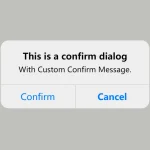 Create iOS-Style Popups & Notifications With Popup JS Library
 Elegant Notification Popup JavaScript Library – Notiflix
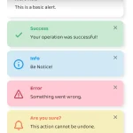 Simple & Stylish JavaScript Alert Notifications – SnapAlert.js
 Customizable Alerts & Dialogs Made Easy – Yoyo Popup
 Cute Alert: Elegant Alert/Confirm/Toast Dialog Box In JavaScript
 Lightweight Customizable Modal and Alert Library – SilverBox.js