


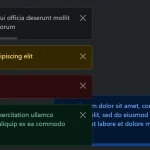
A simple notification JavaScript plugin for displaying highly customizable, toast-style alert popups on the page.
Features:
- 4 built-in notification types.
- 2 animations: slide or fade.
- Auto dismisses or not.
- Supports HTML content.
- Custom icon.
- Custom position.
- And much more.
See Also:
How to use it:
1. Load the minified version of the Simple Notify JavaScript library on the HTML page.
<link rel="stylesheet" href="dist/simple-notify.min.css" />
<script src="dist/simple-notify.min.js"></script>
2. Create a basic alert notification.
new Notify ({
    title: 'Notify Title',
    text: 'Notify Message',
})
3. Create a toast notification that automatically dismisses after 3 seconds.
new Notify ({
    title: 'Notify Title',
    text: 'Notify Message',
    autoclose: true,
    autotimeout: 3000
})
4. Determine the notification type: ‘error’, ‘warning’, ‘success’, or ‘info’.
new Notify ({
    title: 'Notify Title',
    text: 'Notify Message',
    status: 'success'
})
5. Determine the animation you’d like to use. Default: ‘fade’.
new Notify ({
    title: 'Notify Title',
    text: 'Notify Message',
    effect: 'slide',
    speed: 300 // animation speed
})
6. Determine whether to show icons & close button. Default: true.
new Notify ({
    title: 'Notify Title',
    text: 'Notify Message',
    showCloseButton: false,
    showIcon: false,
})
7. Specify the space between notifications.
new Notify ({
    title: 'Notify Title',
    text: 'Notify Message',
    gap: 20,
    distance: 20 // space between popup & screen edge
})
8. Specify the position of the notifications.
- top
- right
- bottom
- left
- x-center
- y-center
- center
new Notify ({
    title: 'Notify Title',
    text: 'Notify Message',
    position: 'right top'
})
9. Set the theme you’d like to use:
new Notify ({
    title: 'Notify Title',
    text: 'Notify Message',
    type: 'outline', // or 'filled'
})
10. Add a custom icon to the notification.
new Notify ({
    title: 'Notify Title',
    text: 'Notify Message',
    customIcon: 'any html here'
})
11. Add a custom CSS class to the notification.
new Notify ({
    title: 'Notify Title',
    text: 'Notify Message',
    customClass: 'any class here'
})
12. Close the notification manually.
instance.close();
Changelog:
v1.0.5 (10/13/2024)
- Fix close icon overlap
v1.0.4 (02/19/2024)
- Corrected misspelled transition-properties to transition-property.
v1.0.2 (02/17/2024)
- bugfixes
v1.0.0 (02/16/2024)
- status set to success by default.
- All CSS variables renamed.
- All classes renamed.
- type values changed to ‘outline’ (default) | ‘filled’.
- autoclose is true by default.
v0.5.5 (05/26/2022)
- Fixed SVG not showing on Safari.
v0.5.4 (08/06/2021)
- Minor fixes and package updates
v0.5.2 (06/07/2021)
- Bugfix
v0.5.1 (05/20/2021)
- added raw html support for text parameter
v0.4.0 (03/24/2021)
- add 3 new positions
v0.3.1 (03/15/2021)
- custom typescript types added
v0.3.0 (03/07/2021)
- isIcon replaced with showIcon
- isCloseButton replaced with showCloseButton
See Also:
 Advanced Alert Notification System For Bootstrap 5 – AvalynxAlert.js
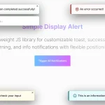 Lightweight JavaScript Notification System – Simple Display Alert
 Sleek Toast & Growl Alert Notification Library – Nostfly.js
 Create iOS-Style Popups & Notifications With Popup JS Library
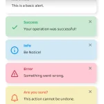 Simple & Stylish JavaScript Alert Notifications – SnapAlert.js
 Notification/Dialog/Loading Indicator JavaScript Library – Fnon
 Customizable Alerts & Dialogs Made Easy – Yoyo Popup
 Cute Alert: Elegant Alert/Confirm/Toast Dialog Box In JavaScript