


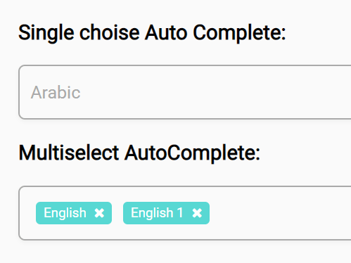
Just another select box replacement library to select single or multiple options from an autocomplete dropdown.
How to use it:
1. Install & download the package.
# Yarn
$ yarn add multi-select2
# NPM
$ npm install multi-select2 --save
2. Import the MultiSelect2 as a module.
import MultiSelect2 from "multi-select2";
3. Or load the bundled JS file in the document.
<script src="bundle.min.js"></script>
4. Define your options in an array as follows:
const myData = [
      {
        label: "CSS",
        value: "css"
      },
      {
        label: "HTML",
        value: "html"
      },
      {
        label: "JavaScript",
        value: "js"
      }
],
5. Initialize the library on the placeholder element and done.
<div class="element"></div>
var mySelect = new MultiSelect2(".element", {
    options: myData
});
6. Available customization options.
var mySelect = new MultiSelect2(".element", {
    // enable/disable autocomplete
    autocomplete: true,
    // enable/disable multiple selection
    multiple: true,
    // custom icons for multiple selection
    icon: "fa fa-times",
    // callback
    onChange: value => {
      console.log(value);
    }

});
7. The example CSS for the custom select box.
.multi-select__select {
  align-items: center;
  box-shadow: 0 2px 4px rgba(0, 0, 0, 0.04);
  box-sizing: border-box;
  cursor: pointer;
  display: flex;
  font-size: 16px;
  font-weight: 500;
  justify-content: left;
  min-height: 44px;
  padding: 5px 10px;
  position: relative;
  transition: 0.2s;
  width: 100%;
  height: 50px;
  border-radius: 6px;
  border: none;
  border: 1px solid #aaaaaa;
  background: transparent;
  color: #aaaaaa;
}
.multi-select__autocomplete::placeholder {
  color: red;
}
.multi-select__options {
  border-radius: 4px;
  border: 1px solid rgba(0, 0, 0, 0.15);
  box-shadow: 0 2px 4px rgba(0, 0, 0, 0.04);
  box-sizing: border-box;
  color: #363b3e;
  display: none;
  left: 0;
  max-height: 221px;
  position: absolute;
  top: 50px;
  width: 100%;
  z-index: 5;
  overflow-y: scroll;
}
.multi-select__option:hover {
  background-color: #e9e9e9;
}
.multi-select__select--opened .multi-select__options {
  display: block;
}
.multi-select__option {
  background: #fff;
  border-bottom: 1px solid #e4e4e4;
  box-sizing: border-box;
  height: 44px;
  line-height: 25px;
  padding: 10px;
}
.multi-select__option-active {
  background-color: #59d9d4 !important;
  color: #ffffff;
}
.multi-select__option--selected {
  color: #e4e4e4;
  cursor: initial;
  pointer-events: none;
}
.multi-select__option--hidden {
  display: none;
}
.multi-select__selected-label {
  background: #58d8d3;
  border-radius: 4px;
  color: #fff;
  cursor: initial;
  display: inline-block;
  margin: 5px;
  padding: 3px 7px;
  font-size: 12px;
}
.multi-select__selected-label:last-of-type {
  margin-right: 0;
}
.multi-select__selected-label i {
  cursor: pointer;
  display: inline-block;
  margin-left: 7px;
}
.multi-select__selected-label i:hover {
  color: #e4e4e4;
}
.multi-select__autocomplete {
  background: #f9f9f8;
  border-bottom: 1px solid #e4e4e4;
  border-left: none;
  border-right: none;
  border-top: none;
  box-sizing: border-box;
  font-size: 16px;
  outline: none;
  padding: 10px;
  width: 100%;
}
See Also:
 Enhanced Select Box In Vanilla JavaScript – Select.js
 Feature-rich Custom Select JavaScript Library – SimpSelect
 High Performance Select Box with Virtual Scroll (Vanilla JS) – Virtual Select
 Customizable Select Box & Input Field Enhancement Library – Choices.js
 Tagging & Searchable Dropdown with Multi-Select – Searchdown.js
 Powerful Single & Multiple Select Library – tail.select
 Enhanced Dropdown Select In Pure JavaScript – LC-select
 Enhance HTML Selects with Advanced Features – SnapSelect
how to get and set value
How to render options run time ?
I mean in text box i want to search things and fill that response as a options.
Plz help.