


A pure CSS solution for mobile-friendly bootstrap tabs component that makes all extra tabs available through dropdown “More tabs” if there is no room for them.
How to use it:
Include the bootstrap-adaptive-tabs.css in the head section of your web page.
<link href="bootstrap-adaptive-tabs.css" rel="stylesheet">
Add the CSS class bs-adaptive-tabs to your Bootstrap Tabs’ tabbed navigation.
<ul role="tablist" class="nav nav-tabs bs-adaptive-tabs" id="myTab">
Changelog:
07/03/2017
- Fixed:after Resizing to less than 768px the tabs are not selecteable
See Also:
 Responsive Vertical Tabs For Bootstrap 5/4
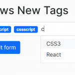 Easy Tags Input Component For Bootstrap 5/4 – Tags.js
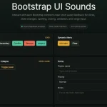 Add Web Audio Feedback to Bootstrap 5 Components – Bootstrap UI Sounds
 iOS-style Bottom Sheet Component for Bootstrap 5 – BootstrapSheet
 CSS-Only Inverted Corner Tabs With Anchor Positioning
 Inspect CSS Styles With Bootstrap Popover CSS Inspector
 Navbar-Synced Context Menu for Bootstrap 5 – BRC JS
 Make Bootstrap 5 Tables More Readable On Mobile Devices – AvalynxTable.js
Hi mladenplavsic,
Is there an updated version for this code using the latest bootstrap like 4.3.1?
Thanks.