


AvalynxSelect is a JavaScript plugin that transforms the regular <select> element into a Bootstrap dropdown component with support for live search, custom styles, scrollable lists, and more.
How to use it:
1. Download the main script avalynx-select.js and insert it into your Bootstrap project.
<link rel="stylesheet" href="/path/to/cdn/bootstrap.min.css" />
<script src="/path/to/cdn/bootstrap.bundle.min.js"></script>
<script src="/path/to/avalynx-select.js"></script>
2. Alternatively, install avalynx-select via NPM and import it as a module into your Bootstrap project.
# NPM
$ npm install avalynx-select
import { AvalynxSelect } from 'avalynx-select';3. Instantiate AvalynxSelect with your target <select> element and customize options as needed:
<select class="form-select avalynx-select" id="example">
... options here ...
</select>
new AvalynxSelect("#example", {
    // options and defaults
    className: '',
    liveSearch: false,
    caseSensitive: false,
    showAll: true,
    showActive: true,
    scrollList: true,
    scrollItems: 8,
    noDefaultSelection: false,
    disabled: false,
    defaultValue: '',
}, {
   // custom placeholders
   searchPlaceholder: 'Search...',
   selectPlaceholder: 'Please select...'
});
4. Callback functions.
new AvalynxSelect("#example", {
    onChange: null,
    onLoaded: null,
}
Changelog:
v1.2.1 (02/26/2025)
- Improved Copy-to-Clipboard Utility
v1.1.0 (10/03/2025)
- Initialize a select as disabled (or mirror the native disabled attribute) and prevent interaction at the custom button level.
- Improves accessibility and avoids accidental changes in read-only contexts.
- New defaultValue option (and data-default-value support) preselects an item during initialization, with sensible precedence.
- Reduces boilerplate and ensures the UI reflects intended defaults immediately.
- Skips empty selects, rebuilds the internal template reliably, and guards event handlers when disabled.
- Increases stability across edge cases and dynamic DOM scenarios.
- Live search normalizes whitespace, respects caseSensitive, and can keep the active item visible.
- Produces more intuitive filtering and cleaner lists for end users.
- Added enable()/disable() and refined value getter/setter to reset or select reliably.
- Makes programmatic control straightforward for app logic and tests.
v1.0.0 (06/05/2025)
- v1.0.0
v0.0.2 (03/08/2025)
- Template renamed from avalynx-select to avalynx-select-template
- Duplicate id fixed
- Dropdown width after resize fixed
- assetscomposer.json added
- onChange event added
- onLoaded event added
See Also:
 Advanced Select Boxes For Bootstrap 5 With use-bootstrap-select
 Modern Select Box Alternative – Better-Nice-Select
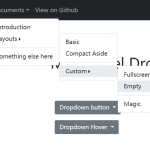 Multi-level Dropdown Component For Bootstrap 5
 Enhanced Dropdown Select Box For Bootstrap 5 – dselect
 Easy Tags Input Component For Bootstrap 5/4 – Tags.js
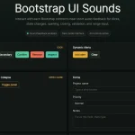 Add Web Audio Feedback to Bootstrap 5 Components – Bootstrap UI Sounds
 iOS-style Bottom Sheet Component for Bootstrap 5 – BootstrapSheet
 Inspect CSS Styles With Bootstrap Popover CSS Inspector