


AvalynxTable is a tiny JavaScript library that makes Bootstrap 5 HTML tables look good and function well on mobile devices.
You know how tables can get all squished and hard to read on smaller screens? This Bootstrap 5 extension fixes that by automatically stacking rows and columns when the table reaches a certain breakpoint. This makes it much easier to view and interact with table data on phones and tablets.
How to use it:
1. Download and load the AvalynxTable’s files in your Bootstrap project.
<!-- Bootstrap -->
<link rel="stylesheet" href="/path/to/cdn/bootstrap.min.css" />
<script src="/path/to/cdn/bootstrap.min.js"></script>
<!-- AvalynxTable -->
<link href="/dist/css/avalynx-table.css" rel="stylesheet" />
<script src="/dist/js/avalynx-table.js"></script>
2. Initialize the AvalynxTable on your Bootstrap table and the library will do the rest.
<table class="avalynx-table table">
  ...
</table>
new AvalynxTable('.avalynx-table');3. AvalynxTable also allows you to specify custom breakpoints for when tables should stack on top of each other. This flexibility ensures that no matter the device or screen size, your tables will stack and become easily navigable at just the right moment.
<table class="avalynx-table avalynx-table-md table">
  ...
</table>
<table class="avalynx-table avalynx-table-xl table">
  ...
</table>
4. Add sortable to the table:
<table id="table-sorting" class="avalynx-table avalynx-table-md">
  <thead>
  <tr>
    <th data-avalynx-table-sort-id="id">ID</th>
    <th data-avalynx-table-sort-id="name">Name</th>
    <th data-avalynx-table-sort-id="department">Department</th>
    <th data-avalynx-table-sort-id="salary">Salary</th>
    <th data-avalynx-sortable="false">Status</th>
  </tr>
  </thead>
  <tbody>
  <tr>
    <td data-avalynx-table-sort-value="1002">1002</td>
    <td>Max Mustermann</td>
    <td>Sales</td>
    <td data-avalynx-table-sort-value="62000">62.000 €</td>
    <td>Active</td>
  </tr>
  ...
  </tbody>
</table>
new AvalynxTable('#table-sorting', {
sortableColumns: ['department', 'name', 'salary'],
sorting: [
{ column: 'department', dir: 'asc' },
{ column: 'name', dir: 'asc' }
],
stackedSorter: true,
stackedMultiSortToggle: true
});5. Override the default CSS classes:
new AvalynxTable('.avalynx-table', {
  buttonClasses: {
    multiSortInactive: 'btn-primary btn-custom-2',
    multiSortActive: 'btn-primary btn-custom-3',
    sortButtonInactive: 'btn-outline-primary btn-custom-2',
    sortButtonActive: 'btn-primary btn-custom-3'
  }
}
6. Localize the library.
new AvalynxTable('.avalynx-table', {
  // options here
}, {
  sortByLabel: 'Sort by',
  multiSortLabel: 'Multi-search',
  multiSortOnLabel: 'on',
  multiSortOffLabel: 'off',
  columnLabel: 'Column'
});
Changelog:
v1.0.3 (03/17/2025)
- Added Column Sorting Support
- Configurable Language and Button Styles
- New .avalynx-table-center Utility Class
See Also:
 Responsive Table For Bootstrap 5 Framework
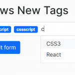 Easy Tags Input Component For Bootstrap 5/4 – Tags.js
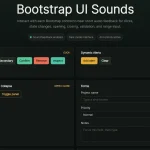 Add Web Audio Feedback to Bootstrap 5 Components – Bootstrap UI Sounds
 iOS-style Bottom Sheet Component for Bootstrap 5 – BootstrapSheet
 Inspect CSS Styles With Bootstrap Popover CSS Inspector
 Navbar-Synced Context Menu for Bootstrap 5 – BRC JS
 Shadstrap: Bootstrap 5 Theme with shadcn/ui Aesthetics
 Lightweight Loading Overlay Plugin For Bootstrap 5 – AvalynxLoader