


Punica is a lightweight, responsive, modern, and fully customizable front-end framework written in pure CSS/SASS/SCSS.
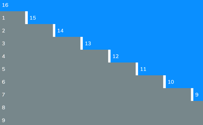
Grid Layout:
- Fully responsive layout system based on CSS Grid
Elements Included:
Components Included:
How to use it:
1. Import the punica.min.css into the document and we’re ready to go.
<!-- Core -->
<link rel="stylesheet" href="./dist/punica.min.css" />
<!-- Dark Mode -->
<link rel="stylesheet" href="./dist/punica-dark.min.css" />
<!-- Custom Themes -->
<link rel="stylesheet" href="./dist/custom/punica-palenight.min.css" />
<link rel="stylesheet" href="./dist/custom/punica-raisin.min.css" />
<link rel="stylesheet" href="./dist/custom/punica-retro.min.css" />
2. Customize the CSS framework by overriding the default variables in the variables.scss.
/*****************************************************
*** GLOBAL DEFINITIONS ******************************/
/*
FONT *************************************************/
@import url('https://fonts.googleapis.com/css2?family=Nunito:wght@300;400;700;900&display=swap');
/*
TYPOGRAPHY *******************************************/
$main-font-family : 'Nunito', -apple-system, BlinkMacSystemFont, "Segoe UI", Roboto, "Helvetica Neue", Arial, sans-serif;
$main-font-weight : 400;
$main-font-size : 13px;
$main-line-height : 1.7;
$main-title-weight : 900;
/*
BASE COLORS ******************************************/
$main-bg : white;
$main-secondary-bg : #e6e6e6; // Platinum
$main-font-color : #3f4143; // Onyx
$main-invert-color : white;
$main-grey-color : #77878b; // Roman Silver
$main-dark-color : #414552; // Charcoal
/*
THEME COLORS *****************************************/
$primary-color : #0a8fff; // Dodger Blue
$success-color : #2ec4b6; // Tiffany Blue
$warning-color : #de9e36; // Gamboge
$error-color : #d62828; // Maximum Red
/*
BORDER ***********************************************/
$main-border-width : 1px;
$main-border-style : solid;
$main-border-color : #c6c6c6; // Silver Sand
$main-border-radius : 4px;
/*
SCROLLBAR ********************************************/
$scrollbar-width : 4px;
$scrollbar-bg : $main-secondary-bg;
$scrollbar-color : $main-dark-color;
/*
MAIN GRID NAMING
It is used in card and form.
******************************************************/
$grids: (
  "one": "1",
  "two": "2",
  "three": "3",
  "four": "4",
  "five": "5",
  "six": "6",
  "seven": "7",
  "eight": "8",
  "nine": "9",
  "ten": "10",
  "eleven": "11",
  "twelve": "12",
  "thirteen": "13",
  "fourteen": "14",
  "fifteen": "15",
  "sixteen": "16"
);
Previews:

Palette
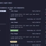
Grid Layout
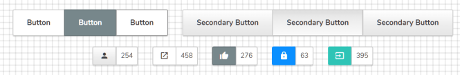
Buttons

Form Elements
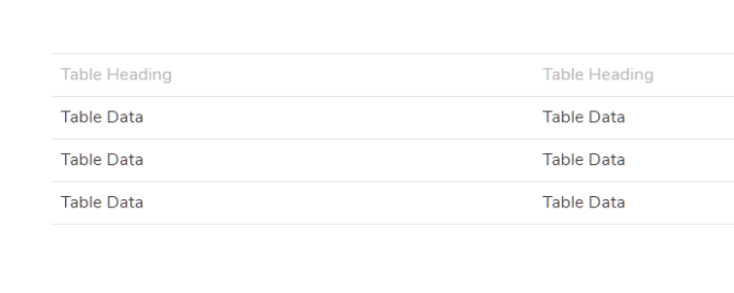
Table

Alerts

Cards

Navbar

Timeline
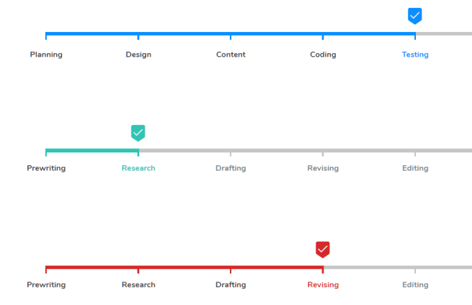
Process
Changelog:
v2.8.20 (07/02/2023)
- optimized grid and added XXL breakpoint
- added .active class to navbar items
- fixed divided navbar
- updated helpers
v2.8.11 (05/30/2023)
- updated helpers (border-{x/y}-{border})
- Minor fixes and updates
- Optimized core
v2.8.0 (04/24/2023)
- Added gradient style to Button (LTR and RTL)
- Added gradient style to Navbar (LTR and RTL)
- Added new helpers; Flex, Float, Height, Text Decoration and Width
- Updated Dusty theme
- Updated Raisin theme
v2.7.2 (04/04/2023)
- added color schema for helpers
- updated options.scss
- optimized helper
- minor fixes
v2.7.0 (03/08/2023)
- minor fixes for icon sizes
v2.6.28 (07/15/2022)
- minor fixes for icon sizes
v2.6.1 (03/14/2022)
- Updated ‘Dusty’ theme
- Updated shadow variables for default theme
- Updated light theme for Navbar
- Updated backdrop filters for Helpers
- Updated _global/_getters.scss
v2.6.0 (02/01/2022)
- Added a new component named ‘Stats’
- Panel : added panel sizes (mini/small)
- Added new classnames.scss API file
- Added a new dark theme named ‘Raven’
- Form : added a new option to options.scss for input file
- Tabnav, Navbar : updated font-weight (set as theme variable)
- Panel : updated border-radius and background-color (set as theme variable)
- Alert, Label, Badge : updated font-weight
- Menu : updated font-size (for .small menu)
- Icon : updated icon variables
- Form : updated margin of form item
- Revized default and dark theme
- .disabled class defined as globally
- Improved debugging for API map keys
- Updated options.scss
- Process : deleted font-weight property
- Navbar : fixed responsive burger menu
- Button : fixed :active and :focus states
- Panel : added a selector to panel title
v2.5.0 (10/28/2021)
- Button : added .outlined style
- Menu : fixed menu shadow for dropdown (top position)
- Menu : fixed .disabled state of menu items
- Typography : fixed font size of headers
- Badge : updated style
- Button : updated .link style
- Menu : updated font weight of menu items (setted as theme variable)
- Tabnav : updated tabnav .active state
v2.4.5 (10/10/2021)
- Added a new theme named “smart”
- Tabnav : added .bottom position
- Menu : added .disabled state to menu items
- Navbar : added a new value of divider color for navbar themes
- Helpers : added .bg-color helper class
- Helpers : added a specificity (!important) to some of helper classes
- Tabnav : Updated icon size in tab
v2.4.0 (08/07/2021)
- Added global font and typography settings to each theme map.
- Class names will now be defined in a separate ‘classnames.scss’ file within each component directory.
- Added a new global function called ‘set-border’ (default border)
- Card : added selectors to sub elements
- Table : added caption style
- Button : updated .block class
- Table : updated variables
- Card : updated .media class (for horizontal card)
- Caption : updated line height value
- Updated shadow mixin
- Updated themes
- Typography
- Fixed Helpers : backdrop filters
v2.3.0 (05/02/2021)
- Tooltip : Added new directions (top, left, right)
- Navbar : Added a new .divided class
- Tabnav : Added a new .centered class
- Helpers : Added new “border-“, “border-style”, “fit-“, “resize-” and “order-” helper classes
- Helpers : fixed .reverse helper class
- Added debug message while a theme compiling
- Added error handling if specified theme doesn’t exist in theme map
v2.2.2 (04/09/2021)
- Added new custom theme called “dusty”
- Button : fixed background property for secondary button
- Updated shadow value for light theme
- Updated display property for .hide helper class
v2.2.0 (03/01/2021)
- Caption : added a new element called “Caption”
- Navbar : added sizes (mini, small)
- Tabnav : fixed tabnav dark color
- Process : fixed process dark color
- Progress : fixed progress dark color
- Timeline : fixed timeline dark color
- Navbar : fixed navbar burger menu by sizes
- Button : fixed width of a button group in state of nested flex
- Helpers : renamed fw- (font-weight) helper prefix to weight-
- Updated options.scss for navbar sizes and new Caption element
- Navbar : Updated brand img by sizes
- Navbar : Updated navbar-spacer value
- Optimized code
v2.1.0 (02/19/2021)
- Added 3 new themes (Palenight, Retro, Raisin).
- Bugs fixed.
- Menu : updated background of menu item
- Menu : updated shadow
- Navbar : added hover effect to navbar buttons
- Optimized shadow mixin in _themes/_setters.scss
- Optimized code
- Button : deleted an unnecessary variable ($button-class-invert)
v1.8.0 (01/23/2021)
- Alert : added new sizes (small, large)
- Dropdown : added new class .clickable to .dropdown
- Form and Process : added new preferences
- Panel and Card : added new conditional style options
- Added new global mixins (set-style, set-sizes)
- Helpers : fixed typo for .align-items-flex-end
- Process : vertical style is setted true for mobile devices
- Icon : improved icon.scss (added a new variable file)
- Optimized code
- Alert, Badge and Billboard : deleted mixin files
v1.7.5 (01/06/2021)
- Helpers : added new helpers for positioned elements and border radius
- Optimized code
- List : deleted flex-direction property for mobile devices
v1.7.4 (12/30/2020)
- Badge : added tiny size
- Badge : fixed border style
- Tabnav : fixed item align
- Badge : updated small badge size
- Form : updated height of form item
- Form : updated checkbox and radio styles
- Form : updated form label
- Panel : updated padding
- Typography : updated <p> size
- Panel : deleted min-height property for panel header
- Button : deleted unnecessary property from .link.button
- Button : deleted unnecessary variable
- Breadcrumb : deleted display property
- Badge : deleted unnecessary variables
- Table : deleted overflow and flex property
v1.7.0 (12/02/2020)
- Dropdown : added new dropdown positions
- Button : added new vertical button groups
- Button : added a css selector pattern for dropdown
- Tabnav : added a css selector pattern for tab buttons
- Panel : added a css selector pattern for panel
- Grid : removed unnecessary first column offset
- Updated scrollbar width
- General code fixes
- Card : deleted unnecessary property from .horizontal.card>.media
v1.6.0 (11/19/2020)
- Card: added media group feature
- List: added active class
- Panel: added dotted and dashed classes
- Form: fixed margin for form items
- Panel: fixed media img position
- Timeline: fixed media img position
- General code fix
v1.5.20 (10/28/2020)
- Form : added time input
- Helpers : added new helper classes (flex-direction, user-select, z-index and position properties)
- Breadcrumb : added cursor value for ::after content
v1.5.0 (10/28/2020)
- Timeline: added a new “photo columns” feature
- Panel: added a new “photo columns” feature
- Helpers: added auto value for padding and margin
- Dropdown: added z-index value for menu in dropdown
- Button: updated padding for tiny buttons
- General code fixes
v1.4.495 (10/24/2020)
- Form: added validation states to input style (.error, .success)
- Button: added a new size called “.tiny”
- Button: updated default font weight
- Button: removed unnecessary $button-force variable
v1.4.308 (10/18/2020)
- List: added a new class called “.subtitle”
- List: added line-height value to .title
- Form: added max-width value to .form
- Helpers: added a specificity for font weights
- List: some of minor updates
- List: deleted image width value of list items (and removed $list-media-width from variables)
v1.4.28 (10/18/2020)
- Card : fixed style of horizontal cards
v1.4.0 (10/15/2020)
- Menu: added a new divided class
- Menu: added width value
- Helpers: added a specificity for display properties
- Helpers: fixed align-self typo
- Panel: deleted paragraphy size in Panel
- Menu: deleted an unnecessary variable
v1.3.459 (10/11/2020)
- Card : fixed syntax
- Card : fixed width value for single card
- Breadcrumb : updated item style
v1.3.429 (10/10/2020)
- Form : updated button sizes
- Form : updated label weight
v1.3.405 (10/09/2020)
- Fixed container width for mobile devices
v1.3.302 (10/07/2020)
- Button : fixed font-weight of buttons
v1.3.269 (10/06/2020)
- Menu : fixed badge style and size of menu items.
- Button : updated font size, weight and padding.
- Navbar : updated font weight and padding of navbar buttons.
- Tabnav : updated padding of tabnav buttons.
v1.3.200 (10/02/2020)
- Added a new style class called “dark” for Label, Alert, Badge, Billboard, Process, Progress and Timeline
v1.3.0 (10/02/2020)
- Tabnav: added new color styles
- Helpers: added a new class called “pure”
- Panel: specific “pure” class was removed
- Menu: specific “pure” class was removed
v1.2.5 (09/28/2020)
- Button: added new warning style
- Button: updated active class
- Tabnav: updated font-weight value of active buttons
- Updated general shadow value
- Fixed bugs
v1.2.0 (09/27/2020)
- Badge : added new color styles and sizes
- Label : added sizes
v1.1.590 (09/24/2020)
- Helpers: helper classes fully optimized
- Table: Updated border color
- Button: Updated bg color of hover state
- Navbar: fixed color value of dark theme
v1.1.472 (09/22/2020)
- Helpers : added a new filter class called “filter-gray”
- fixed border-radius value of dropdown button in Tabnav
- components updated
v1.1.377 (09/20/2020)
- Fixed shadow value of dropdown top menu
v1.1.180 (09/14/2020)
- Base : updated default href color
- Breadcrumb : added href color property
- Menu : updated min-width value
- Menu : updated icon color
v1.1.151 (09/12/2020)
- Added a new .reversed class to reverse the items of process
- Updated transition property
v1.1.10 (09/10/2020)
- Updated Tabnav component
v1.1.0 (09/09/2020)
- Added a new component called “Tabnav”
- Updated blockquote style
v1.0.451 (09/08/2020)
- Updated navbar component
See Also:
 Terminal-Inspired CSS Library for Retro Web UI – WebTUI
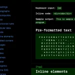 Classless Themeable CSS Framework For Modern Web Design – Dev.css
 CSS Framework With Almost No Classes – no.css
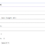 Terminal Style CSS Framework – terminal.css
 Classless CSS Framework with Georgia & Verdana Typography System – MCSS
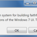 7.css: Windows 7 CSS Framework
 Minimalist CSS Framework For Creating Modern Web Pages – Mgplus
 Minimal Classless CSS Framework – Simple.css
Hello Fatih Kececi ,I am very interested in Punica Framework. Such a great work. I want to join you & with your punica project to next level with JavaScript. I also owned a framework but not modern like you. here it is https://code-opacity.github.io/opacity/
Please reply soon. i wont find your contact info anywhere.
Hello, Demo Not Working. It is producing a 404 Error Page. Please can you fixt it?
Fixed! Thank you for your feedback.