


A pure CSS image slider where you can click on the thumbnails to switch between images.
How to use it:
Add images to your webpage.
<ul class="slide">
  <li class="first" id="slide-1"><img src="img/image_1.jpg" alt="" /></li>
  <li id="slide-2"><img src="img/image_2.jpg" alt="" /></li>
  <li id="slide-3"><img src="img/image_3.jpg" alt="" /></li>
  <li id="slide-4"><img src="img/image_4.jpg" alt="" /></li>
  <li id="slide-5"><img src="img/image_5.jpg" alt="" /></li>
</ul>
Add thumbnails with anchor links pointing to corresponding images.
<ul class="thumbs">
  <li><a href="#slide-1"><img src="img/image_1.jpg" /><span>This is image 1</span></a></li>
  <li><a href="#slide-2"><img src="img/image_2.jpg" /><span>This is image 2</span></a></li>
  <li><a href="#slide-3"><img src="img/image_3.jpg" /><span>This is image 3</span></a></li>
  <li><a href="#slide-4"><img src="img/image_4.jpg" /><span>This is image 4</span></a></li>
  <li><a href="#slide-5"><img src="img/image_5.jpg" /><span>This is image 5</span></a></li>
</ul>
Style the thumbnail navigation.
.thumbs {
  margin-bottom: 10px;
  display: flex;
  justify-content: space-between;
}
.thumbs li, .thumbs li a {
  width: 98px;
  height: 55px;
}
.thumbs a {
  /*display: block;*/
  position: relative;
  font: bold 12px/25px Arial, sans-serif;
  color: #515151;
  text-decoration: none;
  text-shadow: 1px 1px 0px rgba(255, 255, 255, 0.25), inset 1px 1px 0px rgba(0, 0, 0, 0.15);
}
.thumbs li a img {
  width: 90px;
  height: 45px;
  border: 4px solid #3498DB;
}
.thumbs li a:hover span {
  position: absolute;
  z-index: 101;
  bottom: -30px;
  display: block;
  width: 98px;
  height: 25px;
  text-align: center;
  border-radius: 3px;
  -webkit-box-shadow: 0px 1px 0px rgba(0, 0, 0, 0.4);
  -moz-box-shadow: 0px 1px 0px rgba(0, 0, 0, 0.4);
  -o-box-shadow: 0px 1px 0px rgba(0, 0, 0, 0.4);
  -ms-box-shadow: 0px 1px 0px rgba(0, 0, 0, 0.4);
  box-shadow: 0px 1px 0px rgba(0, 0, 0, 0.4);
  background: #fff;
  background: -webkit-linear-gradient(top, #fff 0%, #bcbcbc 100%);
  background: -moz-linear-gradient(top, #fff 0%, #bcbcbc 100%);
  background: -o-linear-gradient(top, #fff 0%, #bcbcbc 100%);
  background: -ms-linear-gradient(top, #fff 0%, #bcbcbc 100%);
  background: linear-gradient(top, #fff 0%, #bcbcbc 100%);
}
.thumbs li a:hover span::before {
  width: 0;
  height: 0;
  border-bottom: 5px solid white;
  border-left: 5px solid transparent;
  border-right: 5px solid transparent;
  content: "";
  position: absolute;
  top: -5px;
  left: 44px;
}
The core CSS/CSS3 rules.
.slide {
  overflow: hidden;
  /*border: 4px solid #E74C3C;*/
  border: 4px solid #3498DB;
}
.slide, .slide li, .slide img {
  width: 712px;
  height: 350px;
  position: relative;
}
.slide li {
  position: absolute;
  z-index: 50;
}
/*Animation For Slider*/
@-webkit-keyframes
slider {  0% {
left: -500px;
}
 100% {
left: 0;
}
}
.slide li:target {
  z-index: 100;
  -webkit-animation: slider 1s 1;
}
/*Not Target*/
@-webkit-keyframes
noTarget {  0% {
z-index: 75;
}
 100% {
z-index: 75;
}
}
.slide li:not(:target) { -webkit-animation: noTarget 1s 1; }
See Also:
 Lightweight Image Slider With Slide/Fade Transitions – SliderJS
 Basic Pure CSS Image Slider – slider.css
 Pure JS / CSS Image Slider With A Masking Effect
 Full Width Responsive Image Slider with JavaScript – Gallry.js
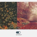 Automatic Image Slider with Pure CSS
 Super Simple Image Slider In Vanilla JavaScript – Vanilla Slider
 Fullscreen 3D Cube Slider with Pure CSS / CSS3
 Dynamic Responsive Image Slider with JavaScript and CSS3 – Karrot Slider