


An HTML/CSS only slideshow that allows you to create a responsive, fullscreen image slider with a fancy 3D cube flipping effect created by several CSS3 properties.
How to use it:
Include the core style sheet in the document’s head section.
<link href="css/skin.min.css" rel="stylesheet">
Create the 3D cube slider with plain html structure and checkbox & label tricks.
<div class="buttons-wrapper">
  <input id="slide1" type="radio" name="slider" checked>
  <input id="slide2" type="radio" name="slider">
  <input id="slide3" type="radio" name="slider">
  <input id="slide4" type="radio" name="slider">
  <ul class="slider">
    <li>
      <div class="caption">
        <h3>Slide One</h3>
        <p>
          Content One
        </p>
      </div>
    </li>
    <li>
      <div class="caption">
        <h3>Slide Two</h3>
        <p>
          Content Two
        </p>
      </div>
    </li>
    <li>
      <div class="caption">
         <h3>Slide Three</h3>
        <p>
          Content Three
        </p>
      </div>
    </li>
    <li>
      <div class="caption">
         <h3>Slide Four</h3>
        <p>
          Content Four
        </p>
      </div>
    </li>
  </ul>
  <label for="slide1"></label>
  <label for="slide2"></label>
  <label for="slide3"></label>
  <label for="slide4"></label>
</div>
Replace the background images with yours.
body .buttons-wrapper .slider > li:nth-child(1) {
  background: url(1.jpg) no-repeat center center;
}
body .buttons-wrapper .slider > li:nth-child(2) {
  background: url(2.jpg) no-repeat center center;
}
body .buttons-wrapper .slider > li:nth-child(3) {
  background: url(3.jpg) no-repeat center center;
}
body .buttons-wrapper .slider > li:nth-child(4) {
  background: url(4.jpg) no-repeat center center;
}
See Also:
 Lightweight Image Slider With Slide/Fade Transitions – SliderJS
 Pure CSS Image Slider With Thumbnail Navigation
 Basic Pure CSS Image Slider – slider.css
 Pure JS / CSS Image Slider With A Masking Effect
 Full Width Responsive Image Slider with JavaScript – Gallry.js
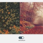 Automatic Image Slider with Pure CSS
 Super Simple Image Slider In Vanilla JavaScript – Vanilla Slider
 Dynamic Responsive Image Slider with JavaScript and CSS3 – Karrot Slider
Hi, this is exactly what I was looking for. But is there a way to have the cube flip on scroll as well?
bro..the animation does not work properly in chrome