Lightweight Masonry Layout Library – Macy.js

Macy.js is a JavaScript library for creating a Masonry- and Pinterest-like grid layout that displays images in dynamic, responsive vertical columns.


Macy.js is a JavaScript library for creating a Masonry- and Pinterest-like grid layout that displays images in dynamic, responsive vertical columns.

Bricklayer is a JavaScript library for generating a responsive, dynamic, Masonry- and Pinterest-like cascading grid layout for your web project.

minigrid is a standalone JavaScript library used to generate a responsive, flexible, customizable grid layout for your next web design.
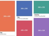
A pure JavaScript solution used to create responsive, fluid waterfall grid layout as you seen on Pinterest.com.

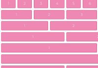
The 60gs.css library lets you create 60 columns grid system based on the CSS Grid Layout.

Yet another small CSS framework that helps developers and beginners to quickly create fully responsive, nested grid layouts using CSS flexbox model.
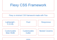
Yet another CSS framework to create a responsive, justified/fluid grid of elements using CSS flexbox. Just weights in 0.3kb (minified) and super flexible.
SMART CSS GRID is an ultra-light (~0.5kb minified) CSS grid framework to create responsive, flexible, fluid, 12-column grid layout for your modern web app.

Atomic Bulldog Grid is a CSS(SCSS) library to generate modern, responsive, flexible grid layout using the CSS Grid Layout technology.

Hexi-Flexi Grid is an SCSS component used to render a responsive, flexible, customizable hexagon layout using CSS grid layout.