Super Tiny Pinterest-style Grid Library – waterfall.js

Just another pure JavaScript library that creates a responsive, fluid, Pinterest inspired grid to showcase your products, services, designs, etc. Also known as Masonry Layout.


Just another pure JavaScript library that creates a responsive, fluid, Pinterest inspired grid to showcase your products, services, designs, etc. Also known as Masonry Layout.

A pure CSS solution to render a fully responsive hexagon grid layout with fancy mouse hover effects in your html page.

A vanilla JavaScript plugin to render a responsive, Masonry-style image and/or card layout using plain JavaScript and CSS. No dependencies.

Atomic Grid is a lightweight, responsive grid layout system based on CSS Grid Layout.

flexmasonry is a lightweight JavaScript layout library which dynamically renders a Masonry-like grid layout using CSS3 flexbox.
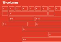
Raster is a pure CSS layout system that makes it simple to generate a responsive modern grid layout using descriptive HTML and CSS Grid Layout.

Gridify is a vanilla JavaScript layout plugin used to arrange your grid items in a Masonry-style layout using pure JavaScript.
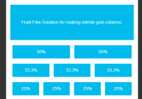
infinity-css-grid is an ultralight (less than 0.1kb ) CSS layout system that helps web developers quickly generate responsive, flexible grid layout using CSS flexbox.
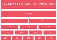
Flex One is a dead simple CSS class to create infinite responsive grid systems based on CSS flexbox layout.
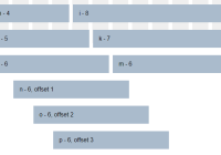
CSSGridSys is a small CSS library used for creating responsive, cross-platform, 12-column grid layout for modern web design.