Responsive Image/HTML Content Lazy Load JavaScript Library – responsivelyLazy

responsivelyLazy is an ultra-light javascript library which allows you to delay the loading of appropriate images based on the width of their parent containers.


responsivelyLazy is an ultra-light javascript library which allows you to delay the loading of appropriate images based on the width of their parent containers.

A JavaScript library that helps make images responsive while preserving defined focus areas.
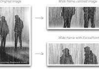
Dynamically crops & resizes your image to fit its container space and makes the focus point (the most important part of the image) always be centered.

reframe.js is a lightweight and pure JavaScript library which makes any embedded content (e.g. iframes, videos, Youtube videos) fully responsive to fit any screen size.

SuperEmbed.js makes iframe embedded videos (e.g. youtube & vimeo videos) fully responsive to fit the specific container while maintaining aspect ratios.

A small vanilla JavaScript library for smartly and dynamically loading proper background images depending on the current screen sizes.

CoverImage is a pure JS responsive image solution which dynamically stretches and crops an image to fill its parent container on window resize.

SmartImages is a JavaScript library for smart image delivery that has the ability to dynamically load and display images according to the screen width.

Backwall is a pure JavaScript library that checkes the screen width and loads in the correct background image to reduce network traffic and increase page load speed.

bg-responsive.js is a vanilla JavaScript library that allows to intelligently load the appropriate background images based on the screen size you’re viewing on.